

Case study
SMTX OS Redesign (Fisheye)
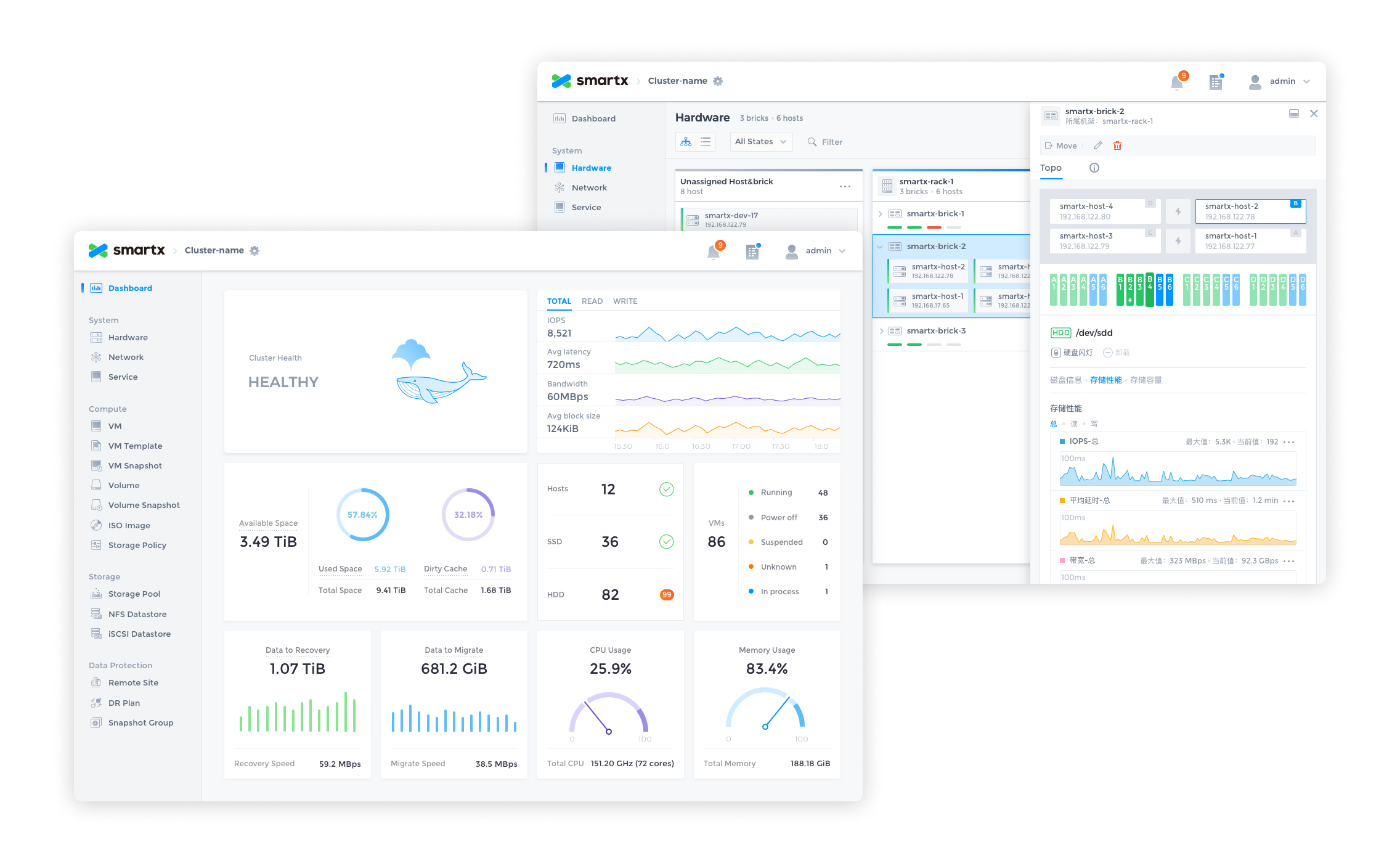
Server hardware status monitoring and data visualization.
role
Product Designer
Platform
Web
My Contribution
UI / UX Design
Motion / Illustration
Data Visualization
Design System
Introduction
SmartX is a leading provider of hyper-converged products and enterprise cloud solutions in China, SmartX redefines the data center through software, bringing the architecture of data centers similar to Google and other Internet companies to enterprises, building faster, more scalable, and more flexible data centers for enterprises.
Fisheye Dashboard is the visual data platform for SmartX hyper-converged systems, providing IT administrators with the ability to monitor, alert, and manage hardware and resources. After 2 major releases, our design team completely redesigned Fisheye to create the first design system for our product.
The redesign process used the Design Sprint and Atomic Design methodologies to experiment and validate the design ideas in a short period of time, and to build the system from the smallest interface elements.
After the design was completed, a detailed UI Kit was compiled.

Why Redesign?
SmartX OS is an operating system designed for hyper-converged architectures, helping customers build agile and efficient modern data centers. Fisheye is the web-based console for SmartX OS, providing the most intuitive platform for system administrators to monitor system status and data metrics.
It has completed 2 major feature iterations in the past 2 years, adding several important features such as virtual machine management, snapshots, storage pools, etc., and is about to receive the 3.0 version update. In the previous version, the design was more focused on completing the features planned in each version, and the design was focused on how to design the feature well, lacking systematic design thinking. For example, the same component is designed multiple times in different versions, but the style and interaction are not exactly the same.
- Duplication of components affects development efficiencyThere are a lot of duplicate components in the design component library and front-end code, which reduces design and development efficiency and needs to be streamlined.
- Inconsistent experienceRedundant components are inconsistent in style and interaction, resulting in an inconsistent experience.
- Poor scalability of information architectureVersion 3.0 will add more complex functions such as rack awareness and networking, and the existing information architecture cannot meet the large amount of data and information and complex interaction functions.
Therefore, the design team decided to conduct a thorough reorganization and refactoring of the product design.
Design Objectives
- To establish a unified design specification to standardize the design and front-end components to provide users with a reliable, consistent and user-friendly experience.
- Reprogram the product information architecture, optimize the existing interaction design, and meet future expansion needs.
- Initially establish brand features and incorporate more brand elements in the design.
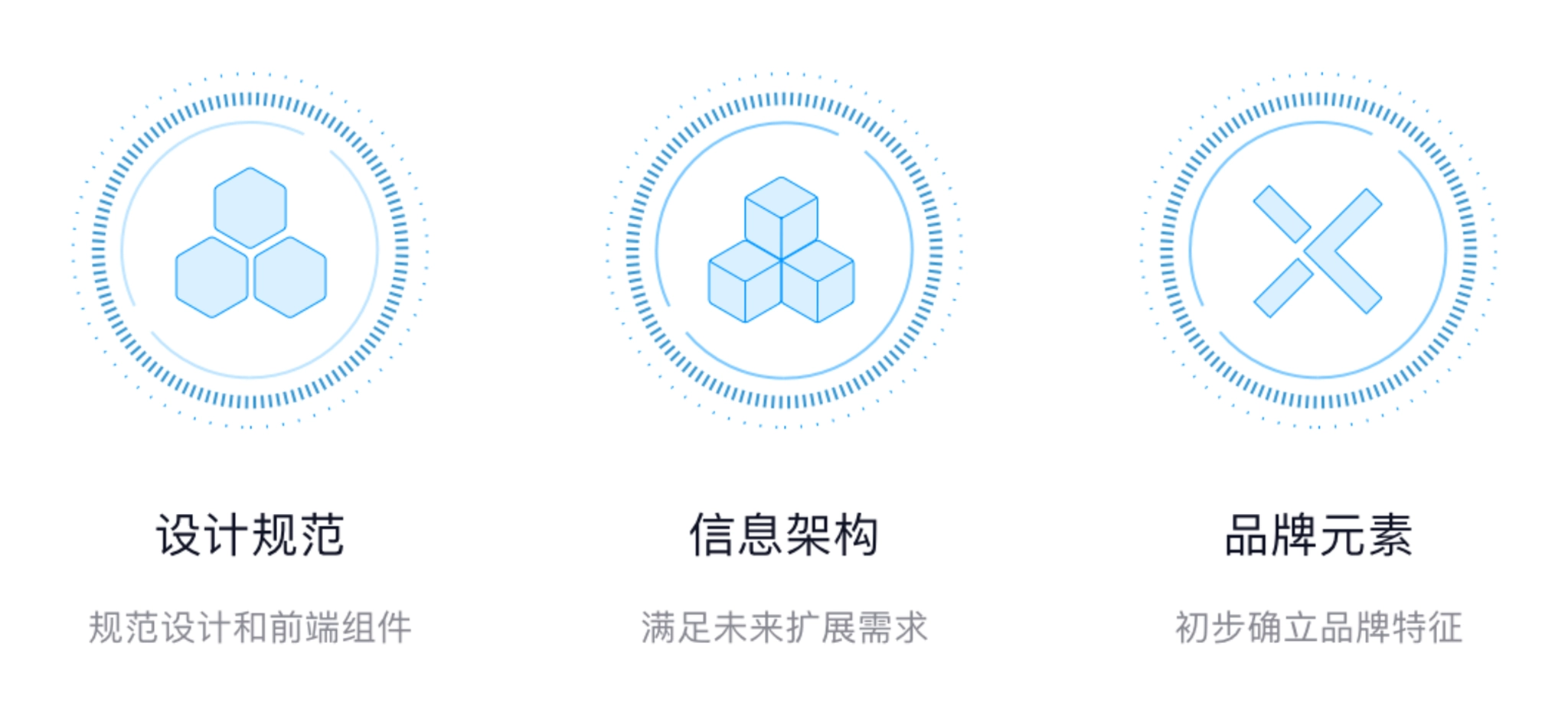
Design objectives.
Design Challenges
1. Data-heavy
There is a large amount of computing and storage-related data in Fisheye that needs to be monitored in real time and presented to system administrators in an intuitive form. How to distinguish the priority of different data and how to choose the appropriate form of data presentation is the focus of the design.
2. Diverse forms of interaction and complex information architecture
The functional design of the product contains a variety of data presentation forms, in addition to the most common list, there are different forms of charts, as well as network pages that reflect the actual topology, and rack-aware pages that simulate actual data center rooms. The information architecture needs to be compatible with various forms of interaction.
3. Alerts, Notifications
Enterprise customers have higher requirements for product reliability. If a problem occurs it must be monitored by the system in time and can be notified to the user in the most intuitive form to avoid greater losses. This also requires us to understand all notifications that are valuable to users, distinguish the priority of notifications, and find the most appropriate way to notify them.
4. Leave room for future functions
In the future, the product will be richer and more complex functions will be added, so the interaction design and information architecture should be flexible enough to leave room for future expansion of functions.
Design Method
Design method.
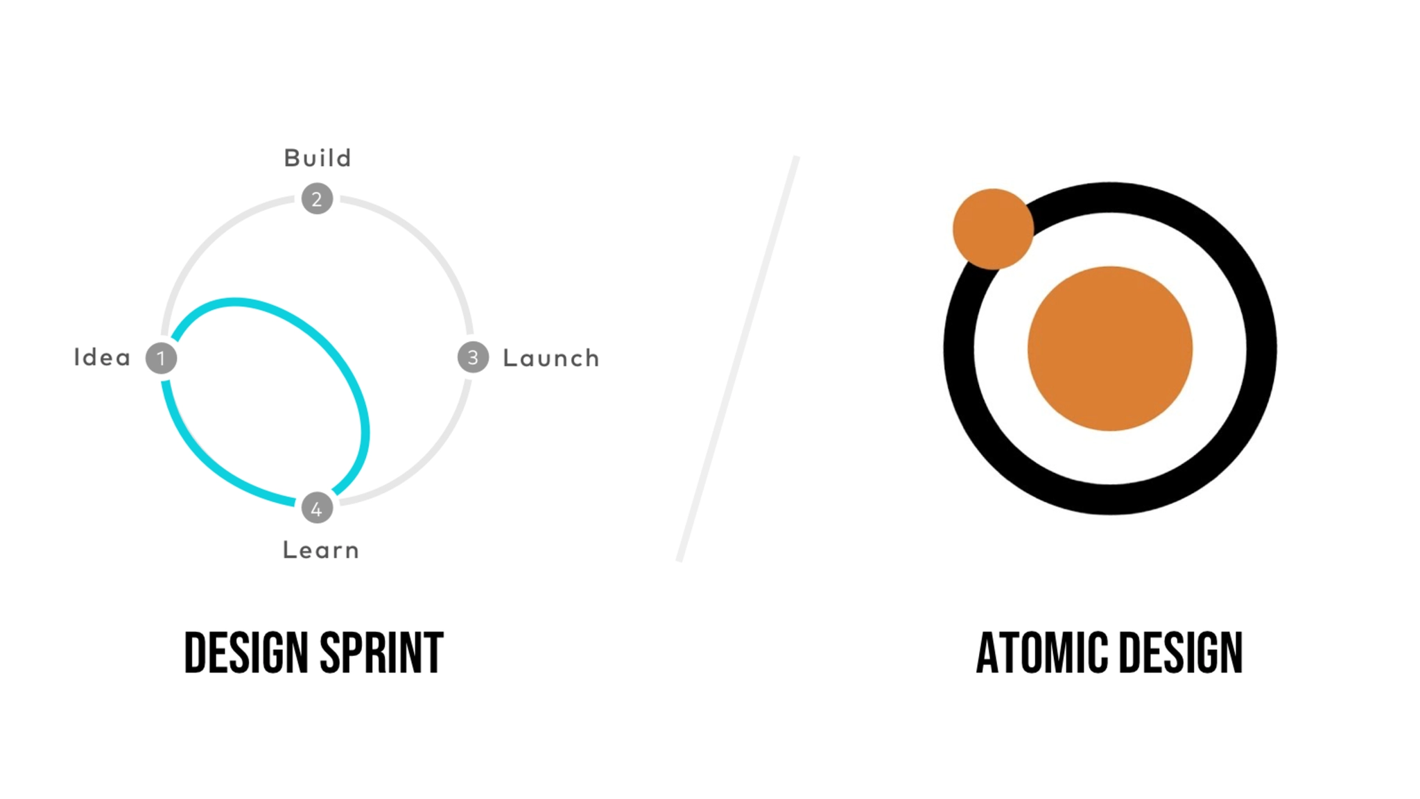
1. Design Sprint
After deciding to redesign the product, we used the Design Sprint to quickly explore design options, validate design ideas, and find the most appropriate solution over the course of a week.
- On Monday, list all the problems that the product wants to solve for the customer, prioritizing the problems.
- Tuesday, start designing and trying different design ideas to solve the proposed problems.
- Wednesday, evaluate all the completed design solutions, find the most appropriate solution, and prepare for prototyping.
- Thursday, create an interactable prototype.
- Friday, test the prototype, evaluate the solution, collect feedback from team members, and determine the design direction.
We spent a week to re-understand the problems encountered by users, explore multiple design solutions, and gather the wisdom of the team to finalize the design direction by understanding the problem, designing, testing, and verifying.
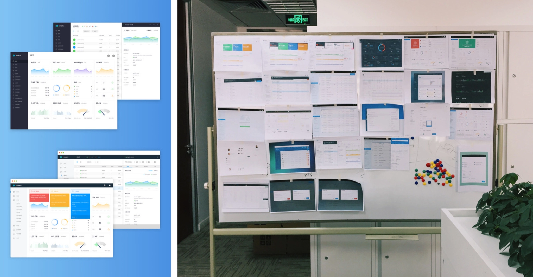
Exploring multiple design solutions.
2. Atomic Design
Entering the design phase, we adopted the Atomic Design method, starting with the smallest design elements and then combining them into components to eventually expand the design in its entirety.
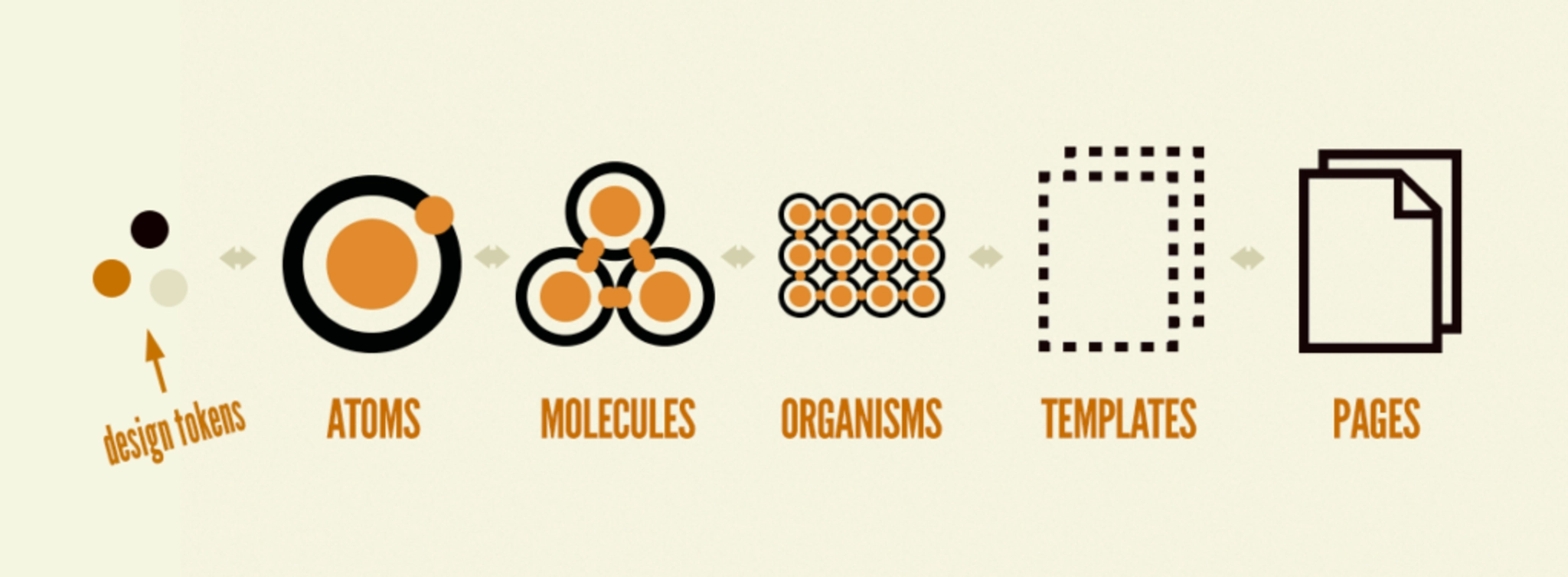
Atomic Design method.
2.1 Design Token
The most basic visual elements, including colors, fonts, page layout, shadows, and transition animation effects are set throughout the redesign. In order to be able to establish the brand identity in the product, the brand color is integrated into the design of the system. The color is pure and can be used as a highlighting color for selected effects, text links, etc. In use, the system will monitor the status of many hardware and services, including servers, hard disks, virtual machines, etc., and respond to the status in real time in the Fisheye interface, so in addition to the brand color, also pre-set the color to reflect different states, the most common states include: running, suspended, error, and shutdown.
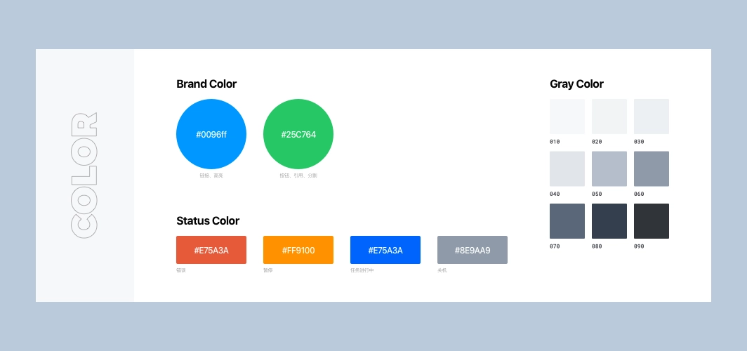
Design token: color
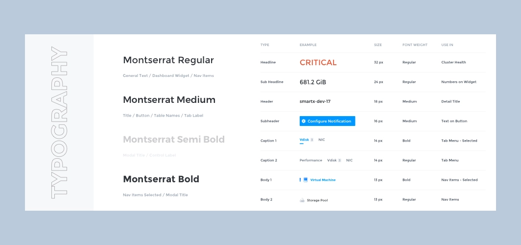
Design token: typography
Design token: layout
2.2 Atoms
With the basic visual elements in place, start designing the smallest design components such as icons, buttons, input boxes, radio boxes, cards, etc.
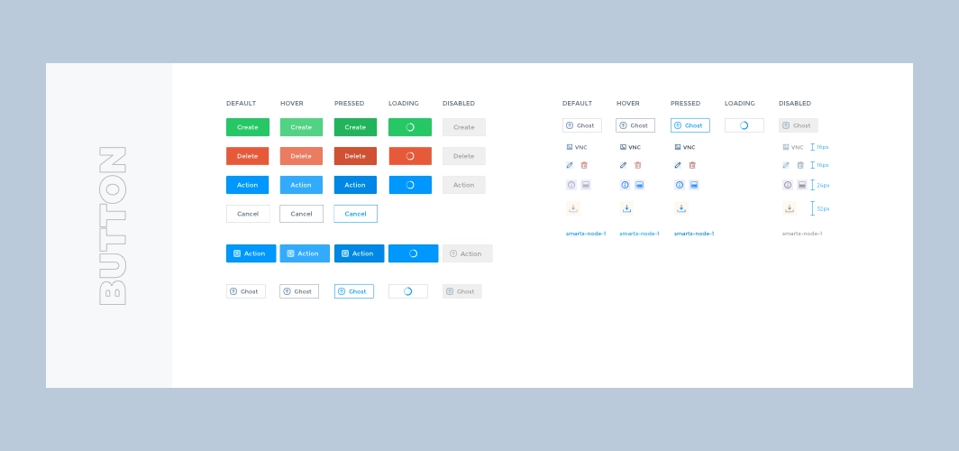
Atoms: button
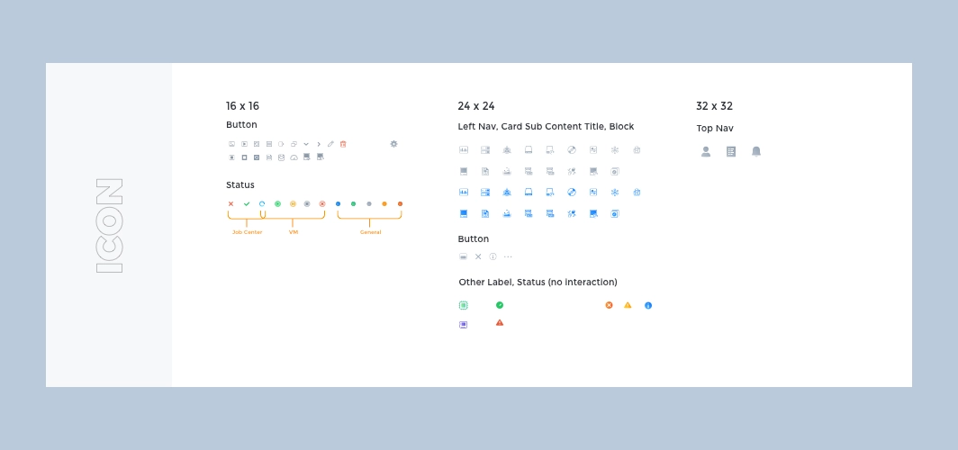
Atoms: icon
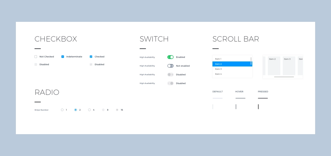
Atoms: checkbox, radio, switch, scroll bar.
2.3 Molecules
Simple combinations of minimal design components as needed can form an action set used in a page, such as breadcrumb navigation, Tabs, dropdown menus, notifications, Loading, page flip buttons, etc.
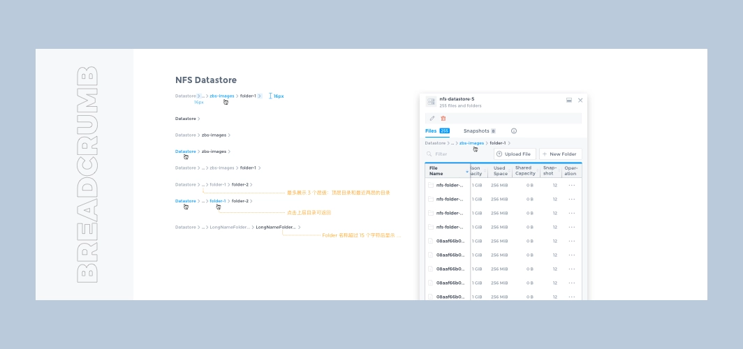
Molecules: breadcrumb
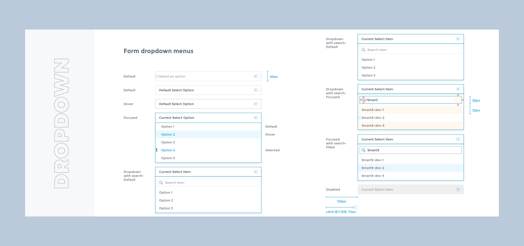
Molecules: dropdown
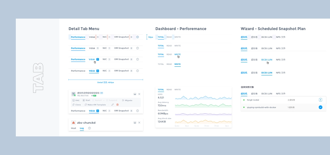
Molecules: tab
2.4 Organisms
Complex page controls can be created by combining multiple simple components, such as pop-ups, notification menus, list action bars with search, filter, and switch view functions.
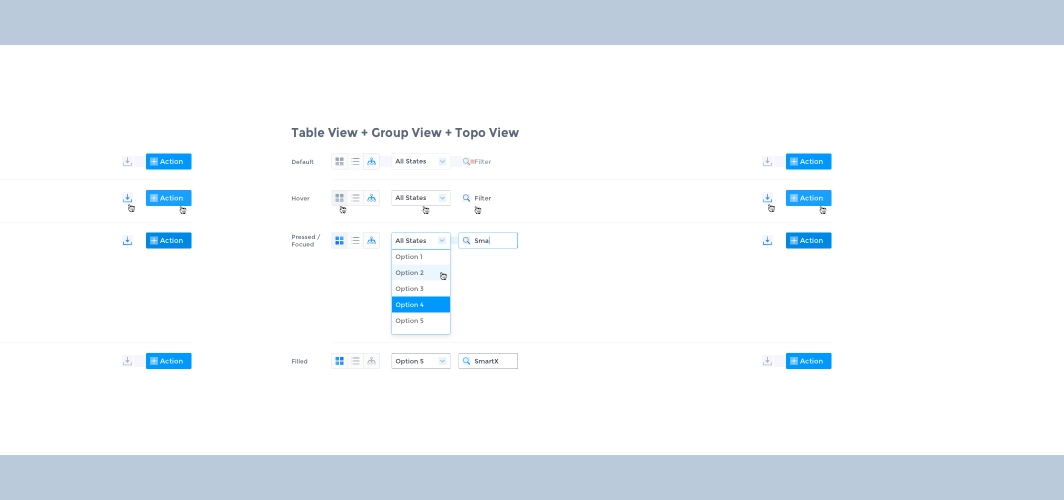
Organisms: view options
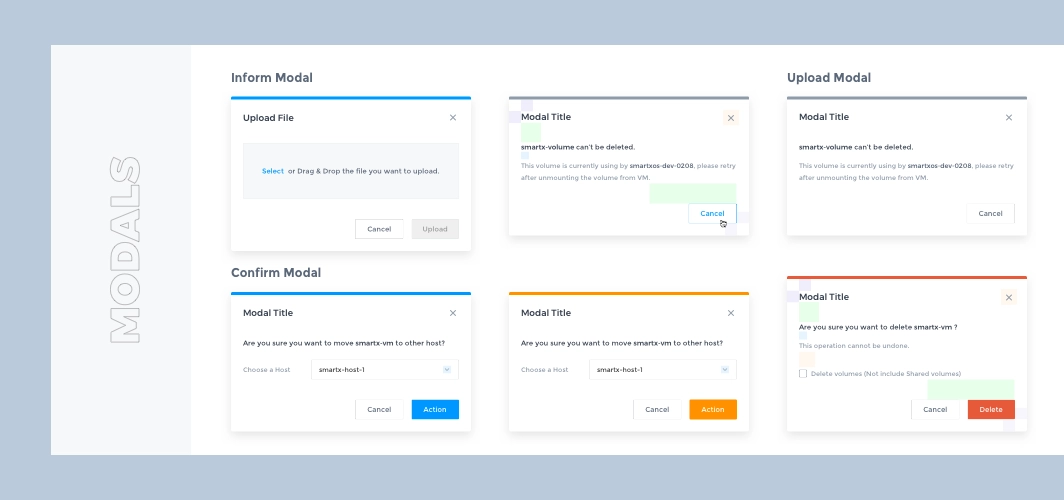
Organisms:modals
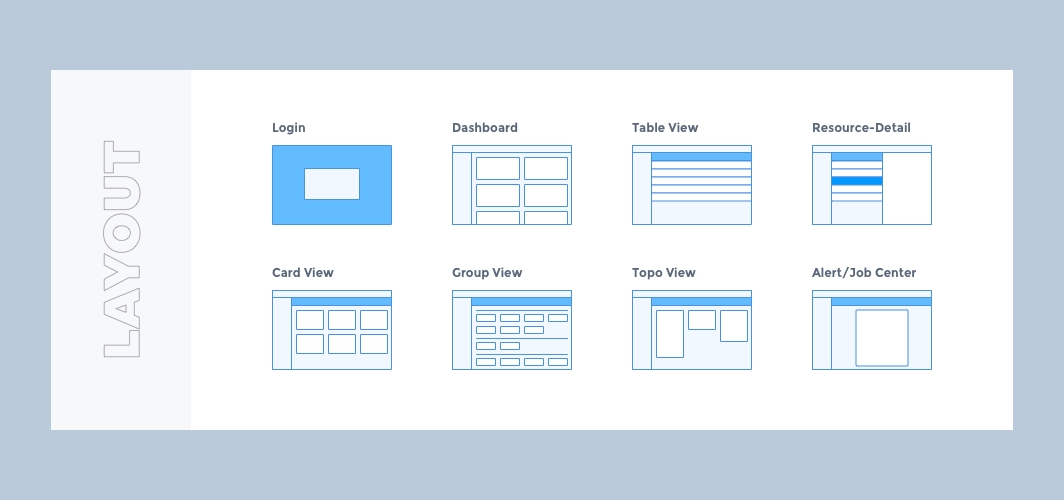
2.5 Templates
After completing the basic control styles, we started exploring the information architecture and experimenting with flexible and scalable interaction forms for Fisheye. The following are some of the ones used in the product.
Multi-View of list
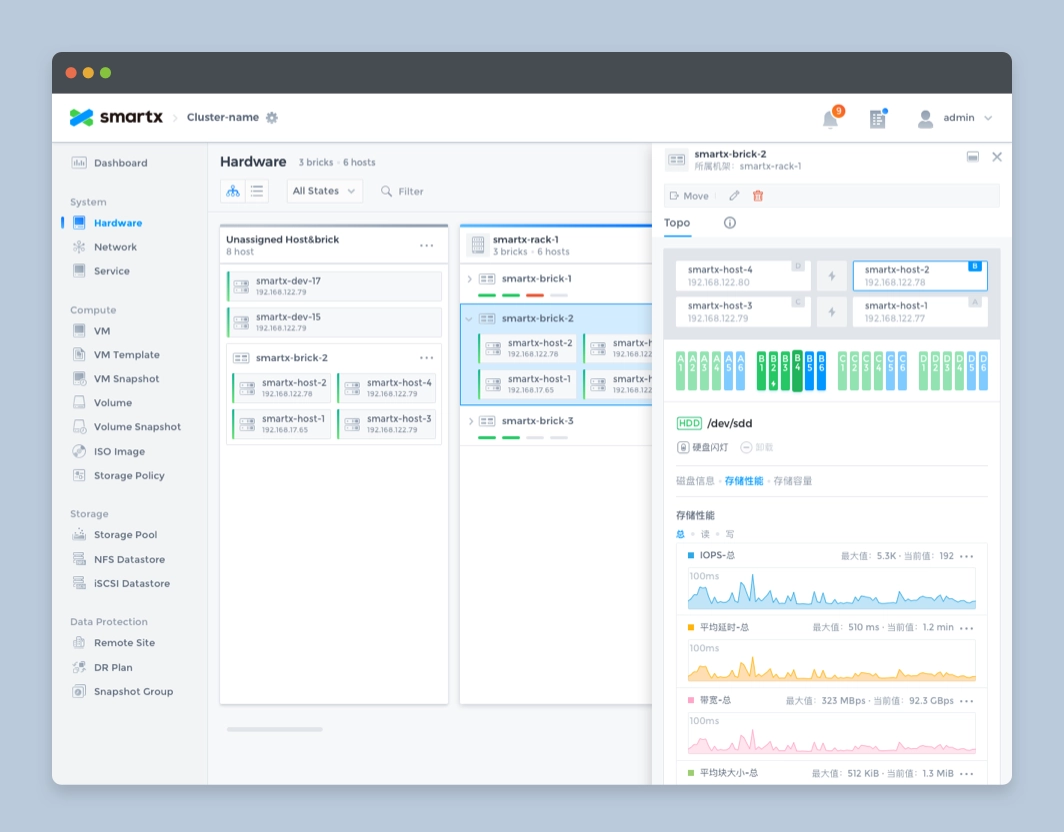
List is the most common element in the system, very suitable for displaying a large amount of data, convenient for administrators to compare, filter and batch operations, but for some functions with dependencies, the list does not visually reflect the relationship between the data, such as how the hosts are organized in the rack, how many virtual machines are running under one host? For this reason we design a more intuitive view for the administrator based on the list view for some functions.
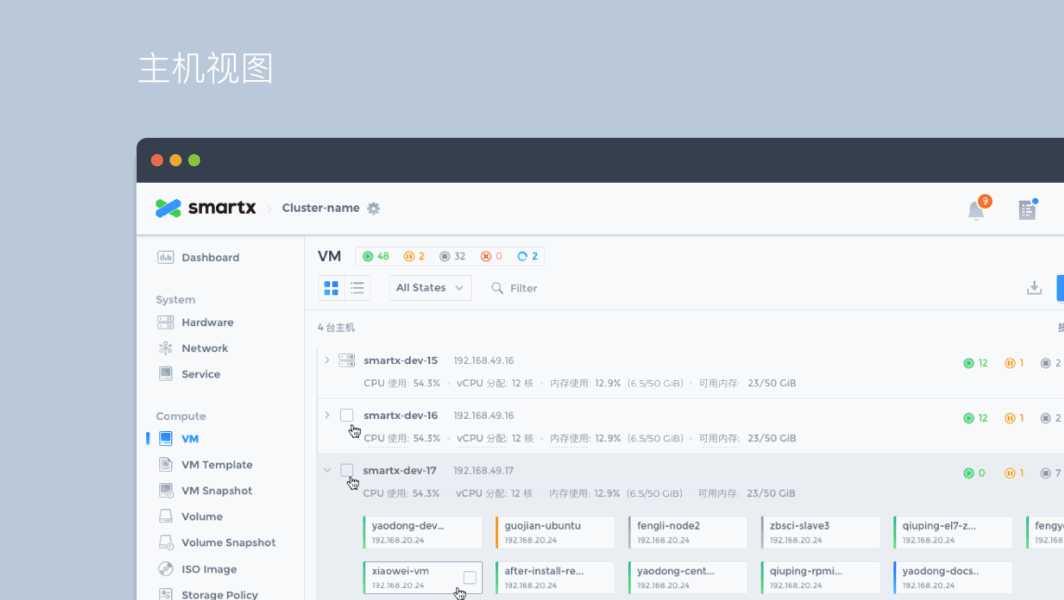
View options: list view, rack view, host view.
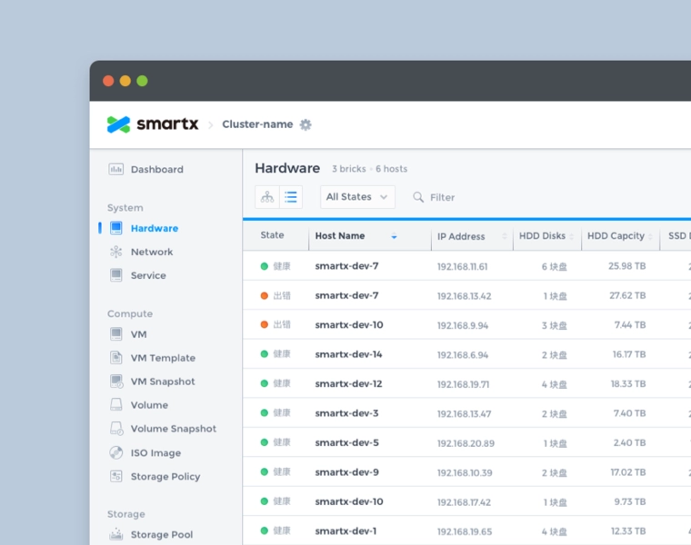
List view: the most common presentation form for displaying large amounts of data or resource information.
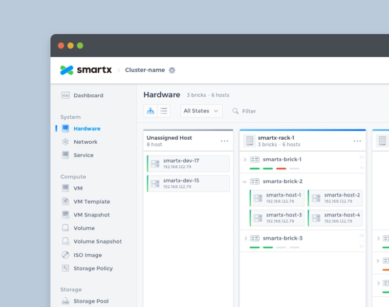
Rack View: Organizes users' resources by rack, making it easy for users to locate machines, keep track of resources and solve problems.
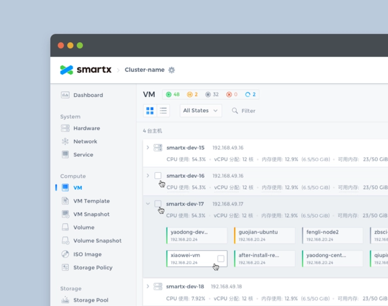
Host View: Shows resources by host, such as host occupancy and virtual machines running on the host.
Adaptive List & Sidebar
There are many data monitored in the system, so the design needs to judge the importance of the data before deciding which level to display in the system: the home page displays the most important index data; the single function list displays the core index data related to the function; for more detailed secondary information, we present it in the sidebar uniformly. The sidebar is used to display all the auxiliary information, and you can switch the Tab to see the detailed data of different dimensions; in addition, users have various screen resolutions, we have made adaptive design for the list, when the width is not enough to display all the list items, or when the sidebar is expanded, the list will support horizontal scrolling, and fix a column of the list title, which is easy for users to understand.
Adaptive list and sidebar.
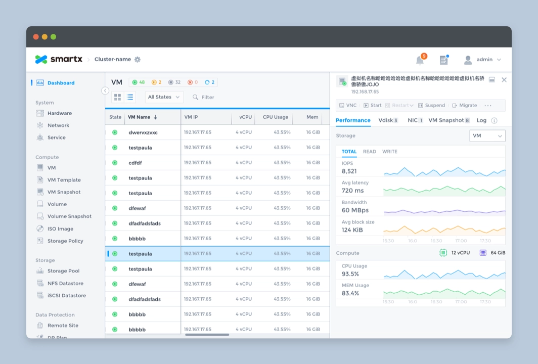
Sidebar of VMs.
Sidebar of nodes.
2.6 Pages
After completing the design of all the components, the next step is to assemble all the pages used in the system.
Homepage
As the first page where the administrator and the system come into contact, we hope that the home page can help the administrator to understand the system operation status with minimum time and reduce the cost of maintenance, which also requires the home page to achieve.
- visually display the system status.
- display the most important indicator data.
- presenting data in a form chosen to be intuitive and easy to understand
- provide early warning when an error occurs in the indicator.
For this purpose, we used the following design for the homepage.
1. Add status module
Visually reflect the system status, divide the warning information into 3 levels and give a summary of error information, which can be viewed and handled by the administrator by clicking on it.
2. Use card design
Display the most important indicators of each module on the home page, and click on the card to go to the module details page to view further data.
3. Chart
Careful consideration of the "appropriate" display format for each indicator shows that different graphs are used to show storage space, transfer speed and utilization rate.
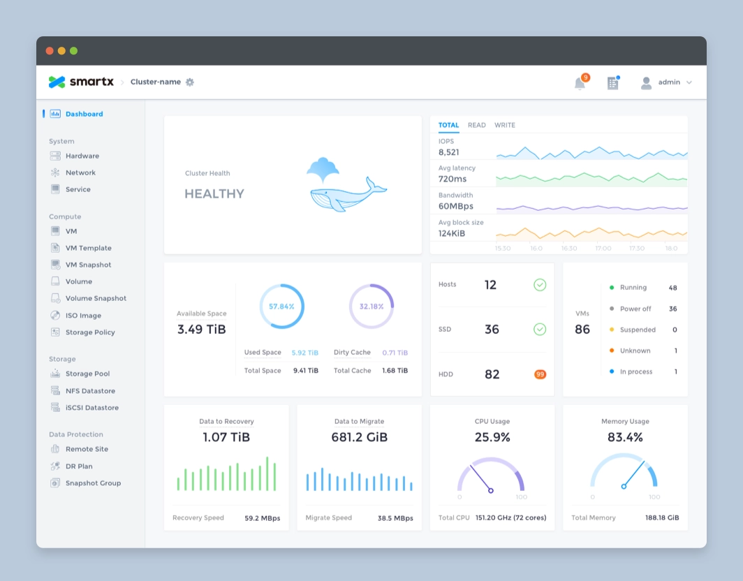
Homepage design.
Other Pages
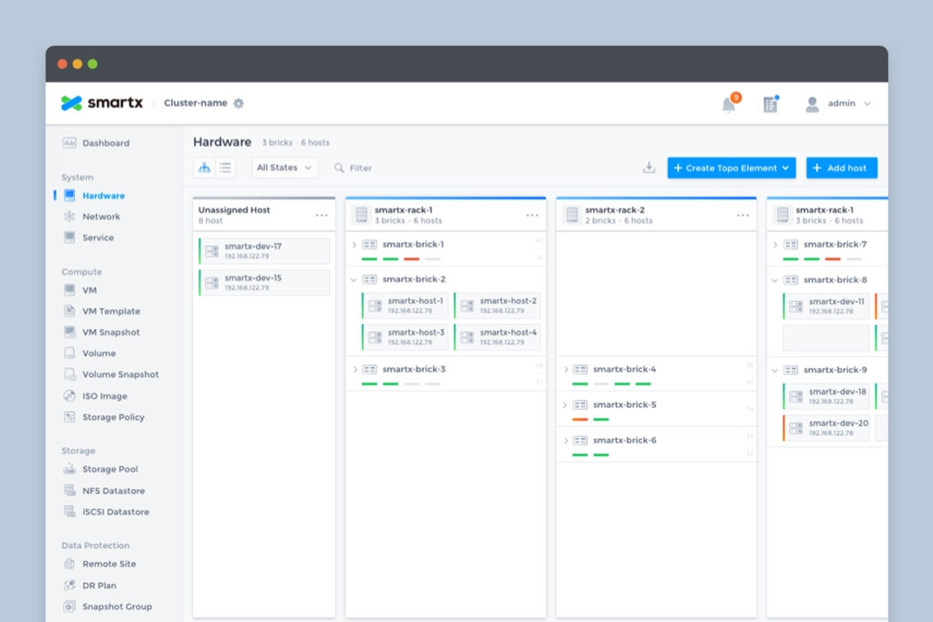
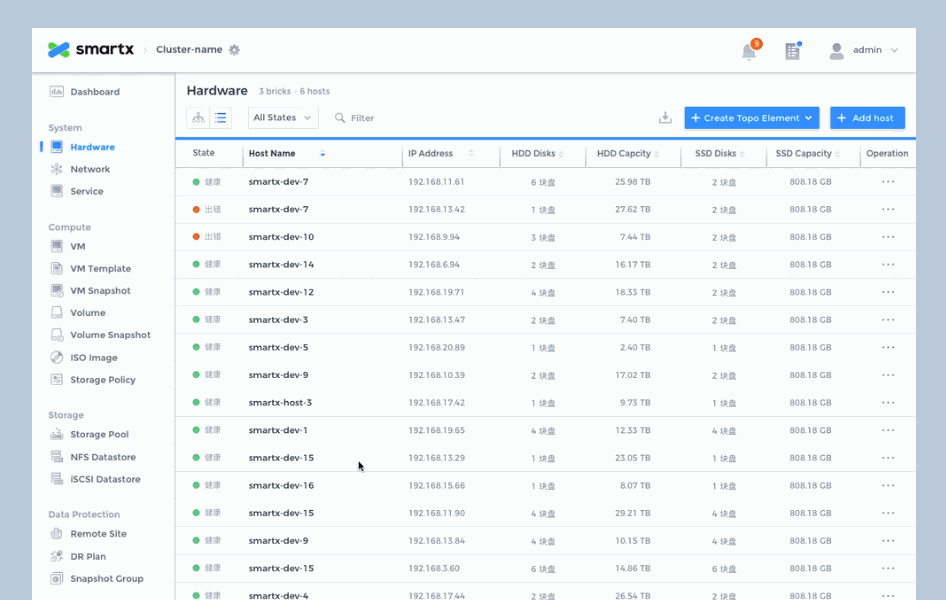
Hardware page.
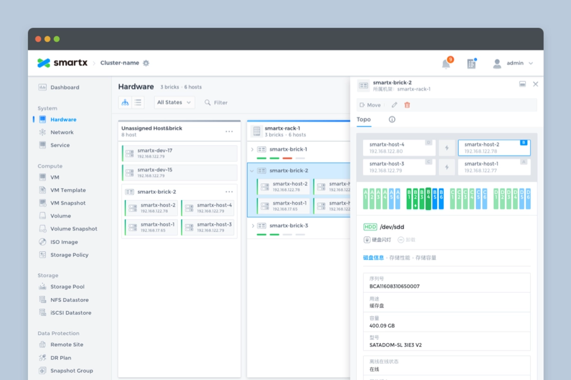
Hardware page with sidebar.
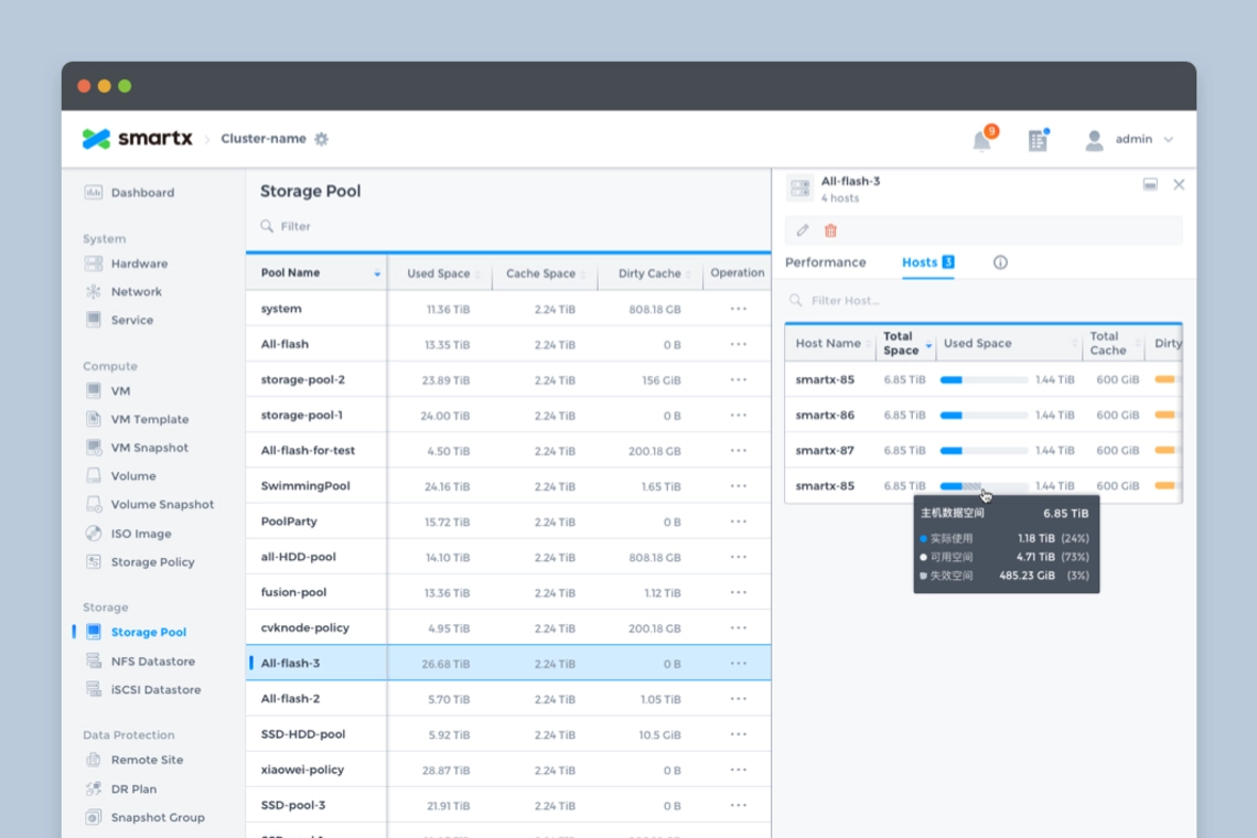
Storage pool page.
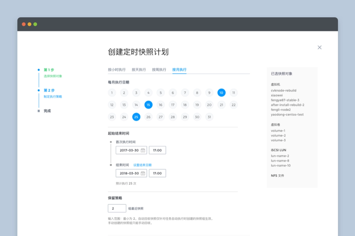
Creating a snapshot plan page.
Illustrations
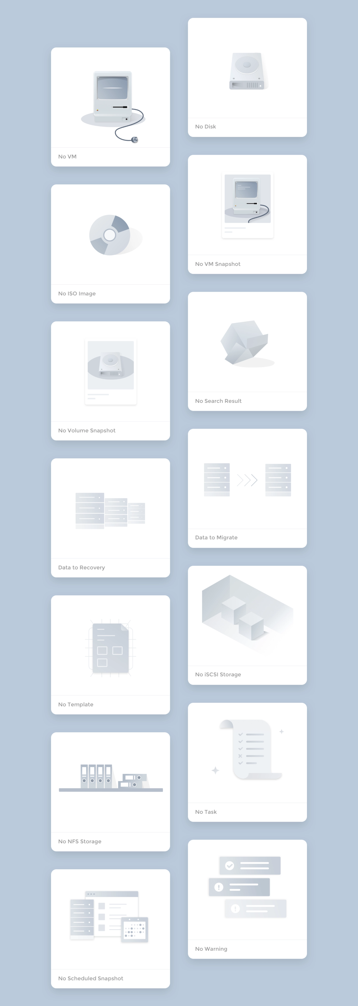
For new users, there is no data when they access the system, so leaving an empty page for customers is not friendly enough, so we added illustrations to the blank pages of each resource, which can reflect the function and enhance the fun.
Creating a snapshot plan page.
Thanks for watching!
Case study
SMTX OS Redesign (Fisheye)
Server hardware status monitoring and data visualization.
role
Product Designer
Platform
Web
My Contribution
UI / UX Design
Motion / Illustration
Data Visualization
Design System
Introduction
SmartX is a leading provider of hyper-converged products and enterprise cloud solutions in China, SmartX redefines the data center through software, bringing the architecture of data centers similar to Google and other Internet companies to enterprises, building faster, more scalable, and more flexible data centers for enterprises.
Fisheye Dashboard is the visual data platform for SmartX hyper-converged systems, providing IT administrators with the ability to monitor, alert, and manage hardware and resources. After 2 major releases, our design team completely redesigned Fisheye to create the first design system for our product.
The redesign process used the Design Sprint and Atomic Design methodologies to experiment and validate the design ideas in a short period of time, and to build the system from the smallest interface elements.
After the design was completed, a detailed UI Kit was compiled.

Why Redesign?
SmartX OS is an operating system designed for hyper-converged architectures, helping customers build agile and efficient modern data centers. Fisheye is the web-based console for SmartX OS, providing the most intuitive platform for system administrators to monitor system status and data metrics.
It has completed 2 major feature iterations in the past 2 years, adding several important features such as virtual machine management, snapshots, storage pools, etc., and is about to receive the 3.0 version update. In the previous version, the design was more focused on completing the features planned in each version, and the design was focused on how to design the feature well, lacking systematic design thinking. For example, the same component is designed multiple times in different versions, but the style and interaction are not exactly the same.
- Duplication of components affects development efficiencyThere are a lot of duplicate components in the design component library and front-end code, which reduces design and development efficiency and needs to be streamlined.
- Inconsistent experienceRedundant components are inconsistent in style and interaction, resulting in an inconsistent experience.
- Poor scalability of information architectureVersion 3.0 will add more complex functions such as rack awareness and networking, and the existing information architecture cannot meet the large amount of data and information and complex interaction functions.
Therefore, the design team decided to conduct a thorough reorganization and refactoring of the product design.
Design Objectives
- To establish a unified design specification to standardize the design and front-end components to provide users with a reliable, consistent and user-friendly experience.
- Reprogram the product information architecture, optimize the existing interaction design, and meet future expansion needs.
- Initially establish brand features and incorporate more brand elements in the design.
Design objectives.
Design Challenges
1. Data-heavy
There is a large amount of computing and storage-related data in Fisheye that needs to be monitored in real time and presented to system administrators in an intuitive form. How to distinguish the priority of different data and how to choose the appropriate form of data presentation is the focus of the design.
2. Diverse forms of interaction and complex information architecture
The functional design of the product contains a variety of data presentation forms, in addition to the most common list, there are different forms of charts, as well as network pages that reflect the actual topology, and rack-aware pages that simulate actual data center rooms. The information architecture needs to be compatible with various forms of interaction.
3. Alerts, Notifications
Enterprise customers have higher requirements for product reliability. If a problem occurs it must be monitored by the system in time and can be notified to the user in the most intuitive form to avoid greater losses. This also requires us to understand all notifications that are valuable to users, distinguish the priority of notifications, and find the most appropriate way to notify them.
4. Leave room for future functions
In the future, the product will be richer and more complex functions will be added, so the interaction design and information architecture should be flexible enough to leave room for future expansion of functions.
Design Method
Design method.
1. Design Sprint
After deciding to redesign the product, we used the Design Sprint to quickly explore design options, validate design ideas, and find the most appropriate solution over the course of a week.
- On Monday, list all the problems that the product wants to solve for the customer, prioritizing the problems.
- Tuesday, start designing and trying different design ideas to solve the proposed problems.
- Wednesday, evaluate all the completed design solutions, find the most appropriate solution, and prepare for prototyping.
- Thursday, create an interactable prototype.
- Friday, test the prototype, evaluate the solution, collect feedback from team members, and determine the design direction.
We spent a week to re-understand the problems encountered by users, explore multiple design solutions, and gather the wisdom of the team to finalize the design direction by understanding the problem, designing, testing, and verifying.
Exploring multiple design solutions.
2. Atomic Design
Entering the design phase, we adopted the Atomic Design method, starting with the smallest design elements and then combining them into components to eventually expand the design in its entirety.
Atomic Design method.
2.1 Design Token
The most basic visual elements, including colors, fonts, page layout, shadows, and transition animation effects are set throughout the redesign. In order to be able to establish the brand identity in the product, the brand color is integrated into the design of the system. The color is pure and can be used as a highlighting color for selected effects, text links, etc. In use, the system will monitor the status of many hardware and services, including servers, hard disks, virtual machines, etc., and respond to the status in real time in the Fisheye interface, so in addition to the brand color, also pre-set the color to reflect different states, the most common states include: running, suspended, error, and shutdown.
Design token: color
Design token: typography
Design token: layout
2.2 Atoms
With the basic visual elements in place, start designing the smallest design components such as icons, buttons, input boxes, radio boxes, cards, etc.
Atoms: button
Atoms: icon
Atoms: checkbox, radio, switch, scroll bar.
2.3 Molecules
Simple combinations of minimal design components as needed can form an action set used in a page, such as breadcrumb navigation, Tabs, dropdown menus, notifications, Loading, page flip buttons, etc.
Molecules: breadcrumb
Molecules: dropdown
Molecules: tab
2.4 Organisms
Complex page controls can be created by combining multiple simple components, such as pop-ups, notification menus, list action bars with search, filter, and switch view functions.
Organisms: view options
Organisms:modals
2.5 Templates
After completing the basic control styles, we started exploring the information architecture and experimenting with flexible and scalable interaction forms for Fisheye. The following are some of the ones used in the product.
Multi-View of list
List is the most common element in the system, very suitable for displaying a large amount of data, convenient for administrators to compare, filter and batch operations, but for some functions with dependencies, the list does not visually reflect the relationship between the data, such as how the hosts are organized in the rack, how many virtual machines are running under one host? For this reason we design a more intuitive view for the administrator based on the list view for some functions.
View options: list view, rack view, host view.
List view: the most common presentation form for displaying large amounts of data or resource information.
Rack View: Organizes users' resources by rack, making it easy for users to locate machines, keep track of resources and solve problems.
Host View: Shows resources by host, such as host occupancy and virtual machines running on the host.
Adaptive List & Sidebar
There are many data monitored in the system, so the design needs to judge the importance of the data before deciding which level to display in the system: the home page displays the most important index data; the single function list displays the core index data related to the function; for more detailed secondary information, we present it in the sidebar uniformly. The sidebar is used to display all the auxiliary information, and you can switch the Tab to see the detailed data of different dimensions; in addition, users have various screen resolutions, we have made adaptive design for the list, when the width is not enough to display all the list items, or when the sidebar is expanded, the list will support horizontal scrolling, and fix a column of the list title, which is easy for users to understand.
Adaptive list and sidebar.
Sidebar of VMs.
Sidebar of nodes.
2.6 Pages
After completing the design of all the components, the next step is to assemble all the pages used in the system.
Homepage
As the first page where the administrator and the system come into contact, we hope that the home page can help the administrator to understand the system operation status with minimum time and reduce the cost of maintenance, which also requires the home page to achieve.
- visually display the system status.
- display the most important indicator data.
- presenting data in a form chosen to be intuitive and easy to understand
- provide early warning when an error occurs in the indicator.
For this purpose, we used the following design for the homepage.
1. Add status module
Visually reflect the system status, divide the warning information into 3 levels and give a summary of error information, which can be viewed and handled by the administrator by clicking on it.
2. Use card design
Display the most important indicators of each module on the home page, and click on the card to go to the module details page to view further data.
3. Chart
Careful consideration of the "appropriate" display format for each indicator shows that different graphs are used to show storage space, transfer speed and utilization rate.
Homepage design.
Other Pages
Hardware page.
Hardware page with sidebar.
Storage pool page.
Creating a snapshot plan page.
Illustrations
For new users, there is no data when they access the system, so leaving an empty page for customers is not friendly enough, so we added illustrations to the blank pages of each resource, which can reflect the function and enhance the fun.
Creating a snapshot plan page.
Thanks for watching!
Navigation
