

Case study
Maptable
A no-code tool that allows users to collect, organize, visualize and analyze spatial data. Users can collaborate in real-time.
role
Lead Product Designer
Platform
Web, Responsive
My Contribution
UI / UX Design
Design Research
Product Management
Background
“Spatial data science treats location, distance, and spatial interaction as core aspects of the data and employs specialized methods and software to store, retrieve, explore, analyze, visualize and learn from such data.” Luc Anselin Ph.D., Center for Spatial Data Science Senior Fellow, University of Chicago
QuantUrban has been focusing on developing spatial data products in the past few years, and has had several attempts in this field. I have also participated in the development of products from Mapmiao, Xiao Qu Luo Pan, City Map, to the Guangdong-Hong Kong-Macao Greater Bay Area Report. These products cover various processes of spatial data from collection, collaboration, visualization to data analysis.
However, these products also have problems to different degrees. They are not "standardization", for example, we didn’t find a good solution for different customers’ need to customize fields on demand, compatible with old data and other needs. In the previously developed Mapmiao product, we made a complex form system to meet the customization needs of customers.
Screenshot of Mapmiao: custom field
Screenshot of Mapmiao: custom field

The Problems
We have been communicating with our customers during developing products, collecting their feedback, and combining our own experience to conclude the problems we faced at that time.
- Several previous products provided solutions for a single scenario, for example, Mapmiao focused on spatial data collection and visualization, and CityMap focused on data collaboration, visualization, and analysis. There is no single product that could completely cover the entire data processing process.
- In the past, data analysis relied more on consulting services, and data processing depended on external tools. And our analysis models could not be applied to the products.
- Our customers are distributed in different fields such as real estate, planning institutes, educational institutions, retail, etc. Customers' needs in different industries vary greatly and are difficult to standardize. Even different companies in the same industry have different needs on data. New customers always need to customize some fields. So we still need to customize the products for many customer projects, which accounts for a large proportion.
- Our customers are primarily in traditional industries, they have accumulated a lot of data in their previous work. A large amount of data is accumulated in the local disks of team members, and members collaborate by transferring files, which is inefficient and easy to make mistakes.
- Due to a large amount of historical data of customers, in previous customer projects, it would take a long time to help customers import old data, and this part of the workload often exceeded expectations.
In summary, there are the following problems:
- Variation in data needsThe data needs of different customers vary greatly and cannot be standardized, requiring the provision of custom fields.
- High migration cost of old dataHigh migration costs due to the large amount of customer history data scattered in different local tools.
- Lack of effective collaborationUnable to collaborate with multiple people, using Excel and Aowei Map to transfer files, that’s inefficient and more prone to errors.
- Low level of productizationPart of the work still relies on manual processing, such as adding custom fields, importing old data, and some data analysis work.
Research
In order to find a solution, we researched both NoCode tools and spatial data products in the market before and during development. We also kept an eye on these products in the market. Overall and specific functional research was done for the table tool and the map product respectively.
Design research on NoCode tools.
Design research on spatial data products.
Goal & The Direction
The next step was to find a form for the requirements. We found that the popular Nocode tools, such as Notion and Airtable, had a flexible database that could be customized at will, and did a good job of compatibility with existing data, allowing free import and export of local data. The flexible database form of table can solve our problem exactly, so we decided to combine the table with our past accumulation in spatial data products. We decided to introduce a new standardized tool product to better handle spatial data and meet the needs of our customers for the whole process:
Lean Canvas
Once I had the initial idea, I started working on customer and product research, compiling the feedback I had collected from customers. Then I organized a Lean Canvas discussion with the team. I created a new Lean Canvas template in Google Docs, and then organized a meeting for the team to discuss and fill it out.
The purpose of the discussion was to analyze our competitive advantage, clarify the product with the team on the other hand, and synchronize the product idea to the team members in concrete terms, so that everyone could reach a consensus on the product to be developed. We have a preliminary understanding of the product's competitive advantages, target customers, and key indicators.
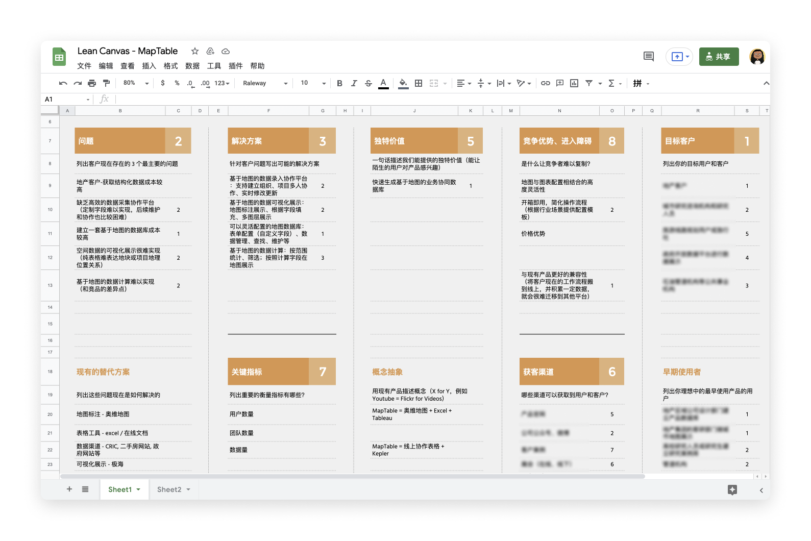
Lean Canvas
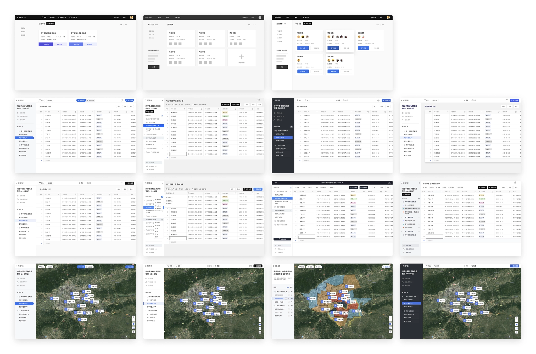
After defining the direction of the product, I started concept design, explore the design of core pages such as tables and maps, and designed several wireframes.
Design Exploration
After defining the direction of the product, I started concept design, explore the design of core pages such as tables and maps, and designed several wireframes.
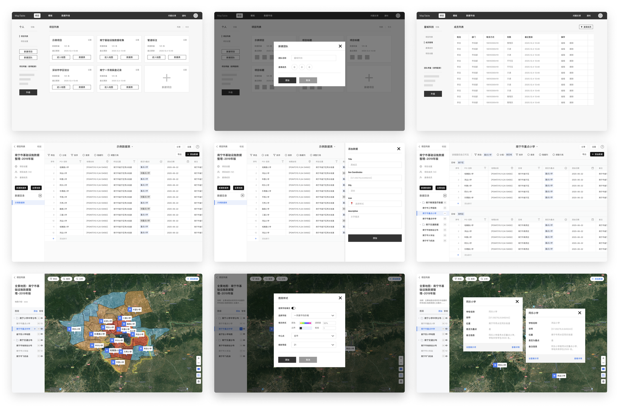
Wireframe design of Maptable.
Design Challenge
The first problems encountered during the prototyping phase are: How to define the functional boundaries of tables and maps?
Both tables and maps are important features in our product planning, but the boundary between tables and maps in the spatial data product is still need to be further defined.
- Tables: take on data collection, team collaboration and a small amount of data analysis functions.
- Maps: take on data collection, map visualization and data analysis functions.
The next question that needs to be addressed is: How do we assemble the product with tables and maps?
The tables and maps can meet the needs of customers in different scenarios, but their forms are so different that if they cannot be assemble in a suitable way, they are just two independent modules in one product, and their value to users is greatly reduced.
Coordinate fieldWe observed the map products developed in the past and found that "coordinates" is the essential part for spatial data products, so we decided to add "coordinates" as a field type to the table. Users can enter coordinates and the map will be rendered on the map based on the coordinates of the table.
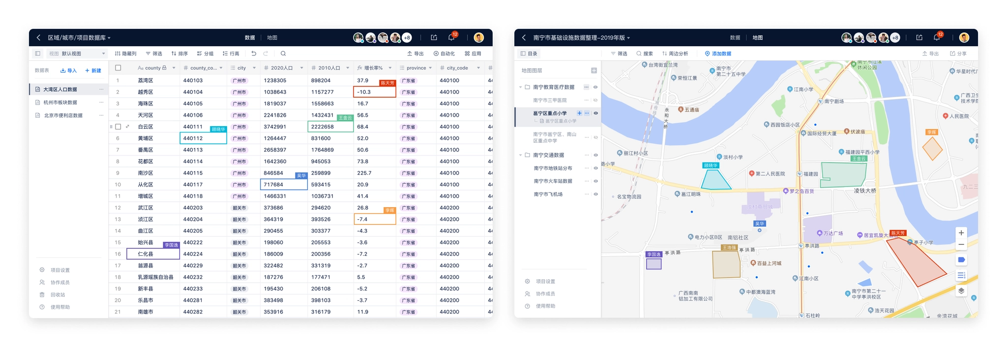
Organizing tables and mapsAccording to the feedback we received from our customers in previous products, they usually manage tasks and arrange people in "projects". Therefore, we also introduced the concept of "project" into the product. In addition, considering that collaboration is usually done between a company or department, we added the concept of "team" on top of the project, so that the overall information organization is basically sorted out clearly.
- Data table: the smallest unit that makes up the project data, a data table contains a number of rows and columns of cells.
- Map layer: the smallest unit that makes up the map module, a map layer can choose a data table as the data source and set the style.
- Project: a project contains two modules "Data" and "Map", the data can contain several data tables, and the map contains several map layers.
- Team: an organization with multiple team members, multiple projects can be created under the team and the team members can be managed.
- Personal Desktop: place to storage personal projects, which can be understood as a special type of teams.
Design concept of Maptable.
While exploring the design, I made a list of functional modules of the product, prioritize features with co-founders, define features need to be done in MVP, alpha, and public beta versions.
Features of different versions of Maptable.
MVP version
The goal of the MVP version is to build out the basic framework of the product and complete the development of the basic core functionality. For Maptable, the core features are:
- Account: account system, login methods, etc.
- Project organizing modules: data tables, folders, projects, teams, and other organizational methods.
- Data details: displaying the complete data content.
- Data tables: containing basic field types.
- Maps: containing simple map displays.
Design Challenge
From the design exploration, we chose a solution as the framework for the MVP version, on the basis of which the key pages were gradually improved.
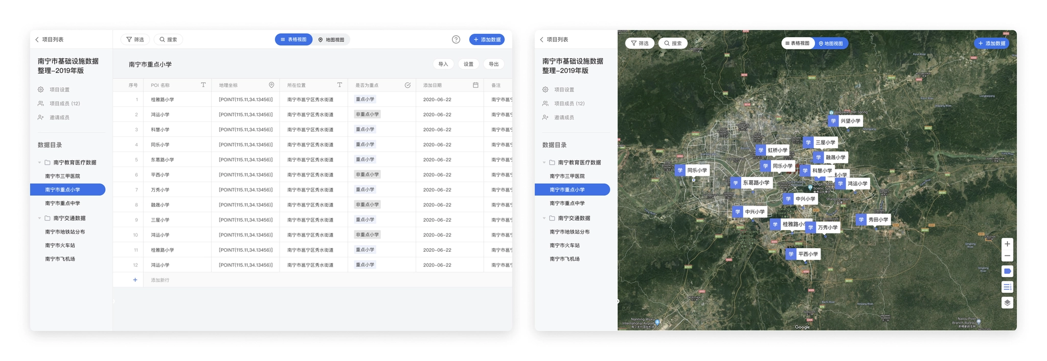
- Page structureThe chosen solution is to have the data table and the map as two separate pages in the project, with "Map" and "View Data Table" buttons on the page as the access portal.
Table view in MVP version.
Map view in MVP version.
- Determine the data fieldsThrough the preliminary research on table tools, the functions and field types of the data table part have been understood clearly, but as the MVP version, the introduction of too many fields will add additional development costs, and in addition, considering the combination of map scenarios, it was finally decided to add the following fields in the MVP version.
Fields supported in MVP version:
- Text / Long Text
- Coordinate
- Number
- Single / Multiple Choice
- Date
- Album
- Attachment
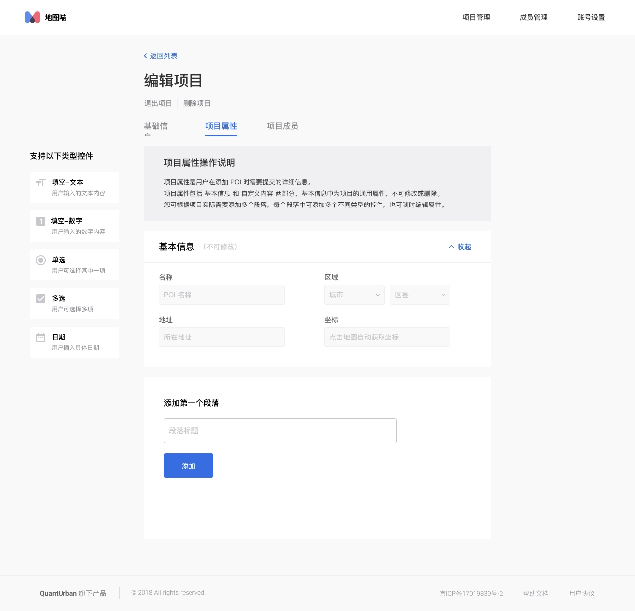
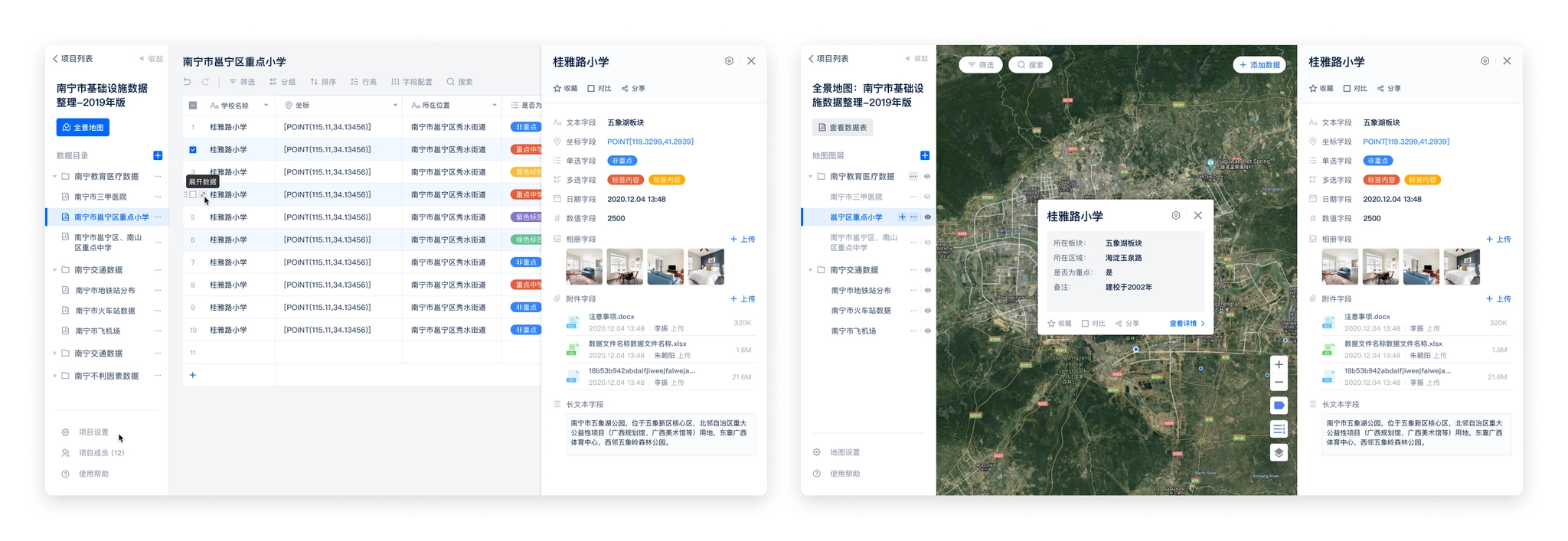
- Define the base componentsIn addition to the table page and map page, we also need to consider adding information display forms to meet the display of information of different levels of importance. We chose to add "Side Panel" and "Info Window" to the product.
- Side PanelPOI data is displayed as a row in the data table and a point, line or polygon in the map. POI data itself stores a large number of data fields, but by default it cannot display more information in the data table and map. Therefore, we added a detail side panel to display the complete information contained in the POI, and set the side panel as a shared component between the table and the map to increase the consistency of the two pages and also reduce unnecessary development costs.
Side panel in table and map page
- Info WindowThe map page shows the spatial position of POIs, there is no more information except for the point or polygon and the name label of the POI. And the complete information is shown in the side panel. Therefore, Info window is added to the map. The map page supports opening up to 6 Info windows at the same time, and supports configuring the fields displayed in the Info window.
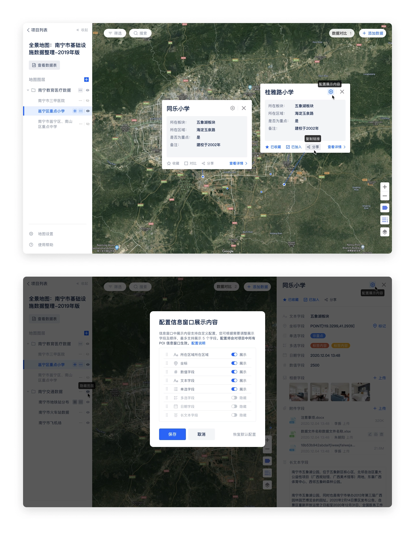
The info window on the map page supports multiple simultaneous openings and configurable display content.
The MVP version defines the information architecture and interaction of the product. We also complete the basic functions of data tables and maps. In the MVP version, you can add, delete, and check the data in the tables and maps.
Alpha version
After the MVP version was completed, the team started a week of product experience and testing. In addition to overall testing of the completed features, we also each experimented with scenarios that customers might use, then we put together the feedback from team members and combined it with the previous project planning to determine the tasks need to be completed in the alpha version.
- UI / UX improvements: navigation bar
- Customized member list
- Notifications
- Real-time collaboration
- Permissions
- Registration, login page optimization
UI / UX improvements
Navigation bar
During the product testing process, one of the main issues that team members fed back was that it was difficult to understand the information structure of the product, especially the relationship between tables and maps. The default page was the table page after opening a project, which looked similar to other smart table products, the design lacked uniqueness. In addition, the entrance between table and map was difficult to find, which affected users' motivation to explore the product further. Therefore, we decided to optimize the navigation bar.
- Putting the table and map page entrances in the center of the navigation, so that users can easily understand the parallel relationship between table and map. They are two "views" of the project and in the same hierarchy.
- Copy adjustment: change "View Data Table" to "Data" and "Panorama Map" to "Map", which simplifies the name and reduces the difficulty of understanding.
Before:design in MVP version
After:design in Alpha version
Team / personal desktop entrance adjustment
In the MVP version, the entrance of personal desktop and team is placed in the left menu of the project list page, which is not obvious and cannot be seen when switching to other pages. Therefore, the following adjustments were made to the team / personal desktop entrance in the alpha version.
- Put the personal desktop and team entrance in the navigation bar, hide the logo (less important), and create an immersive experience.
- Enlarge the team logo, so that users can know which team they are currently on more quickly.
- Reducing the team name font size to show more information by default and make it easier for users to identify the current team.
- Enlarge the clickable area to keep the same width as the left menu, and add hover effect to improve the efficiency of switching teams.
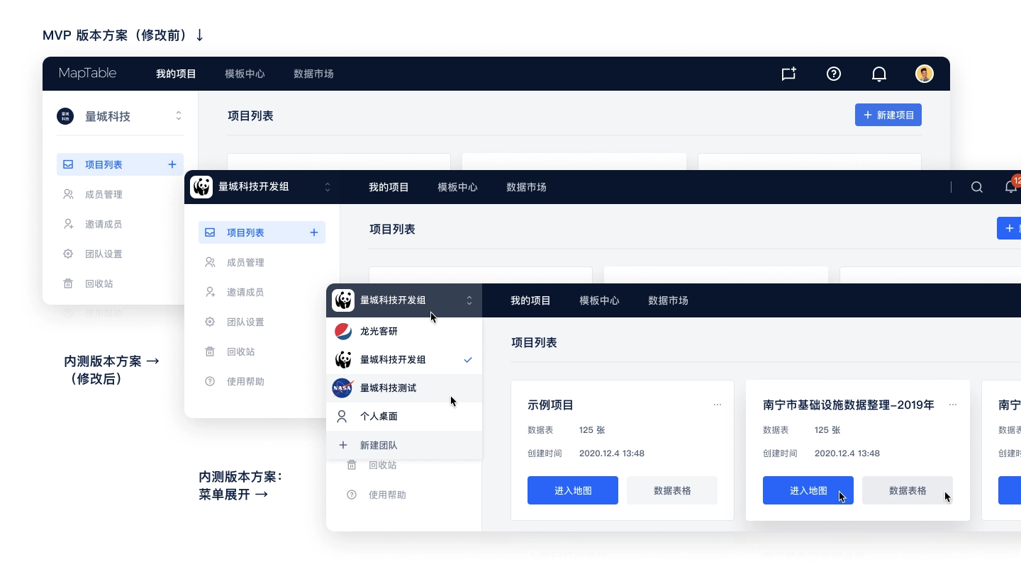
Redesign the team / personal desktop entrance in Alpha version.
Notification
Notifications are always a complex feature in a product, especially when organizing the notification types, writing of the notification copy and testing of each notification type after launching.
The following process was used for organizing notifications:
- Listing all user behavior and actions in the system.
- Prioritizing the actions.
- Selecting the right notification types (system notifications, SMS, etc.) for the actions with different priorities.
- Write a description copy for each action that will trigger a notification.
I created a notification table on Maptable, so that we can collaborate with the dev team, and we can also have a chance to in-depth experience with the product's features and interactions (eat dog food).
The notification form contains the following fields.
- Notification Type
- Function Module
- Triggered by
- Receiver
- Notification text
- Notification type: System notification, SMS
- Description: Users can click on the notification jumps to different pages
- Test results: Additional test results after the notification launched
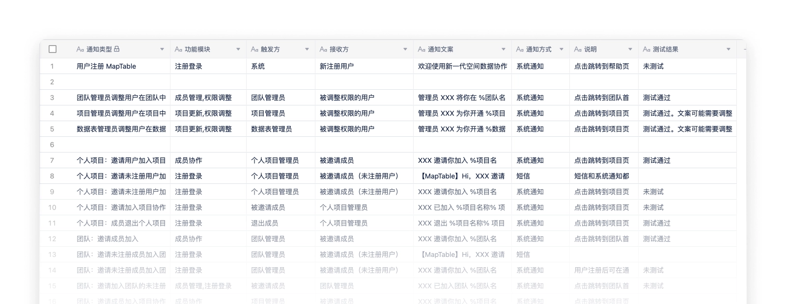
The notification table organized in Maptable.
After sorting out the notification types, the design of notifications becomes simple, we use a notification window and a notification page to display notification.
- The notification window is expanded by clicking the notification icon in the navigation bar, and is used to quickly view the most recent notifications. The window shows the 5 most recent notifications, you can view and mark them as read directly in the floating window, and click on them to jump to the corresponding page. The "View all notifications" button is provided at the bottom of the floating window, and you can click it to enter the notification page to view all notifications.
- The notification page shows all notifications, and distinguishes read and unread status, and supports two sorting methods: "Latest notifications first" and "Unread notifications first".
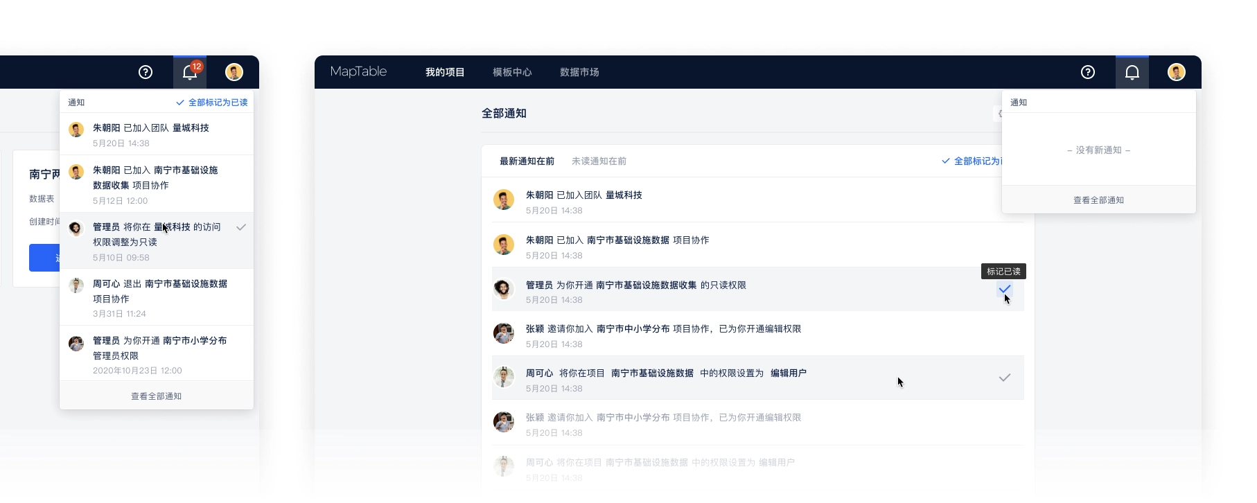
The design of notification center.
Real-time collaboration
The positioning of the product is "spatial data collaboration tool", and real-time collaboration is one of the core features. Our real-time collaboration is more complex than other table products because the collaboration status needs to be reflected in the map view as well. The status of real-time collaboration display has the following parts.
- Navigation bar: Showing team members who are accessing the project at the same time.The project navigation bar shows all members currently accessing the project and assigns a color to each member in order of precedence, which corresponds to the element in the table or map that the user is working on.To ensure that the Collaborators area does not take up too much space in the navigation, it is limited to displaying a maximum of 5 collaborators' avatars, with more than 5 collaborators tucked away in the list.
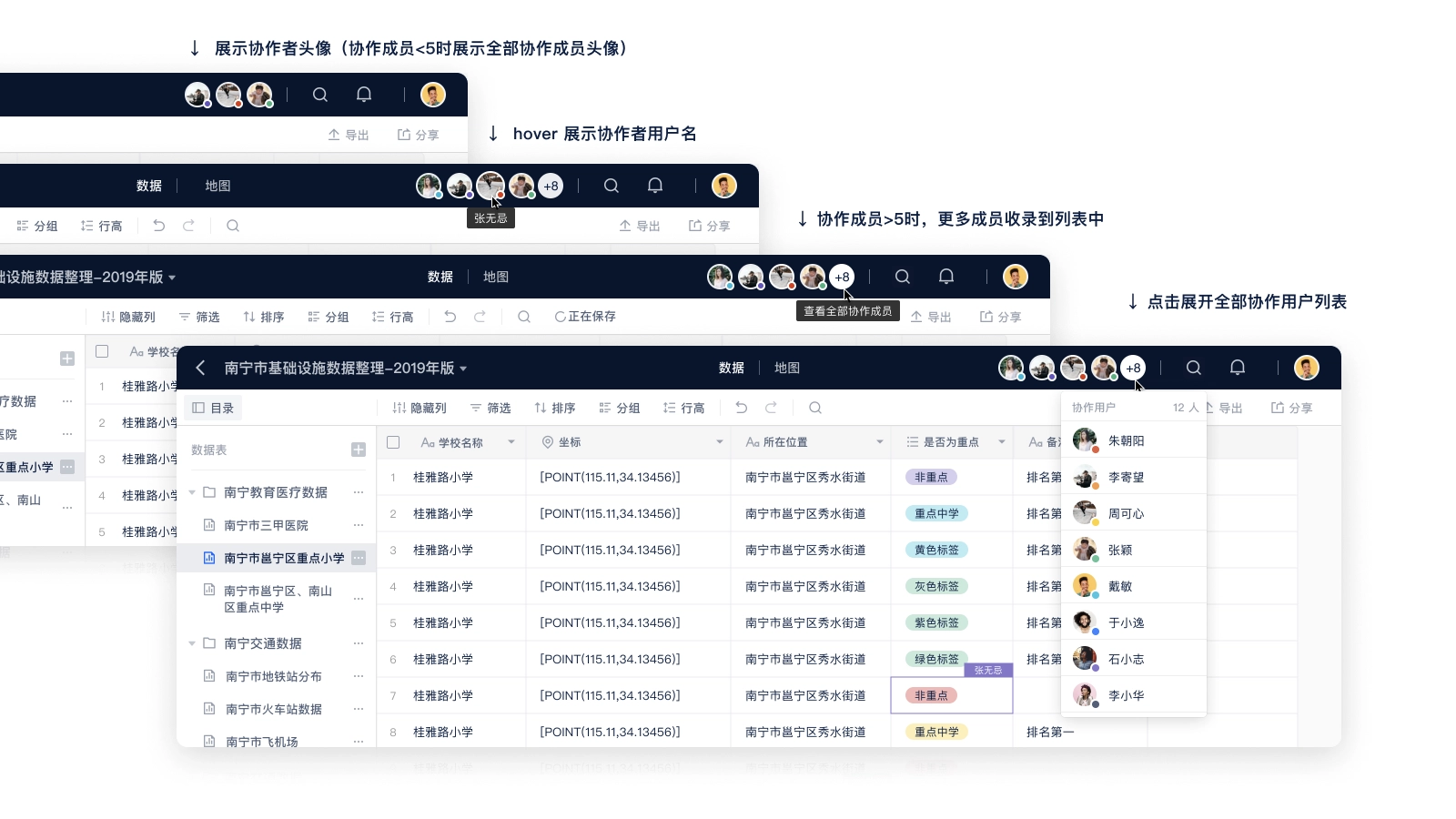
Real-time collaboration users.
- Table:show the cell being edited by other usersCollaboration status display in the data table plays a role in showing the status and preventing conflicts, other table products have mature solutions, we also use a similar way to deal with.
- highlighting the borders of cells selected by collaborating members and displaying the username of the member in the upper right corner of the cell.
- the cell highlighting color is the same as the color of the lower right corner of the collaborating member's avatar in the navigation bar.
- multiple collaborating members can select the same cell at the same time, the cell color is based on the color of the last selected member, and the avatars of multiple members are displayed in the upper right corner of the cell.
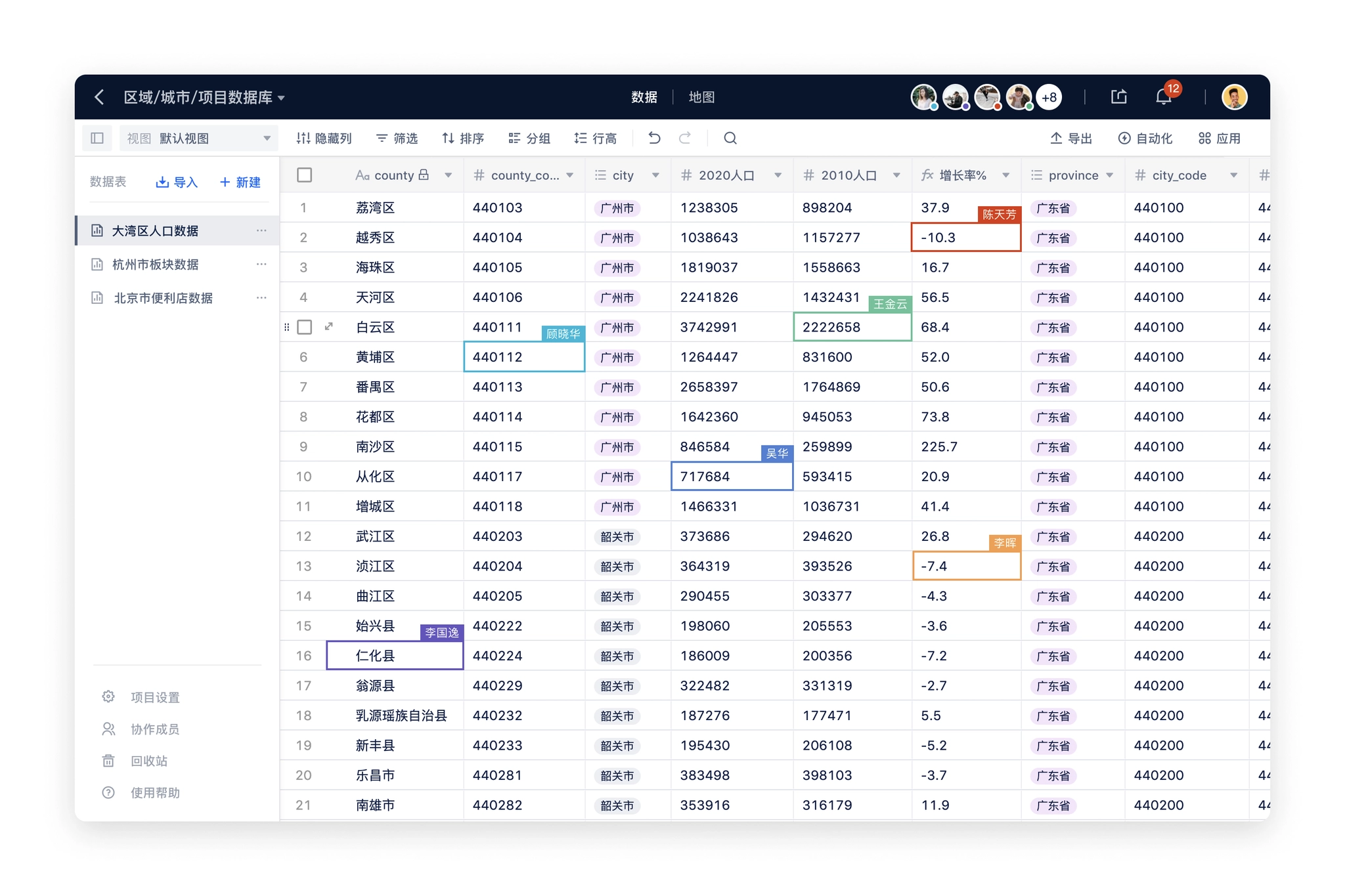
Real-time collaboration users on table page.
- Map:Showing POIs being edited by other usersThe map part was initially considered similar to Figma's solution of displaying multiple users' mouse during collaboration, but after evaluation, our product does not require that much real-time collaboration, and rendering users' mouse in real-time will increase the amount of data transferred, which will cause interference to other users.Finally, we decided to use the same processing scheme as the table: highlighting the POI that the user is working on to prevent operation conflicts.
Real-time collaboration users on table page.
Permissions
Permissions are the most complex part of the entire product and need to deal with multiple levels of inheritance relationships. The organization type distinguishes between personal desktop / teams, projects that contain data / map settings, and each part needs to be reconsidered in terms of corresponding permissions.
- Information architecture in Maptable:
- Personal Desktop → Project → Data Table / Map
- Team → Project → Data Table / Map
- Permission types:
- Inaccessible
- Read Only
- Edit
- Administrator
In addition to the complete inheritance of user permissions from the previous level, the project, data table / map also needs to take into account that users in the team will further clarify the role. For example, several members of the team is responsible for a project, other members do not need to participate; or each member of a project is responsible for maintaining a data table, the members also need to do permission isolation. We, therefore, added two options for permissions on projects, data tables / maps (Level 2, Level 3).
- Inherit higher-level permissions
- Specify members to be visible
In order to simplify the requirements, specifying members visible is only supported for internal members of the higher level, not for inviting external members of the team. For example, only a few members from the team in the project can be set as "specified members visible"; only a few members from the project in the data table can be set as "specified members visible".
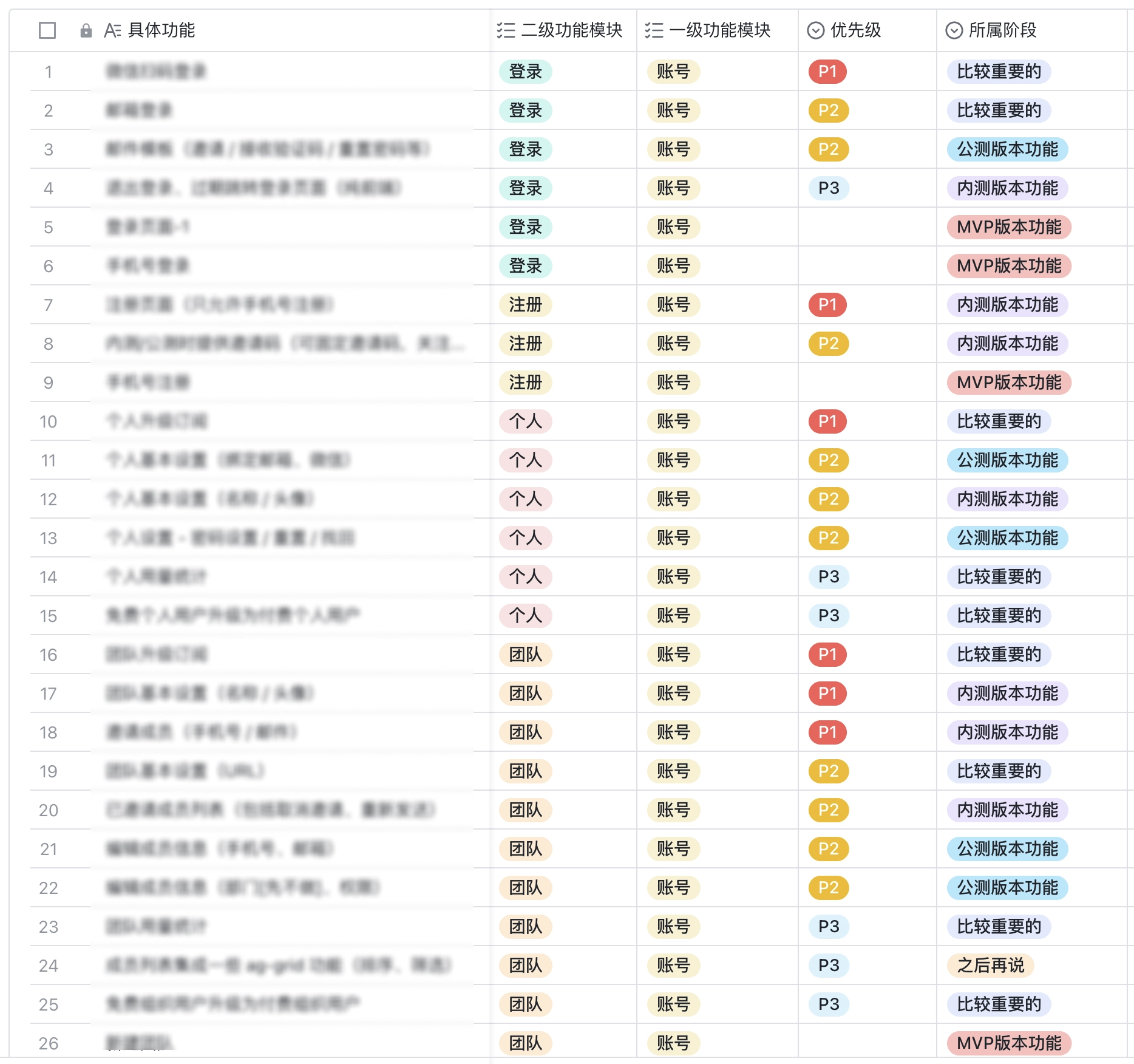
So the arrangement of permissions is a combination of the above three parts. In order to organize more clearly and collaborate with my development colleagues, I built a table in Google Sheets to organize all the actions of each page under different permissions according to the functional module.
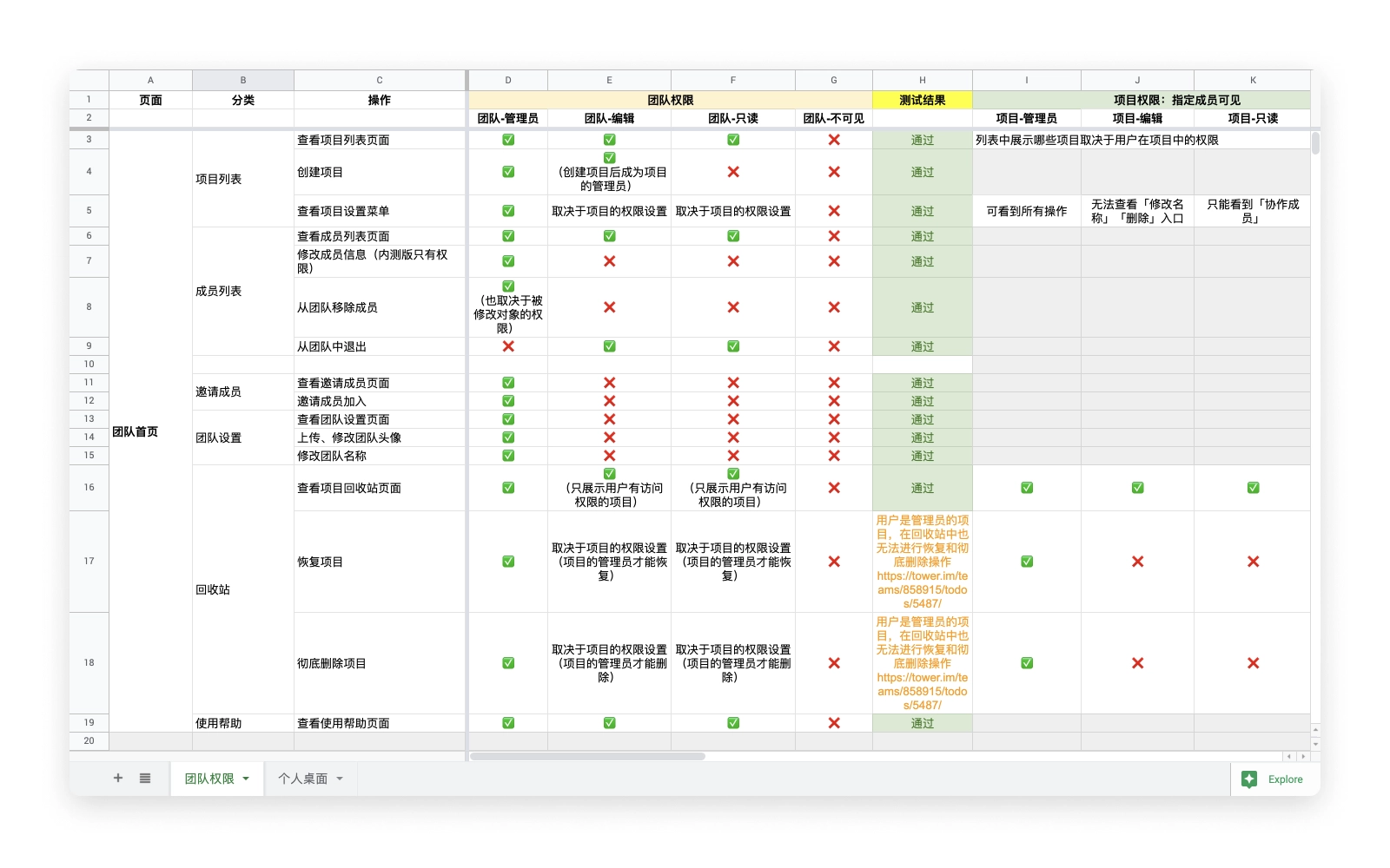
Maptable permission list on Google Sheets
Discussion about permission corner case.
After sorting out the actions under different permission types, I start the design of the permission section, there are two user types to be considered:
- Administrator: invite members, manage members, modify members' permissions, remove members, etc.
- Normal users (including read-only and edit users): view the list of collaboration members and quit the collaboration by themselves.
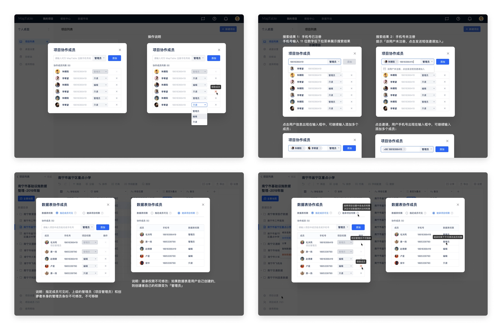
Permission setting windows.
Login page optimization
The MVP version is for testing inside the team, and the design time is rather tight, so the registration and login pages are designed simply, and only the process of cell phone number registration and login is implemented.
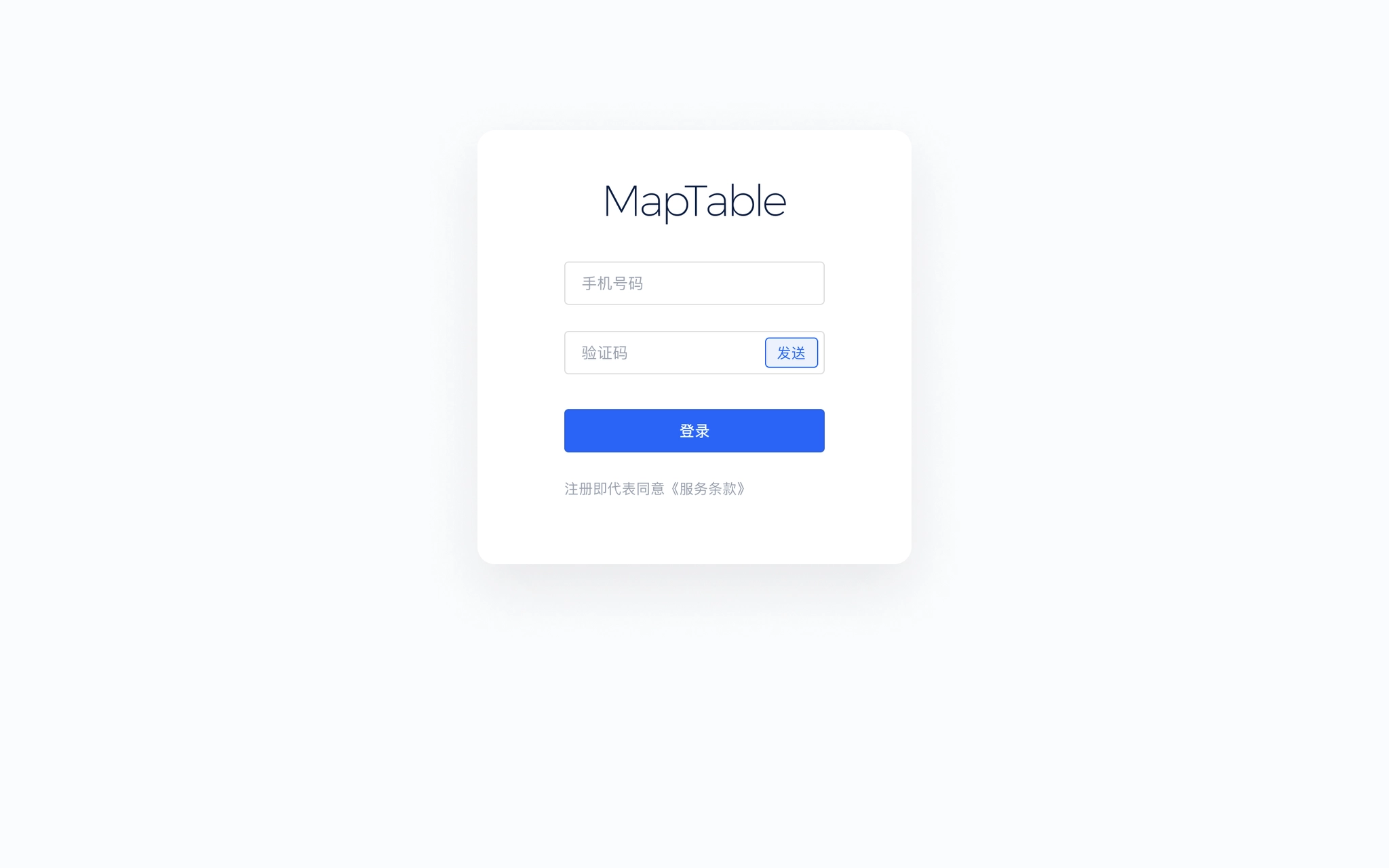
Login page in MVP version
We considered adding the invitation code in the alpha (internal test) version and the beta (public test) version, sending invitations to the target users, who could register to experience the product using the invitation code, and the login process also needed to be adjusted accordingly. In addition, considering the registration page is the first few pages that users will visit, adding the introduction of core functions on the registration page will help users understand the core functions and values of the product faster, and also make better use of the page space.
- Adding invitation code process
- Adding illustraions for introducing key features
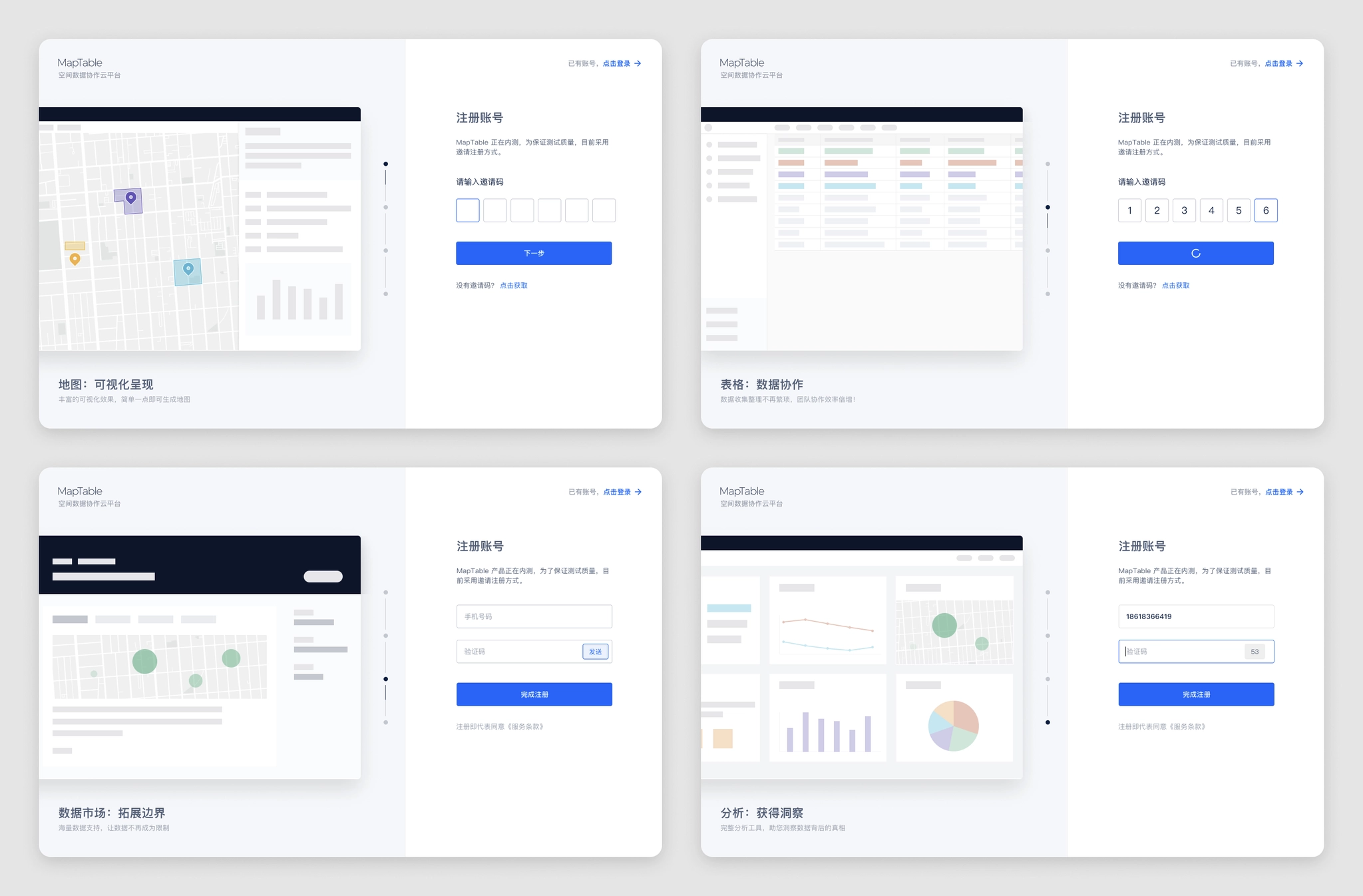
Login page modified in Alpha version
Map style configuration
After importing the data, visualization in map is also an important step in spatial data analysis. Maptable's layer style configuration is to translate the experience accumulated from previous products into concrete functions.
The initial idea of map layers was to correspond with data tables one by one, and a data table would have both table and map views by default. The team discussed that the advantage of this solution is that it is clear and intuitive, and the user can easily understand the relationship between the data table and the two views; however, the disadvantage is also obvious, only one data table layer can be seen at a time, which is not conducive to viewing the global POI data, and sometimes the analysis needs to be based on the global data to reach a conclusion. It is also not conducive to expansion, and it is difficult to add views later.
Prototype before MVP version: tables and maps as different views of a data table.
Therefore, we decided to adopt a more flexible layer scheme, borrowing from the concept of layers in the design tool, users can create any number of layers in the map page according to their needs, each map layer is only individually set to show/hide state, the map shows the effect of multiple layers stacked on top of each other, each layer supports individual layer style settings, users can complete the visualization and analysis needs in a highly flexible manner.
We provide the following settings in the layer configuration.
- Data source: select a data table as the data source, which can be displayed in the map after selection.
- POI coordinates: select the coordinate field in the corresponding data table, and select the first one by default.
- POI label: the text label displayed to the map POI.
- Label style: the display style and display position of the POI label.
- fill color: the fill color of the POI, fill mode, etc. (POI includes point, line, polygon, multi-point, multi-line, multi-polygon and other types)
- Stroke: style of filling the edges of POI graphics, including stroke color and thickness.
- Fill radius: the size of the radius of the POI, and the field on which it is based.
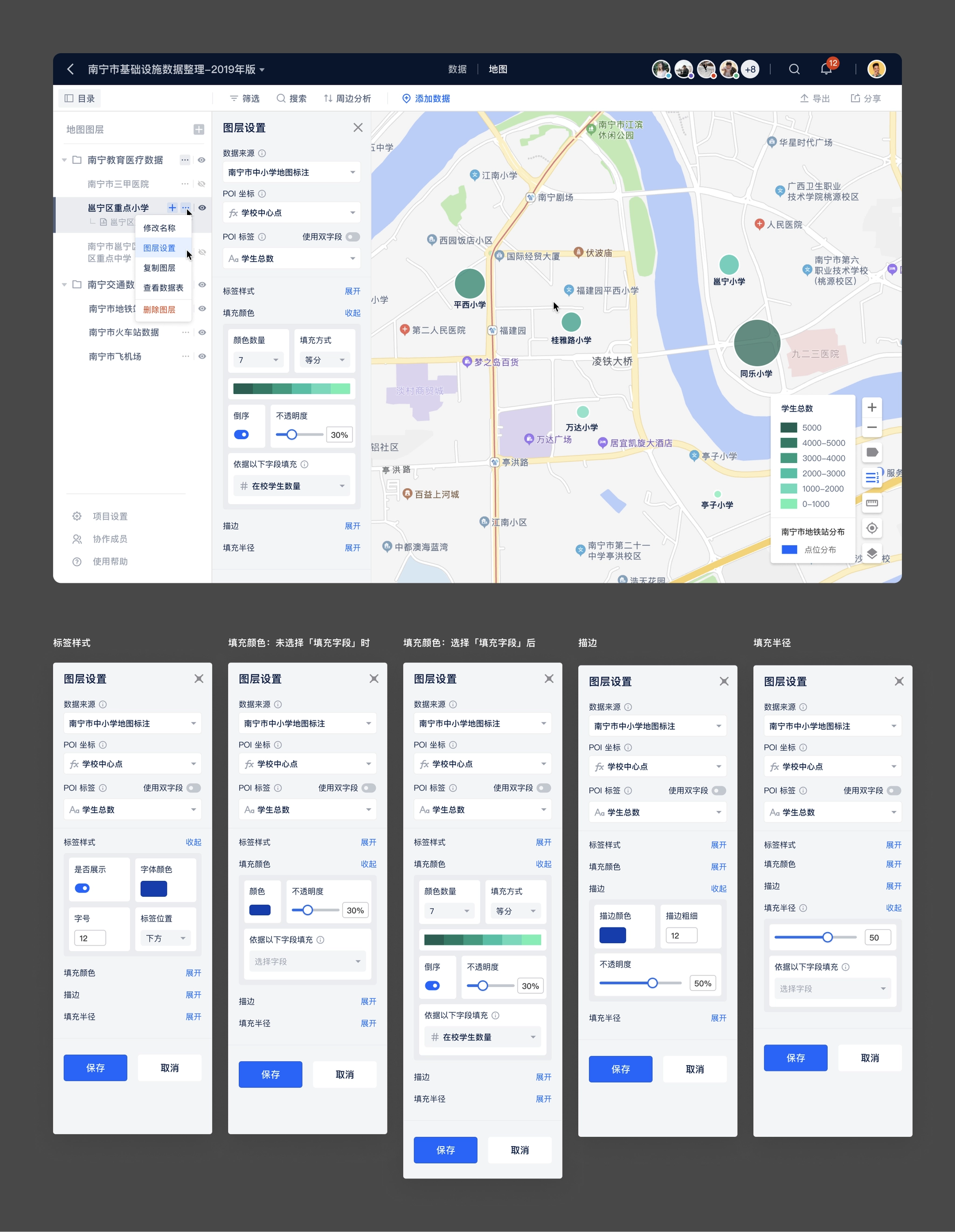
Map layer style configuration
Things I learned
Create something small to start with
When thinking about a very big project, you are sure to make a lot of assumptions, which means you have a lot of possibilities to be wrong. The smaller the point you start from, the higher the likelihood of getting it right. In the initial product positioning we avoided thinking of ourselves as another table product, tables are just a suitable set of solutions to achieve our users' needs at this stage, and we positioned ourselves as a "spatial data collaboration tool", not a new product of Airtable. Only after we have done well enough in the niche area, it makes sense to consider expanding to more scenarios.
The market is the best test for the authenticity of a product's demand
Maptable is a product based on our understanding of customer needs in previous products, but the development process lacks interaction with real customers, and only after the completion of the beta version of the features with some customer participation, resulting in many features and the actual needs of customers and the use of the way different. If customers could be involved from the beginning, our understanding of the needs and market could be better, and there would be less detours.
Fail fast and learn fast
The MVP and alpha versions actually had the basic features, but we kept "pursuing perfection" to launch a better version, but the "better" version should come from customer feedback, not from our assumptions.
The value of SaaS products
The essence of SaaS is renewal, and the premise of customer renewal is that the product itself solves problems for the user and brings new value, so customers will only be willing to renew if they are guaranteed success. Customer success, similar to user experience, is not just the job of product design; different departments throughout the company need to align with the goal of "customer success".
Generic Product SaaS Product Conundrum
There has been a long-standing debate about which is more promising, a generic SaaS product or a vertical SaaS, and the process of making Maptable has deepened our understanding of both directions. What we do is a general product that can meet the needs of different industries and different scenarios, but it also brings the problem of not being "professional" enough, customers will instinctively want to have a "customized" solution for themselves, especially some traditional industry customers, this part of the face of general-purpose products will have some threshold to accept. Airtable and Notion both focus on user guidance in their products, providing many scenario templates and often releasing actual user usage, which are lowering the threshold of user acceptance for general-purpose products. Only when customers decide that the product is close enough to their own usage scenarios, customers will take the step to try it.
Case study
Maptable
A no-code tool that allows users to collect, organize, visualize and analyze spatial data. Users can collaborate in real-time.
role
Lead Product Designer
Platform
Web, Responsive
My Contribution
UI / UX Design
Design Research
Product Management
Background
“Spatial data science treats location, distance, and spatial interaction as core aspects of the data and employs specialized methods and software to store, retrieve, explore, analyze, visualize and learn from such data.” Luc Anselin Ph.D., Center for Spatial Data Science Senior Fellow, University of Chicago
QuantUrban has been focusing on developing spatial data products in the past few years, and has had several attempts in this field. I have also participated in the development of products from Mapmiao, Xiao Qu Luo Pan, City Map, to the Guangdong-Hong Kong-Macao Greater Bay Area Report. These products cover various processes of spatial data from collection, collaboration, visualization to data analysis.
However, these products also have problems to different degrees. They are not "standardization", for example, we didn’t find a good solution for different customers’ need to customize fields on demand, compatible with old data and other needs. In the previously developed Mapmiao product, we made a complex form system to meet the customization needs of customers.
Screenshot of Mapmiao: custom field
Screenshot of Mapmiao: custom field

The Problems
We have been communicating with our customers during developing products, collecting their feedback, and combining our own experience to conclude the problems we faced at that time.
- Several previous products provided solutions for a single scenario, for example, Mapmiao focused on spatial data collection and visualization, and CityMap focused on data collaboration, visualization, and analysis. There is no single product that could completely cover the entire data processing process.
- In the past, data analysis relied more on consulting services, and data processing depended on external tools. And our analysis models could not be applied to the products.
- Our customers are distributed in different fields such as real estate, planning institutes, educational institutions, retail, etc. Customers' needs in different industries vary greatly and are difficult to standardize. Even different companies in the same industry have different needs on data. New customers always need to customize some fields. So we still need to customize the products for many customer projects, which accounts for a large proportion.
- Our customers are primarily in traditional industries, they have accumulated a lot of data in their previous work. A large amount of data is accumulated in the local disks of team members, and members collaborate by transferring files, which is inefficient and easy to make mistakes.
- Due to a large amount of historical data of customers, in previous customer projects, it would take a long time to help customers import old data, and this part of the workload often exceeded expectations.
In summary, there are the following problems:
- Variation in data needsThe data needs of different customers vary greatly and cannot be standardized, requiring the provision of custom fields.
- High migration cost of old dataHigh migration costs due to the large amount of customer history data scattered in different local tools.
- Lack of effective collaborationUnable to collaborate with multiple people, using Excel and Aowei Map to transfer files, that’s inefficient and more prone to errors.
- Low level of productizationPart of the work still relies on manual processing, such as adding custom fields, importing old data, and some data analysis work.
Research
In order to find a solution, we researched both NoCode tools and spatial data products in the market before and during development. We also kept an eye on these products in the market. Overall and specific functional research was done for the table tool and the map product respectively.
Design research on NoCode tools.
Design research on spatial data products.
Goal & The Direction
The next step was to find a form for the requirements. We found that the popular Nocode tools, such as Notion and Airtable, had a flexible database that could be customized at will, and did a good job of compatibility with existing data, allowing free import and export of local data. The flexible database form of table can solve our problem exactly, so we decided to combine the table with our past accumulation in spatial data products. We decided to introduce a new standardized tool product to better handle spatial data and meet the needs of our customers for the whole process:
Lean Canvas
Once I had the initial idea, I started working on customer and product research, compiling the feedback I had collected from customers. Then I organized a Lean Canvas discussion with the team. I created a new Lean Canvas template in Google Docs, and then organized a meeting for the team to discuss and fill it out.
The purpose of the discussion was to analyze our competitive advantage, clarify the product with the team on the other hand, and synchronize the product idea to the team members in concrete terms, so that everyone could reach a consensus on the product to be developed. We have a preliminary understanding of the product's competitive advantages, target customers, and key indicators.
Lean Canvas
After defining the direction of the product, I started concept design, explore the design of core pages such as tables and maps, and designed several wireframes.
Design Exploration
After defining the direction of the product, I started concept design, explore the design of core pages such as tables and maps, and designed several wireframes.
Wireframe design of Maptable.
Design Challenge
The first problems encountered during the prototyping phase are: How to define the functional boundaries of tables and maps?
Both tables and maps are important features in our product planning, but the boundary between tables and maps in the spatial data product is still need to be further defined.
- Tables: take on data collection, team collaboration and a small amount of data analysis functions.
- Maps: take on data collection, map visualization and data analysis functions.
The next question that needs to be addressed is: How do we assemble the product with tables and maps?
The tables and maps can meet the needs of customers in different scenarios, but their forms are so different that if they cannot be assemble in a suitable way, they are just two independent modules in one product, and their value to users is greatly reduced.
Coordinate fieldWe observed the map products developed in the past and found that "coordinates" is the essential part for spatial data products, so we decided to add "coordinates" as a field type to the table. Users can enter coordinates and the map will be rendered on the map based on the coordinates of the table.
Organizing tables and mapsAccording to the feedback we received from our customers in previous products, they usually manage tasks and arrange people in "projects". Therefore, we also introduced the concept of "project" into the product. In addition, considering that collaboration is usually done between a company or department, we added the concept of "team" on top of the project, so that the overall information organization is basically sorted out clearly.
- Data table: the smallest unit that makes up the project data, a data table contains a number of rows and columns of cells.
- Map layer: the smallest unit that makes up the map module, a map layer can choose a data table as the data source and set the style.
- Project: a project contains two modules "Data" and "Map", the data can contain several data tables, and the map contains several map layers.
- Team: an organization with multiple team members, multiple projects can be created under the team and the team members can be managed.
- Personal Desktop: place to storage personal projects, which can be understood as a special type of teams.
Design concept of Maptable.
While exploring the design, I made a list of functional modules of the product, prioritize features with co-founders, define features need to be done in MVP, alpha, and public beta versions.
Features of different versions of Maptable.
MVP version
The goal of the MVP version is to build out the basic framework of the product and complete the development of the basic core functionality. For Maptable, the core features are:
- Account: account system, login methods, etc.
- Project organizing modules: data tables, folders, projects, teams, and other organizational methods.
- Data details: displaying the complete data content.
- Data tables: containing basic field types.
- Maps: containing simple map displays.
Design Challenge
From the design exploration, we chose a solution as the framework for the MVP version, on the basis of which the key pages were gradually improved.
- Page structureThe chosen solution is to have the data table and the map as two separate pages in the project, with "Map" and "View Data Table" buttons on the page as the access portal.
Table view in MVP version.
Map view in MVP version.
- Determine the data fieldsThrough the preliminary research on table tools, the functions and field types of the data table part have been understood clearly, but as the MVP version, the introduction of too many fields will add additional development costs, and in addition, considering the combination of map scenarios, it was finally decided to add the following fields in the MVP version.
Fields supported in MVP version:
- Text / Long Text
- Coordinate
- Number
- Single / Multiple Choice
- Date
- Album
- Attachment
- Define the base componentsIn addition to the table page and map page, we also need to consider adding information display forms to meet the display of information of different levels of importance. We chose to add "Side Panel" and "Info Window" to the product.
- Side PanelPOI data is displayed as a row in the data table and a point, line or polygon in the map. POI data itself stores a large number of data fields, but by default it cannot display more information in the data table and map. Therefore, we added a detail side panel to display the complete information contained in the POI, and set the side panel as a shared component between the table and the map to increase the consistency of the two pages and also reduce unnecessary development costs.
Side panel in table and map page
- Info WindowThe map page shows the spatial position of POIs, there is no more information except for the point or polygon and the name label of the POI. And the complete information is shown in the side panel. Therefore, Info window is added to the map. The map page supports opening up to 6 Info windows at the same time, and supports configuring the fields displayed in the Info window.
The info window on the map page supports multiple simultaneous openings and configurable display content.
The MVP version defines the information architecture and interaction of the product. We also complete the basic functions of data tables and maps. In the MVP version, you can add, delete, and check the data in the tables and maps.
Alpha version
After the MVP version was completed, the team started a week of product experience and testing. In addition to overall testing of the completed features, we also each experimented with scenarios that customers might use, then we put together the feedback from team members and combined it with the previous project planning to determine the tasks need to be completed in the alpha version.
- UI / UX improvements: navigation bar
- Customized member list
- Notifications
- Real-time collaboration
- Permissions
- Registration, login page optimization
UI / UX improvements
Navigation bar
During the product testing process, one of the main issues that team members fed back was that it was difficult to understand the information structure of the product, especially the relationship between tables and maps. The default page was the table page after opening a project, which looked similar to other smart table products, the design lacked uniqueness. In addition, the entrance between table and map was difficult to find, which affected users' motivation to explore the product further. Therefore, we decided to optimize the navigation bar.
- Putting the table and map page entrances in the center of the navigation, so that users can easily understand the parallel relationship between table and map. They are two "views" of the project and in the same hierarchy.
- Copy adjustment: change "View Data Table" to "Data" and "Panorama Map" to "Map", which simplifies the name and reduces the difficulty of understanding.
Before:design in MVP version
After:design in Alpha version
Team / personal desktop entrance adjustment
In the MVP version, the entrance of personal desktop and team is placed in the left menu of the project list page, which is not obvious and cannot be seen when switching to other pages. Therefore, the following adjustments were made to the team / personal desktop entrance in the alpha version.
- Put the personal desktop and team entrance in the navigation bar, hide the logo (less important), and create an immersive experience.
- Enlarge the team logo, so that users can know which team they are currently on more quickly.
- Reducing the team name font size to show more information by default and make it easier for users to identify the current team.
- Enlarge the clickable area to keep the same width as the left menu, and add hover effect to improve the efficiency of switching teams.
Redesign the team / personal desktop entrance in Alpha version.
Notification
Notifications are always a complex feature in a product, especially when organizing the notification types, writing of the notification copy and testing of each notification type after launching.
The following process was used for organizing notifications:
- Listing all user behavior and actions in the system.
- Prioritizing the actions.
- Selecting the right notification types (system notifications, SMS, etc.) for the actions with different priorities.
- Write a description copy for each action that will trigger a notification.
I created a notification table on Maptable, so that we can collaborate with the dev team, and we can also have a chance to in-depth experience with the product's features and interactions (eat dog food).
The notification form contains the following fields.
- Notification Type
- Function Module
- Triggered by
- Receiver
- Notification text
- Notification type: System notification, SMS
- Description: Users can click on the notification jumps to different pages
- Test results: Additional test results after the notification launched
The notification table organized in Maptable.
After sorting out the notification types, the design of notifications becomes simple, we use a notification window and a notification page to display notification.
- The notification window is expanded by clicking the notification icon in the navigation bar, and is used to quickly view the most recent notifications. The window shows the 5 most recent notifications, you can view and mark them as read directly in the floating window, and click on them to jump to the corresponding page. The "View all notifications" button is provided at the bottom of the floating window, and you can click it to enter the notification page to view all notifications.
- The notification page shows all notifications, and distinguishes read and unread status, and supports two sorting methods: "Latest notifications first" and "Unread notifications first".
The design of notification center.
Real-time collaboration
The positioning of the product is "spatial data collaboration tool", and real-time collaboration is one of the core features. Our real-time collaboration is more complex than other table products because the collaboration status needs to be reflected in the map view as well. The status of real-time collaboration display has the following parts.
- Navigation bar: Showing team members who are accessing the project at the same time.The project navigation bar shows all members currently accessing the project and assigns a color to each member in order of precedence, which corresponds to the element in the table or map that the user is working on.To ensure that the Collaborators area does not take up too much space in the navigation, it is limited to displaying a maximum of 5 collaborators' avatars, with more than 5 collaborators tucked away in the list.
Real-time collaboration users.
- Table:show the cell being edited by other usersCollaboration status display in the data table plays a role in showing the status and preventing conflicts, other table products have mature solutions, we also use a similar way to deal with.
- highlighting the borders of cells selected by collaborating members and displaying the username of the member in the upper right corner of the cell.
- the cell highlighting color is the same as the color of the lower right corner of the collaborating member's avatar in the navigation bar.
- multiple collaborating members can select the same cell at the same time, the cell color is based on the color of the last selected member, and the avatars of multiple members are displayed in the upper right corner of the cell.
Real-time collaboration users on table page.
- Map:Showing POIs being edited by other usersThe map part was initially considered similar to Figma's solution of displaying multiple users' mouse during collaboration, but after evaluation, our product does not require that much real-time collaboration, and rendering users' mouse in real-time will increase the amount of data transferred, which will cause interference to other users.Finally, we decided to use the same processing scheme as the table: highlighting the POI that the user is working on to prevent operation conflicts.
Real-time collaboration users on table page.
Permissions
Permissions are the most complex part of the entire product and need to deal with multiple levels of inheritance relationships. The organization type distinguishes between personal desktop / teams, projects that contain data / map settings, and each part needs to be reconsidered in terms of corresponding permissions.
- Information architecture in Maptable:
- Personal Desktop → Project → Data Table / Map
- Team → Project → Data Table / Map
- Permission types:
- Inaccessible
- Read Only
- Edit
- Administrator
In addition to the complete inheritance of user permissions from the previous level, the project, data table / map also needs to take into account that users in the team will further clarify the role. For example, several members of the team is responsible for a project, other members do not need to participate; or each member of a project is responsible for maintaining a data table, the members also need to do permission isolation. We, therefore, added two options for permissions on projects, data tables / maps (Level 2, Level 3).
- Inherit higher-level permissions
- Specify members to be visible
In order to simplify the requirements, specifying members visible is only supported for internal members of the higher level, not for inviting external members of the team. For example, only a few members from the team in the project can be set as "specified members visible"; only a few members from the project in the data table can be set as "specified members visible".
So the arrangement of permissions is a combination of the above three parts. In order to organize more clearly and collaborate with my development colleagues, I built a table in Google Sheets to organize all the actions of each page under different permissions according to the functional module.
Maptable permission list on Google Sheets
Discussion about permission corner case.
After sorting out the actions under different permission types, I start the design of the permission section, there are two user types to be considered:
- Administrator: invite members, manage members, modify members' permissions, remove members, etc.
- Normal users (including read-only and edit users): view the list of collaboration members and quit the collaboration by themselves.
Permission setting windows.
Login page optimization
The MVP version is for testing inside the team, and the design time is rather tight, so the registration and login pages are designed simply, and only the process of cell phone number registration and login is implemented.
Login page in MVP version
We considered adding the invitation code in the alpha (internal test) version and the beta (public test) version, sending invitations to the target users, who could register to experience the product using the invitation code, and the login process also needed to be adjusted accordingly. In addition, considering the registration page is the first few pages that users will visit, adding the introduction of core functions on the registration page will help users understand the core functions and values of the product faster, and also make better use of the page space.
- Adding invitation code process
- Adding illustraions for introducing key features
Login page modified in Alpha version
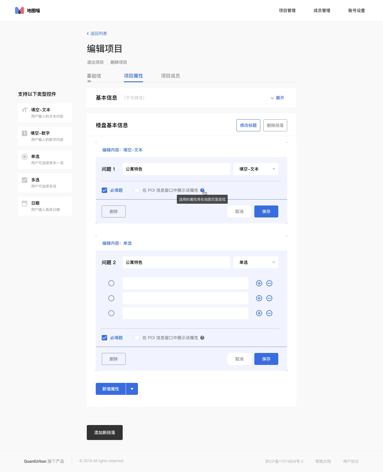
Map style configuration
After importing the data, visualization in map is also an important step in spatial data analysis. Maptable's layer style configuration is to translate the experience accumulated from previous products into concrete functions.
The initial idea of map layers was to correspond with data tables one by one, and a data table would have both table and map views by default. The team discussed that the advantage of this solution is that it is clear and intuitive, and the user can easily understand the relationship between the data table and the two views; however, the disadvantage is also obvious, only one data table layer can be seen at a time, which is not conducive to viewing the global POI data, and sometimes the analysis needs to be based on the global data to reach a conclusion. It is also not conducive to expansion, and it is difficult to add views later.
Prototype before MVP version: tables and maps as different views of a data table.
Therefore, we decided to adopt a more flexible layer scheme, borrowing from the concept of layers in the design tool, users can create any number of layers in the map page according to their needs, each map layer is only individually set to show/hide state, the map shows the effect of multiple layers stacked on top of each other, each layer supports individual layer style settings, users can complete the visualization and analysis needs in a highly flexible manner.
We provide the following settings in the layer configuration.
- Data source: select a data table as the data source, which can be displayed in the map after selection.
- POI coordinates: select the coordinate field in the corresponding data table, and select the first one by default.
- POI label: the text label displayed to the map POI.
- Label style: the display style and display position of the POI label.
- fill color: the fill color of the POI, fill mode, etc. (POI includes point, line, polygon, multi-point, multi-line, multi-polygon and other types)
- Stroke: style of filling the edges of POI graphics, including stroke color and thickness.
- Fill radius: the size of the radius of the POI, and the field on which it is based.
Map layer style configuration
Things I learned
Create something small to start with
When thinking about a very big project, you are sure to make a lot of assumptions, which means you have a lot of possibilities to be wrong. The smaller the point you start from, the higher the likelihood of getting it right. In the initial product positioning we avoided thinking of ourselves as another table product, tables are just a suitable set of solutions to achieve our users' needs at this stage, and we positioned ourselves as a "spatial data collaboration tool", not a new product of Airtable. Only after we have done well enough in the niche area, it makes sense to consider expanding to more scenarios.
The market is the best test for the authenticity of a product's demand
Maptable is a product based on our understanding of customer needs in previous products, but the development process lacks interaction with real customers, and only after the completion of the beta version of the features with some customer participation, resulting in many features and the actual needs of customers and the use of the way different. If customers could be involved from the beginning, our understanding of the needs and market could be better, and there would be less detours.
Fail fast and learn fast
The MVP and alpha versions actually had the basic features, but we kept "pursuing perfection" to launch a better version, but the "better" version should come from customer feedback, not from our assumptions.
The value of SaaS products
The essence of SaaS is renewal, and the premise of customer renewal is that the product itself solves problems for the user and brings new value, so customers will only be willing to renew if they are guaranteed success. Customer success, similar to user experience, is not just the job of product design; different departments throughout the company need to align with the goal of "customer success".
Generic Product SaaS Product Conundrum
There has been a long-standing debate about which is more promising, a generic SaaS product or a vertical SaaS, and the process of making Maptable has deepened our understanding of both directions. What we do is a general product that can meet the needs of different industries and different scenarios, but it also brings the problem of not being "professional" enough, customers will instinctively want to have a "customized" solution for themselves, especially some traditional industry customers, this part of the face of general-purpose products will have some threshold to accept. Airtable and Notion both focus on user guidance in their products, providing many scenario templates and often releasing actual user usage, which are lowering the threshold of user acceptance for general-purpose products. Only when customers decide that the product is close enough to their own usage scenarios, customers will take the step to try it.
Navigation

Case study
Maptable
A no-code tool that allows users to collect, organize, visualize and analyze spatial data. Users can collaborate in real-time.
role
Lead Product Designer
Platform
Web, Responsive
My Contribution
UI / UX Design
Design Research
Product Management
Background
“Spatial data science treats location, distance, and spatial interaction as core aspects of the data and employs specialized methods and software to store, retrieve, explore, analyze, visualize and learn from such data.” Luc Anselin Ph.D., Center for Spatial Data Science Senior Fellow, University of Chicago
QuantUrban has been focusing on developing spatial data products in the past few years, and has had several attempts in this field. I have also participated in the development of products from Mapmiao, Xiao Qu Luo Pan, City Map, to the Guangdong-Hong Kong-Macao Greater Bay Area Report. These products cover various processes of spatial data from collection, collaboration, visualization to data analysis.
However, these products also have problems to different degrees. They are not "standardization", for example, we didn’t find a good solution for different customers’ need to customize fields on demand, compatible with old data and other needs. In the previously developed Mapmiao product, we made a complex form system to meet the customization needs of customers.
Screenshot of Mapmiao: custom field
Screenshot of Mapmiao: custom field

The Problems
We have been communicating with our customers during developing products, collecting their feedback, and combining our own experience to conclude the problems we faced at that time.
- Several previous products provided solutions for a single scenario, for example, Mapmiao focused on spatial data collection and visualization, and CityMap focused on data collaboration, visualization, and analysis. There is no single product that could completely cover the entire data processing process.
- In the past, data analysis relied more on consulting services, and data processing depended on external tools. And our analysis models could not be applied to the products.
- Our customers are distributed in different fields such as real estate, planning institutes, educational institutions, retail, etc. Customers' needs in different industries vary greatly and are difficult to standardize. Even different companies in the same industry have different needs on data. New customers always need to customize some fields. So we still need to customize the products for many customer projects, which accounts for a large proportion.
- Our customers are primarily in traditional industries, they have accumulated a lot of data in their previous work. A large amount of data is accumulated in the local disks of team members, and members collaborate by transferring files, which is inefficient and easy to make mistakes.
- Due to a large amount of historical data of customers, in previous customer projects, it would take a long time to help customers import old data, and this part of the workload often exceeded expectations.
In summary, there are the following problems:
- Variation in data needsThe data needs of different customers vary greatly and cannot be standardized, requiring the provision of custom fields.
- High migration cost of old dataHigh migration costs due to the large amount of customer history data scattered in different local tools.
- Lack of effective collaborationUnable to collaborate with multiple people, using Excel and Aowei Map to transfer files, that’s inefficient and more prone to errors.
- Low level of productizationPart of the work still relies on manual processing, such as adding custom fields, importing old data, and some data analysis work.
Research
In order to find a solution, we researched both NoCode tools and spatial data products in the market before and during development. We also kept an eye on these products in the market. Overall and specific functional research was done for the table tool and the map product respectively.
Design research on NoCode tools.
Design research on spatial data products.
Goal & The Direction
The next step was to find a form for the requirements. We found that the popular Nocode tools, such as Notion and Airtable, had a flexible database that could be customized at will, and did a good job of compatibility with existing data, allowing free import and export of local data. The flexible database form of table can solve our problem exactly, so we decided to combine the table with our past accumulation in spatial data products. We decided to introduce a new standardized tool product to better handle spatial data and meet the needs of our customers for the whole process:
Lean Canvas
Once I had the initial idea, I started working on customer and product research, compiling the feedback I had collected from customers. Then I organized a Lean Canvas discussion with the team. I created a new Lean Canvas template in Google Docs, and then organized a meeting for the team to discuss and fill it out.
The purpose of the discussion was to analyze our competitive advantage, clarify the product with the team on the other hand, and synchronize the product idea to the team members in concrete terms, so that everyone could reach a consensus on the product to be developed. We have a preliminary understanding of the product's competitive advantages, target customers, and key indicators.
Lean Canvas
After defining the direction of the product, I started concept design, explore the design of core pages such as tables and maps, and designed several wireframes.
Design Exploration
After defining the direction of the product, I started concept design, explore the design of core pages such as tables and maps, and designed several wireframes.
Wireframe design of Maptable.
Design Challenge
The first problems encountered during the prototyping phase are: How to define the functional boundaries of tables and maps?
Both tables and maps are important features in our product planning, but the boundary between tables and maps in the spatial data product is still need to be further defined.
- Tables: take on data collection, team collaboration and a small amount of data analysis functions.
- Maps: take on data collection, map visualization and data analysis functions.
The next question that needs to be addressed is: How do we assemble the product with tables and maps?
The tables and maps can meet the needs of customers in different scenarios, but their forms are so different that if they cannot be assemble in a suitable way, they are just two independent modules in one product, and their value to users is greatly reduced.
Coordinate fieldWe observed the map products developed in the past and found that "coordinates" is the essential part for spatial data products, so we decided to add "coordinates" as a field type to the table. Users can enter coordinates and the map will be rendered on the map based on the coordinates of the table.
Organizing tables and mapsAccording to the feedback we received from our customers in previous products, they usually manage tasks and arrange people in "projects". Therefore, we also introduced the concept of "project" into the product. In addition, considering that collaboration is usually done between a company or department, we added the concept of "team" on top of the project, so that the overall information organization is basically sorted out clearly.
- Data table: the smallest unit that makes up the project data, a data table contains a number of rows and columns of cells.
- Map layer: the smallest unit that makes up the map module, a map layer can choose a data table as the data source and set the style.
- Project: a project contains two modules "Data" and "Map", the data can contain several data tables, and the map contains several map layers.
- Team: an organization with multiple team members, multiple projects can be created under the team and the team members can be managed.
- Personal Desktop: place to storage personal projects, which can be understood as a special type of teams.
Design concept of Maptable.
While exploring the design, I made a list of functional modules of the product, prioritize features with co-founders, define features need to be done in MVP, alpha, and public beta versions.
Features of different versions of Maptable.
MVP version
The goal of the MVP version is to build out the basic framework of the product and complete the development of the basic core functionality. For Maptable, the core features are:
- Account: account system, login methods, etc.
- Project organizing modules: data tables, folders, projects, teams, and other organizational methods.
- Data details: displaying the complete data content.
- Data tables: containing basic field types.
- Maps: containing simple map displays.
Design Challenge
From the design exploration, we chose a solution as the framework for the MVP version, on the basis of which the key pages were gradually improved.
- Page structureThe chosen solution is to have the data table and the map as two separate pages in the project, with "Map" and "View Data Table" buttons on the page as the access portal.
Table view in MVP version.
Map view in MVP version.
- Determine the data fieldsThrough the preliminary research on table tools, the functions and field types of the data table part have been understood clearly, but as the MVP version, the introduction of too many fields will add additional development costs, and in addition, considering the combination of map scenarios, it was finally decided to add the following fields in the MVP version.
Fields supported in MVP version:
- Text / Long Text
- Coordinate
- Number
- Single / Multiple Choice
- Date
- Album
- Attachment
- Define the base componentsIn addition to the table page and map page, we also need to consider adding information display forms to meet the display of information of different levels of importance. We chose to add "Side Panel" and "Info Window" to the product.
- Side PanelPOI data is displayed as a row in the data table and a point, line or polygon in the map. POI data itself stores a large number of data fields, but by default it cannot display more information in the data table and map. Therefore, we added a detail side panel to display the complete information contained in the POI, and set the side panel as a shared component between the table and the map to increase the consistency of the two pages and also reduce unnecessary development costs.
Side panel in table and map page
- Info WindowThe map page shows the spatial position of POIs, there is no more information except for the point or polygon and the name label of the POI. And the complete information is shown in the side panel. Therefore, Info window is added to the map. The map page supports opening up to 6 Info windows at the same time, and supports configuring the fields displayed in the Info window.
The info window on the map page supports multiple simultaneous openings and configurable display content.
The MVP version defines the information architecture and interaction of the product. We also complete the basic functions of data tables and maps. In the MVP version, you can add, delete, and check the data in the tables and maps.
Alpha version
After the MVP version was completed, the team started a week of product experience and testing. In addition to overall testing of the completed features, we also each experimented with scenarios that customers might use, then we put together the feedback from team members and combined it with the previous project planning to determine the tasks need to be completed in the alpha version.
- UI / UX improvements: navigation bar
- Customized member list
- Notifications
- Real-time collaboration
- Permissions
- Registration, login page optimization
UI / UX improvements
Navigation bar
During the product testing process, one of the main issues that team members fed back was that it was difficult to understand the information structure of the product, especially the relationship between tables and maps. The default page was the table page after opening a project, which looked similar to other smart table products, the design lacked uniqueness. In addition, the entrance between table and map was difficult to find, which affected users' motivation to explore the product further. Therefore, we decided to optimize the navigation bar.
- Putting the table and map page entrances in the center of the navigation, so that users can easily understand the parallel relationship between table and map. They are two "views" of the project and in the same hierarchy.
- Copy adjustment: change "View Data Table" to "Data" and "Panorama Map" to "Map", which simplifies the name and reduces the difficulty of understanding.
Before:design in MVP version
After:design in Alpha version
Team / personal desktop entrance adjustment
In the MVP version, the entrance of personal desktop and team is placed in the left menu of the project list page, which is not obvious and cannot be seen when switching to other pages. Therefore, the following adjustments were made to the team / personal desktop entrance in the alpha version.
- Put the personal desktop and team entrance in the navigation bar, hide the logo (less important), and create an immersive experience.
- Enlarge the team logo, so that users can know which team they are currently on more quickly.
- Reducing the team name font size to show more information by default and make it easier for users to identify the current team.
- Enlarge the clickable area to keep the same width as the left menu, and add hover effect to improve the efficiency of switching teams.
Redesign the team / personal desktop entrance in Alpha version.
Notification
Notifications are always a complex feature in a product, especially when organizing the notification types, writing of the notification copy and testing of each notification type after launching.
The following process was used for organizing notifications:
- Listing all user behavior and actions in the system.
- Prioritizing the actions.
- Selecting the right notification types (system notifications, SMS, etc.) for the actions with different priorities.
- Write a description copy for each action that will trigger a notification.
I created a notification table on Maptable, so that we can collaborate with the dev team, and we can also have a chance to in-depth experience with the product's features and interactions (eat dog food).
The notification form contains the following fields.
- Notification Type
- Function Module
- Triggered by
- Receiver
- Notification text
- Notification type: System notification, SMS
- Description: Users can click on the notification jumps to different pages
- Test results: Additional test results after the notification launched
The notification table organized in Maptable.
After sorting out the notification types, the design of notifications becomes simple, we use a notification window and a notification page to display notification.
- The notification window is expanded by clicking the notification icon in the navigation bar, and is used to quickly view the most recent notifications. The window shows the 5 most recent notifications, you can view and mark them as read directly in the floating window, and click on them to jump to the corresponding page. The "View all notifications" button is provided at the bottom of the floating window, and you can click it to enter the notification page to view all notifications.
- The notification page shows all notifications, and distinguishes read and unread status, and supports two sorting methods: "Latest notifications first" and "Unread notifications first".
The design of notification center.
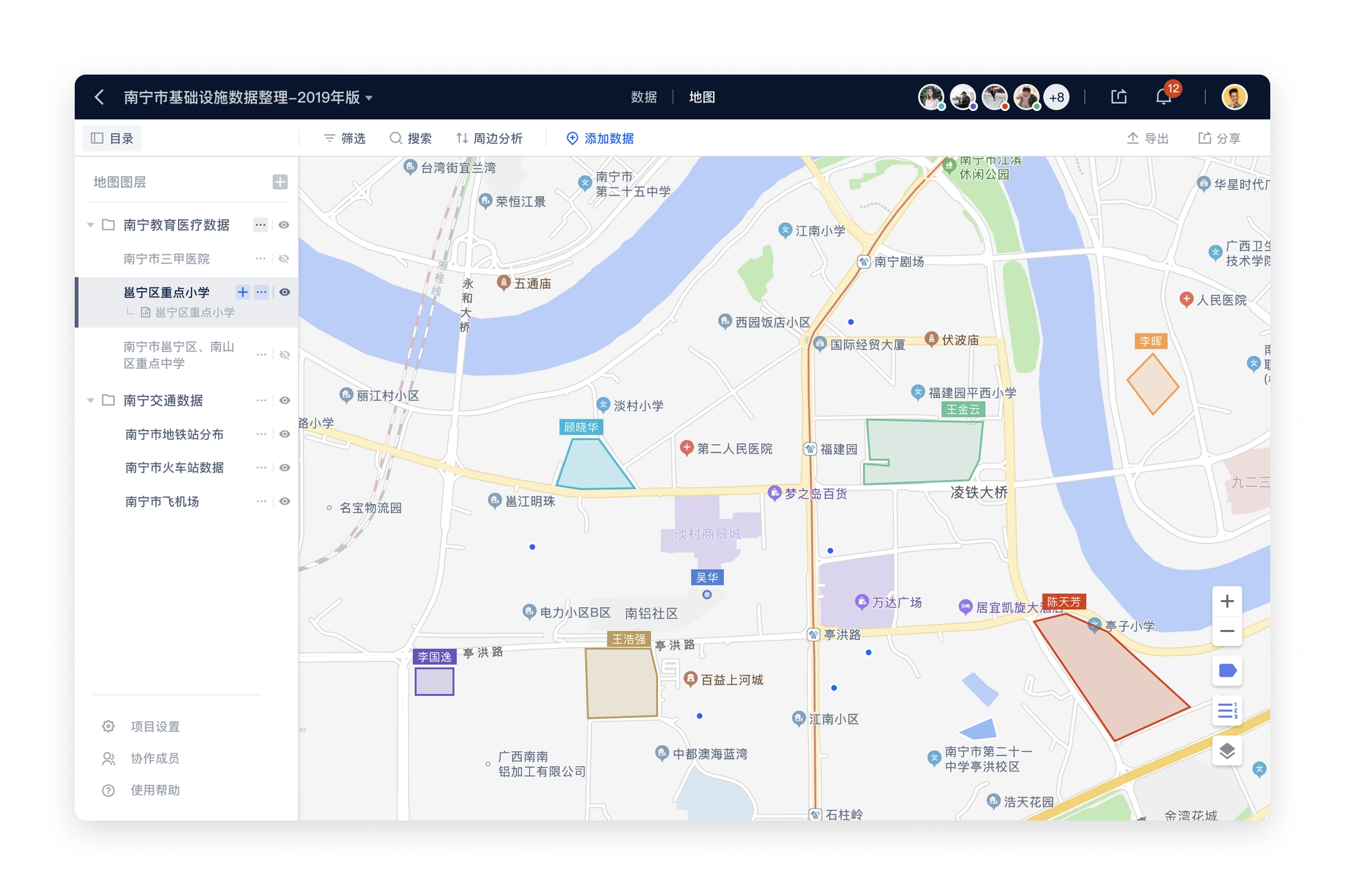
Real-time collaboration
The positioning of the product is "spatial data collaboration tool", and real-time collaboration is one of the core features. Our real-time collaboration is more complex than other table products because the collaboration status needs to be reflected in the map view as well. The status of real-time collaboration display has the following parts.
- Navigation bar: Showing team members who are accessing the project at the same time.The project navigation bar shows all members currently accessing the project and assigns a color to each member in order of precedence, which corresponds to the element in the table or map that the user is working on.To ensure that the Collaborators area does not take up too much space in the navigation, it is limited to displaying a maximum of 5 collaborators' avatars, with more than 5 collaborators tucked away in the list.
Real-time collaboration users.
- Table:show the cell being edited by other usersCollaboration status display in the data table plays a role in showing the status and preventing conflicts, other table products have mature solutions, we also use a similar way to deal with.
- highlighting the borders of cells selected by collaborating members and displaying the username of the member in the upper right corner of the cell.
- the cell highlighting color is the same as the color of the lower right corner of the collaborating member's avatar in the navigation bar.
- multiple collaborating members can select the same cell at the same time, the cell color is based on the color of the last selected member, and the avatars of multiple members are displayed in the upper right corner of the cell.
Real-time collaboration users on table page.
- Map:Showing POIs being edited by other usersThe map part was initially considered similar to Figma's solution of displaying multiple users' mouse during collaboration, but after evaluation, our product does not require that much real-time collaboration, and rendering users' mouse in real-time will increase the amount of data transferred, which will cause interference to other users.Finally, we decided to use the same processing scheme as the table: highlighting the POI that the user is working on to prevent operation conflicts.
Real-time collaboration users on table page.
Permissions
Permissions are the most complex part of the entire product and need to deal with multiple levels of inheritance relationships. The organization type distinguishes between personal desktop / teams, projects that contain data / map settings, and each part needs to be reconsidered in terms of corresponding permissions.
- Information architecture in Maptable:
- Personal Desktop → Project → Data Table / Map
- Team → Project → Data Table / Map
- Permission types:
- Inaccessible
- Read Only
- Edit
- Administrator
In addition to the complete inheritance of user permissions from the previous level, the project, data table / map also needs to take into account that users in the team will further clarify the role. For example, several members of the team is responsible for a project, other members do not need to participate; or each member of a project is responsible for maintaining a data table, the members also need to do permission isolation. We, therefore, added two options for permissions on projects, data tables / maps (Level 2, Level 3).
- Inherit higher-level permissions
- Specify members to be visible
In order to simplify the requirements, specifying members visible is only supported for internal members of the higher level, not for inviting external members of the team. For example, only a few members from the team in the project can be set as "specified members visible"; only a few members from the project in the data table can be set as "specified members visible".
So the arrangement of permissions is a combination of the above three parts. In order to organize more clearly and collaborate with my development colleagues, I built a table in Google Sheets to organize all the actions of each page under different permissions according to the functional module.
Maptable permission list on Google Sheets
Discussion about permission corner case.
After sorting out the actions under different permission types, I start the design of the permission section, there are two user types to be considered:
- Administrator: invite members, manage members, modify members' permissions, remove members, etc.
- Normal users (including read-only and edit users): view the list of collaboration members and quit the collaboration by themselves.
Permission setting windows.
Login page optimization
The MVP version is for testing inside the team, and the design time is rather tight, so the registration and login pages are designed simply, and only the process of cell phone number registration and login is implemented.
Login page in MVP version
We considered adding the invitation code in the alpha (internal test) version and the beta (public test) version, sending invitations to the target users, who could register to experience the product using the invitation code, and the login process also needed to be adjusted accordingly. In addition, considering the registration page is the first few pages that users will visit, adding the introduction of core functions on the registration page will help users understand the core functions and values of the product faster, and also make better use of the page space.
- Adding invitation code process
- Adding illustraions for introducing key features
Login page modified in Alpha version
Map style configuration
After importing the data, visualization in map is also an important step in spatial data analysis. Maptable's layer style configuration is to translate the experience accumulated from previous products into concrete functions.
The initial idea of map layers was to correspond with data tables one by one, and a data table would have both table and map views by default. The team discussed that the advantage of this solution is that it is clear and intuitive, and the user can easily understand the relationship between the data table and the two views; however, the disadvantage is also obvious, only one data table layer can be seen at a time, which is not conducive to viewing the global POI data, and sometimes the analysis needs to be based on the global data to reach a conclusion. It is also not conducive to expansion, and it is difficult to add views later.
Prototype before MVP version: tables and maps as different views of a data table.
Therefore, we decided to adopt a more flexible layer scheme, borrowing from the concept of layers in the design tool, users can create any number of layers in the map page according to their needs, each map layer is only individually set to show/hide state, the map shows the effect of multiple layers stacked on top of each other, each layer supports individual layer style settings, users can complete the visualization and analysis needs in a highly flexible manner.
We provide the following settings in the layer configuration.
- Data source: select a data table as the data source, which can be displayed in the map after selection.
- POI coordinates: select the coordinate field in the corresponding data table, and select the first one by default.
- POI label: the text label displayed to the map POI.
- Label style: the display style and display position of the POI label.
- fill color: the fill color of the POI, fill mode, etc. (POI includes point, line, polygon, multi-point, multi-line, multi-polygon and other types)
- Stroke: style of filling the edges of POI graphics, including stroke color and thickness.
- Fill radius: the size of the radius of the POI, and the field on which it is based.
Map layer style configuration
Things I learned
Create something small to start with
When thinking about a very big project, you are sure to make a lot of assumptions, which means you have a lot of possibilities to be wrong. The smaller the point you start from, the higher the likelihood of getting it right. In the initial product positioning we avoided thinking of ourselves as another table product, tables are just a suitable set of solutions to achieve our users' needs at this stage, and we positioned ourselves as a "spatial data collaboration tool", not a new product of Airtable. Only after we have done well enough in the niche area, it makes sense to consider expanding to more scenarios.
The market is the best test for the authenticity of a product's demand
Maptable is a product based on our understanding of customer needs in previous products, but the development process lacks interaction with real customers, and only after the completion of the beta version of the features with some customer participation, resulting in many features and the actual needs of customers and the use of the way different. If customers could be involved from the beginning, our understanding of the needs and market could be better, and there would be less detours.
Fail fast and learn fast
The MVP and alpha versions actually had the basic features, but we kept "pursuing perfection" to launch a better version, but the "better" version should come from customer feedback, not from our assumptions.
The value of SaaS products
The essence of SaaS is renewal, and the premise of customer renewal is that the product itself solves problems for the user and brings new value, so customers will only be willing to renew if they are guaranteed success. Customer success, similar to user experience, is not just the job of product design; different departments throughout the company need to align with the goal of "customer success".
Generic Product SaaS Product Conundrum
There has been a long-standing debate about which is more promising, a generic SaaS product or a vertical SaaS, and the process of making Maptable has deepened our understanding of both directions. What we do is a general product that can meet the needs of different industries and different scenarios, but it also brings the problem of not being "professional" enough, customers will instinctively want to have a "customized" solution for themselves, especially some traditional industry customers, this part of the face of general-purpose products will have some threshold to accept. Airtable and Notion both focus on user guidance in their products, providing many scenario templates and often releasing actual user usage, which are lowering the threshold of user acceptance for general-purpose products. Only when customers decide that the product is close enough to their own usage scenarios, customers will take the step to try it.
Navigation
