

Case study
Value Assessment of Industrial Parks in Guangdong-Hong Kong-Macao Greater Bay Area
Visualizing the value of industrial parks.
role
Product Designer
Platform
Web, Responsive
My Contribution
UI / UX Design
Motion Design
Data Visualization
Background
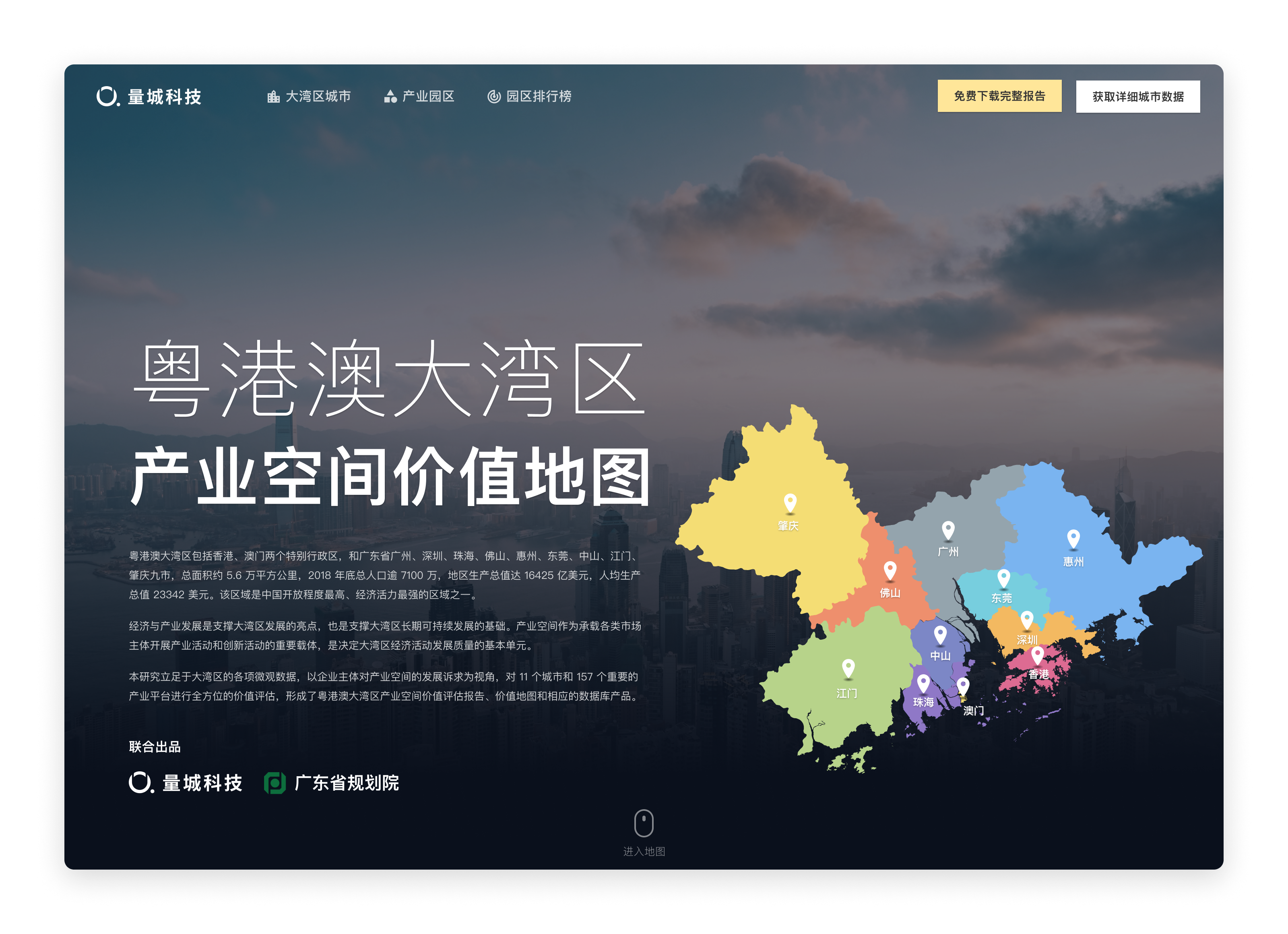
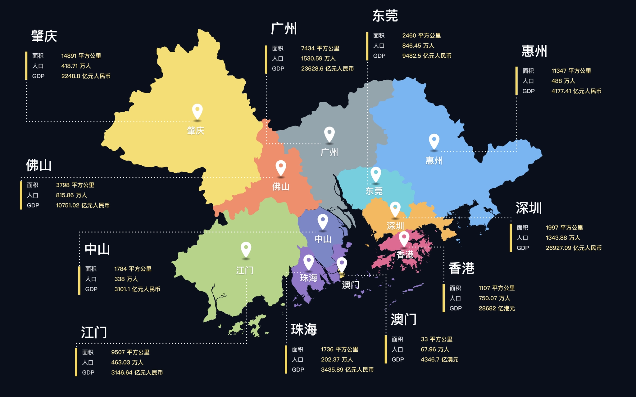
Guangdong-Hong Kong-Macao Greater Bay Area includes the nine cities of Guangzhou, Shenzhen, Zhuhai, Foshan, Huizhou, Dongguan, Zhongshan, Jiangmen, Zhaoqing, and Hong Kong and Macau, with a total area of about 56,000 square kilometers, a total population of more than 71 million, and a gross regional product of US$16,425 billion at the end of 2018. And the region has a per capita GDP of US$ 23,342. The region is one of the most open and economically dynamic regions in China.
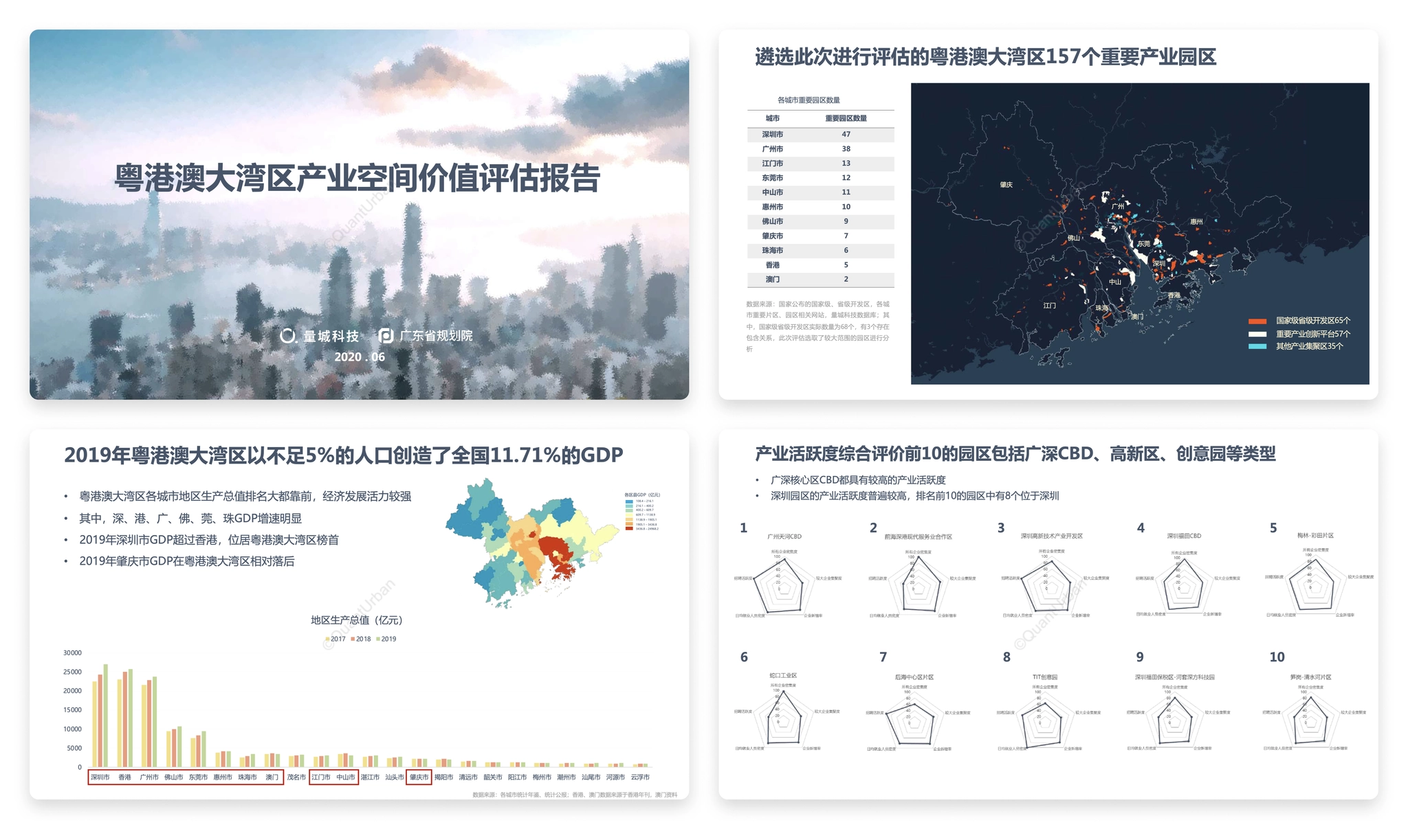
Value assessment of industrial parks in Guangdong-Hong Kong-Macao Greater Bay Area is a study initiated by QuantUrban and jointly completed by Guangdong Provincial Planning Institute. Based on the microdata of the Greater Bay Area, the study assesses the value of 11 cities and 157 important industrial platforms from the perspective of the development demands of industrial space by business entities. The final output of the study is the "Guangdong-Hong Kong-Macao Greater Bay Area Industrial Parks Value Assessment Report", and this website is a visual presentation of the study report.
Pages from the study report.
The website should not only present the findings of the study, but also visualize the massive data used in the study as well. Some similar products abroad have done a good example of open data visualization, such as DataUSA 、DataMéxico, where the data is in types of beautiful, interesting and easy to understand charts, rather than boring numbers in a table. Designing a "city data" website must be very complex and challenging, and I always want to have a chance to challenge myself.

Information Architecture
Unlike the organization of a research report, the first step in designing the website is to clarify the relationship between data. The data used in the research report contains both city and county level statistics, as well as spatial data such as the location of industrial park landings and surrounding facilities.
So the first step is to classify the information, which we divide into 4 categories.
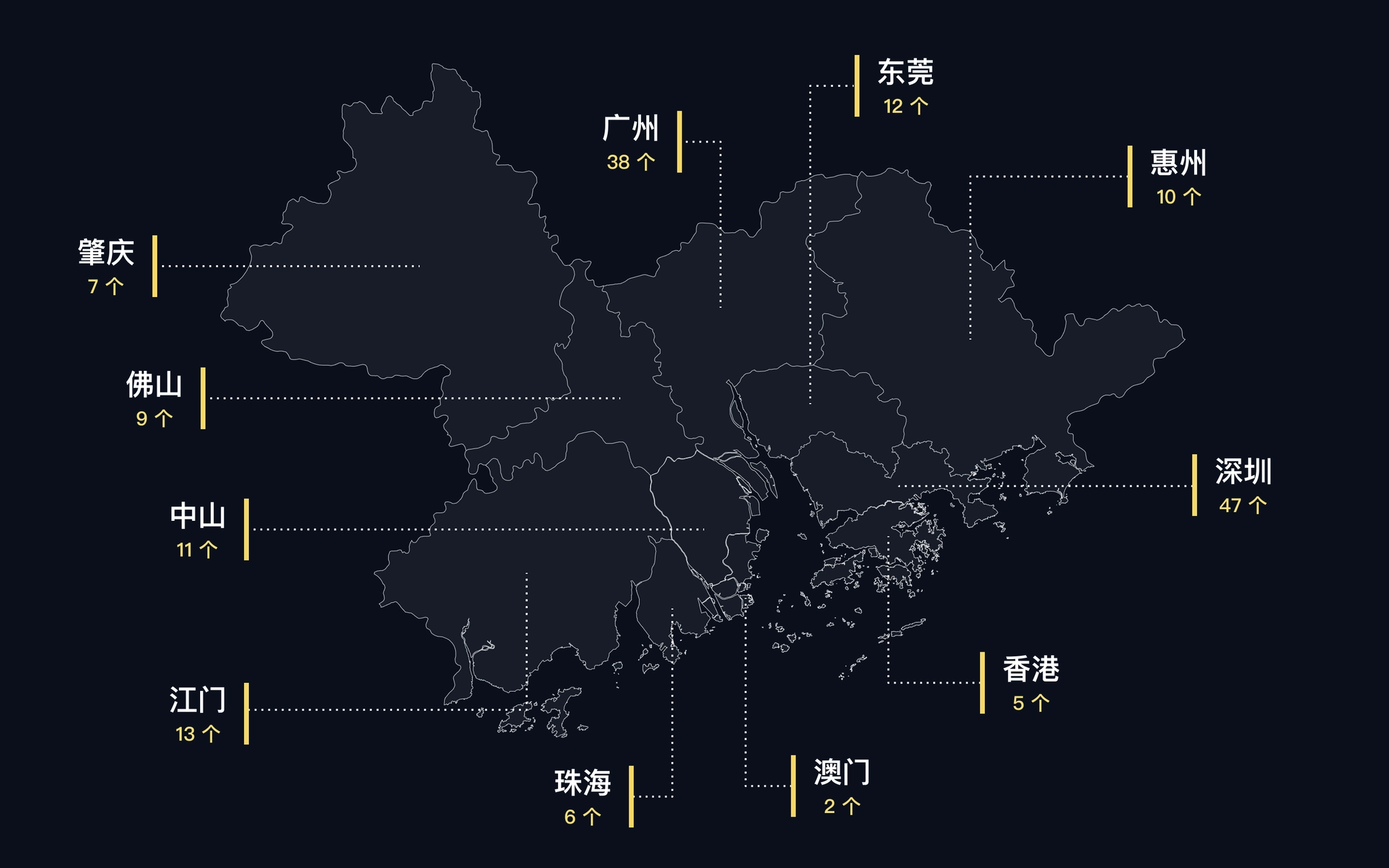
- Guangdong-Hong Kong-Macao Greater Bay Area overall data: statistics of the Greater Bay Area as a whole, such as data on population, area, gross product, etc. As well as the distribution of industrial parks in each city.
- City data: data on city population, commuting, economy, industry, public service facilities, commercial service facilities, etc. For each city, including the districts and counties under the city.
- Industrial park data: data on the location, enterprises, surrounding facilities, etc. Of each industrial park, and its score and overall ranking under our assessment indicators.
- Value assessment indicators: descriptions of assessment indicators and calculation methods, as well as the ranking of industrial parks under individual assessment dimensions.
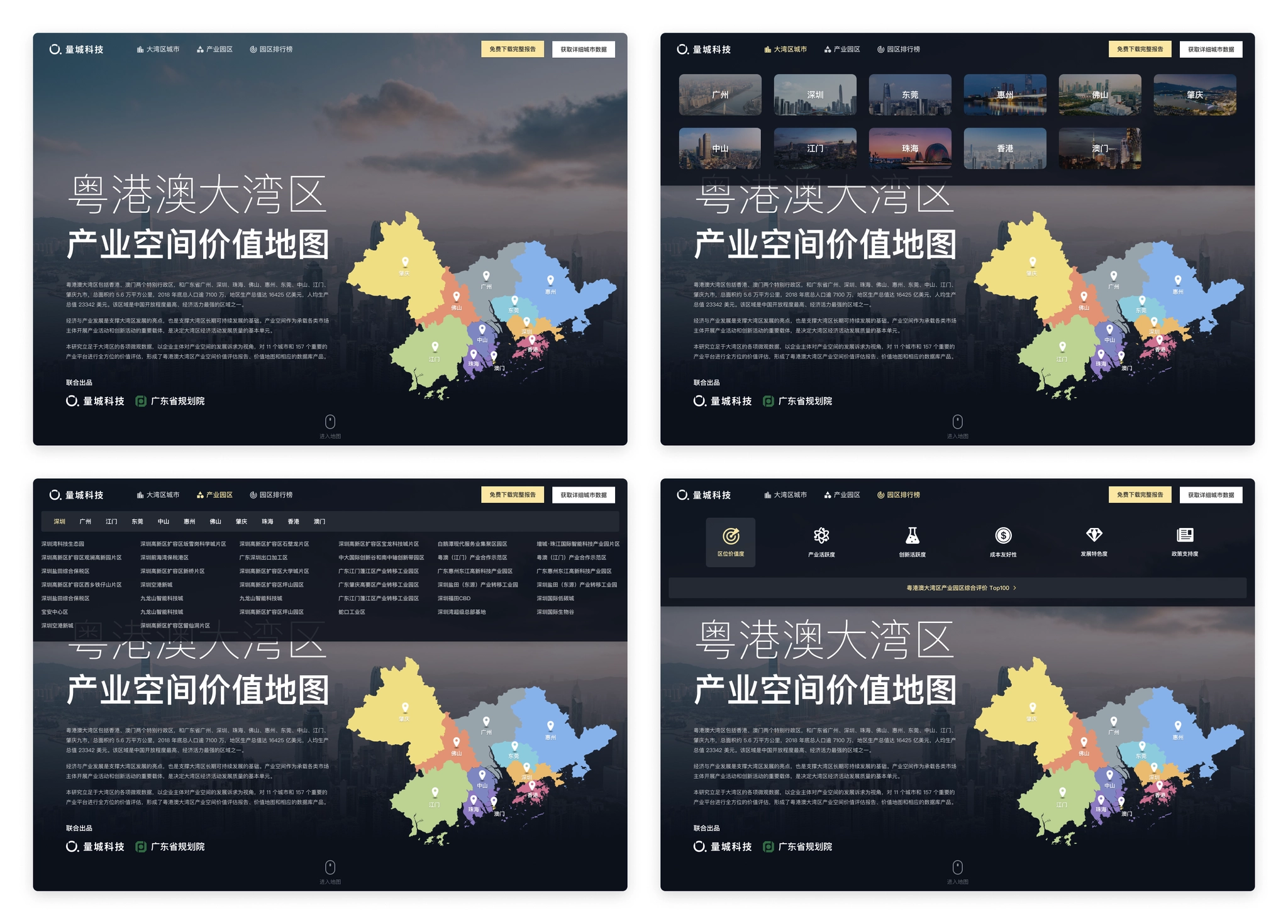
After classifying the information, we started to design the overall information architecture of the website. Considering the different types of data, we aggregated different types of data to different pages, while the home page as an overall overview page also provided entrances to cities, industrial parks, and assessment indicators. The contents of several pages are clearly distinguished.
- Home page: showing the overall situation of Guangdong-Hong Kong-Macao Greater Bay Area, providing entrances to the city page, industrial park and assessment index page.
- Cities: showcases the list of cities in the Greater Bay Area, and provides access to the city details page by clicking on it.
- Industrial parks: displaying the list of industrial parks and access to the details page of each industrial park.
- Park ranking: displaying 6 indicators used to evaluate the value of industrial parks, each indicator has a corresponding description page and a single ranking.
Information architecture of Parkfig website.
Homepage
The homepage is the entrance for users to visit the website, and it takes on the function of overview and index of the directory, so we should first consider that the information we want to convey can be displayed completely.
The homepage needs to display these information.
- The name and introduction of the study.
- Basic data of the Guangdong-Hong Kong-Macao Greater Bay Area.
- Map of the Guangdong-Hong Kong-Macao Greater Bay Area.
- The distribution of industrial parks.
- Methods of industrial spatial value assessment.
- Quick entrances to cities and industrial parks.
- Complete the report and purchase data entrance.
It can be seen that the amount of information to be displayed in the homepage is massive, and it needs to be organized appropriately and arranged reasonably in terms of layout design. What is more difficult is how to ensure that users have continuous interest in browsing when they visit on the basis of complete information display, and attract them to the story we tell.
At that time, we made some layout attempts, but the layout of information was a bit redundant, the interaction was relatively complicated, the access data needed to switch categories or click several times to see, and the overall was rather monotonous, just presenting the information originally, lacking attraction.
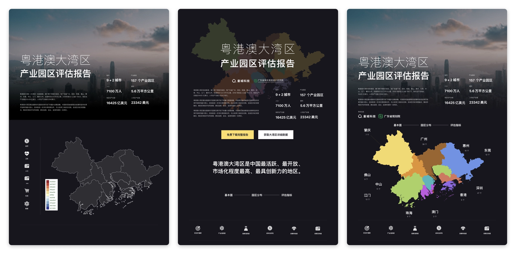
Prototype design: Some layout experiments
After some attempts, there was no clear idea on how to improve the homepage design, and the design was at an impasse. So the choice was made to stop and start rethinking the objectives of the homepage.
- To let users understand the background and objectives of the study initiation.
- To let users have a basic understanding of the urban composition, spatial location, population and economic situation of the Guangdong-Hong Kong-Macao Greater Bay Area.
- To let users understand the distribution of the industrial parks of this study in each city.
- To provide users with an understanding of our assessment methodology and the scores of the parks assessed according to our assessment methodology.
- Providing users with a convenient portal to visit particular cities or parks.
- To guide users to view the full report and purchase data.
When thinking about the goal of the home page, it is noted that there is a hierarchical progressive relationship between several contents of cities, industrial parks, and assessment methods. The hierarchical relationship can be utilized in the spatial display and combined with interactive actions to create a dynamic display.
In the map product, mouse scrolling to zoom in & zoom out is a very common action, and the interaction of scrolling to zoom in corresponds to the relationship between data, so we decided to use the interaction of "vertical scrolling", and considering the need to display the corresponding data under different levels, we added the design of "split screen".
- Vertical scrolling: corresponding to different zoom levels, when scrolling from the national level zoomed to the Bay Area, to 157 industrial parks.
- Split screen: while scrolling, a split screen is added on the right side to show the data of the corresponding map level (city → park → assessment method).
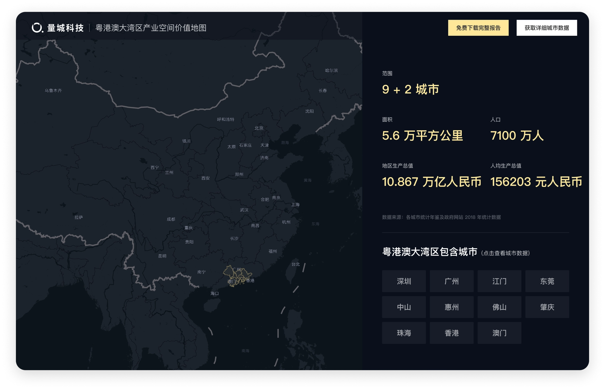
Homepage design: the initial state of the map, showing the location and basic information of Guangdong, Hong Kong and Macao Bay Area.
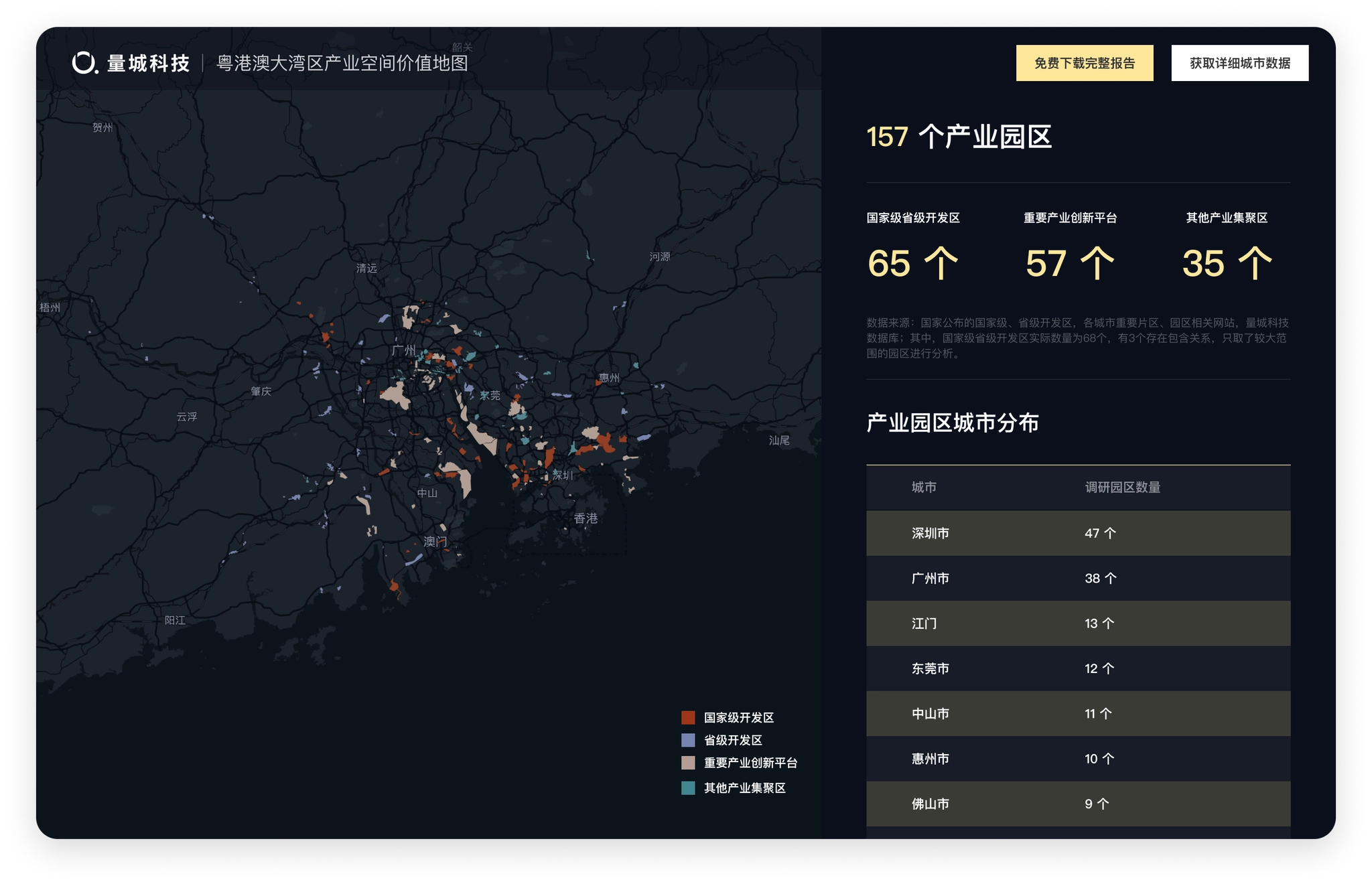
After scrolling and zooming into the interior of Guangdong, Hong Kong, Macao and the Bay Area, the map display changes to the location and classification of the 157 industrial parks we evaluated.
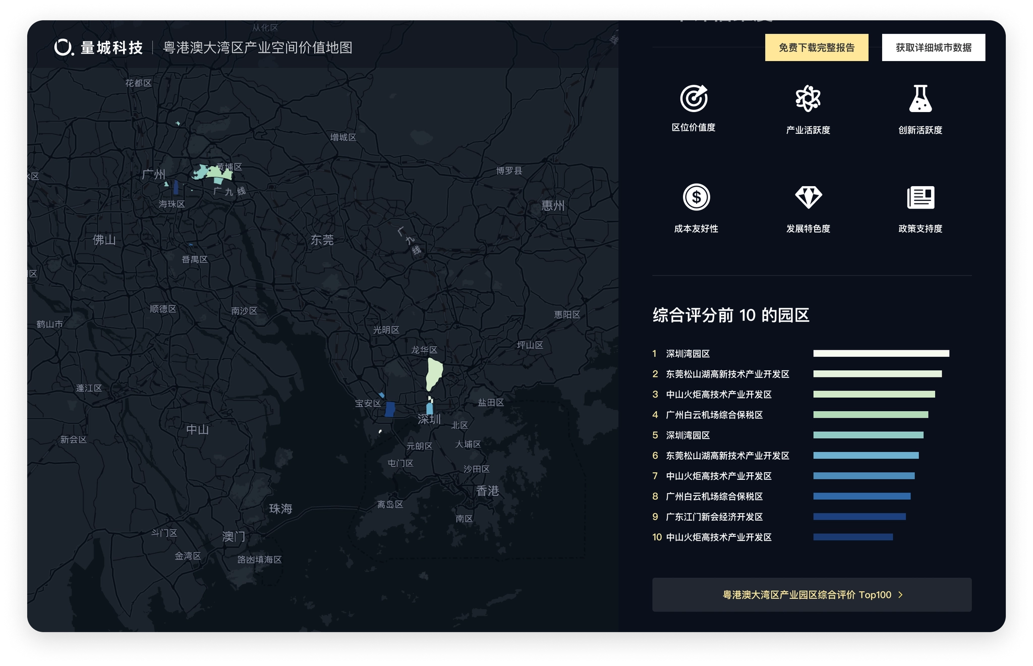
Keep scrolling to show the top 10 industrial parks and their locations under our evaluation methodology
Homepage design scrolling effect (video is a bit large, please wait)
Visualization of urban data
The prerequisite for data visualization is to understand the data and find a suitable form of expression for the data. After completing the design of the homepage, the next step is to complete the design of the city, industrial park and assessment dimensions. The biggest difficulty of this part is the visual presentation of a large amount of data, which requires thinking about the most suitable visualization form for each part of data one by one.
City Page
Cover of City
The city page wanted to let users feel the atmosphere of the city as soon as they opened it. The first screen was designed with a large background image, and the content displayed on the image was streamlined, keeping only the key information and putting the rest of the information outside the first screen. So the copyright-free images of each city were selected as the background.
City pages hero sections (Figma)
Urban Data
We have compiled a large amount of statistical yearbook data for the city in the Guangdong-Hong Kong-Macao Bay Area, and all these data need to be displayed in the city pages as needed. The next step is to decide the corresponding visualization form according to the data characteristics of each section.
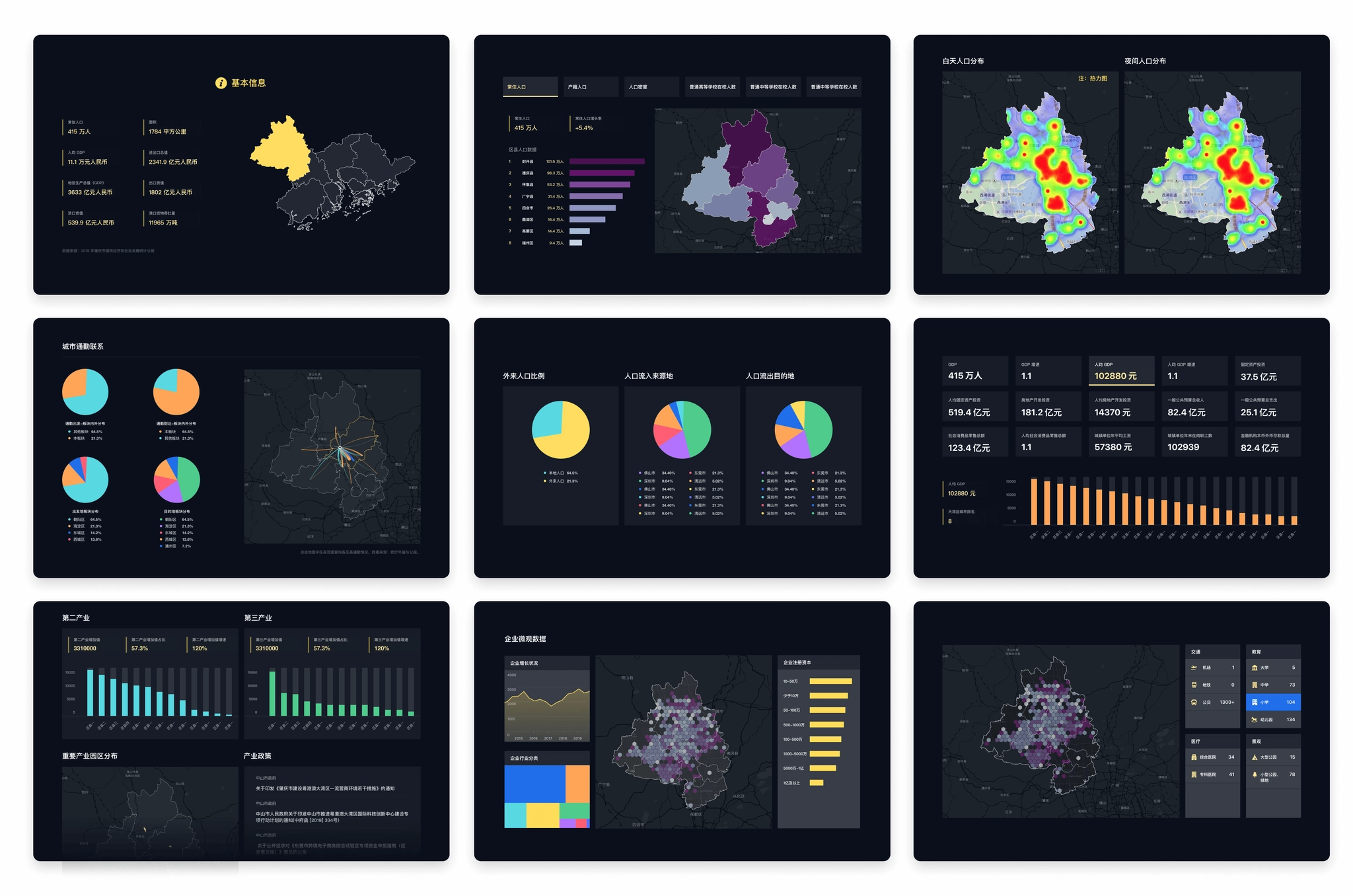
- Basic information: allowing users to establish a basic knowledge of the city, using the way of highlighting the current city in the map to show the location of the city in the Guangdong-Hong Kong-Macao Greater Bay Area, and the basic data (the first line left in the figure below).
- City population data: The population data is divided into multiple dimensions such as resident population and household population, and each item shows the population statistics of the city and the districts and counties within the city, using a bar chart + map, while using different intensity of color filling, so that the bar chart (ranking of districts and counties) and the map (location of districts and counties) can establish a connection (middle of the first row of the figure below).
- City population distribution: daytime and nighttime population distribution in the city, and the "hotness" of the areas where residents are concentrated is well suited to be displayed using a heat map (first row right of the figure below).
- Commuting structure: the inflow and outflow of population between regions in the city, the proportion of inflow and outflow to the city using pie charts, and the location of inflow and outflow indicated by lines of different colors in the map, the thickness of the lines represents the amount of mobile population (second row left and center of the figure below).
- City Economy: The economic fundamentals of the city and counties, including GDP, growth rate, GDP per capita and other 15 dimensions, under each dimension, the data of each district and county should be displayed at the same time, so the card option is designed to be switched with a click, the card shows the data of the city by default, and the data of other dimensions can be automatically rotated or manually switched by users. The data of each district and county is added with the function of sorting from high to low, so the form of bar chart is adopted to visually reflect the position of each region in the city (the second row of the figure below, right).
- City industries: the same bar chart is used for the secondary and tertiary industries; important industrial parks within the city use the scheme marked on the map (third row left in the figure below).
- Enterprise microdata: for enterprise growth data, a line graph is used to better view the trend of the data; a treemap chart is used for industry classification in order to better view the proportion of industries within the city; a honeycomb diagram scheme is used for enterprise distribution displayed on the map, which is more detailed than the heat map.
- Public service facilities, commercial service facilities: using a switchable list format, when selected, the honeycomb map under the category is displayed on the map to view the distribution of this type of data in the city.
Charts on City page.
Industrial Park Page
The industrial park detail page shows the data of the park and how it scores on each dimension under our evaluation system.
Industrial Park First Screen
The first screen needs to introduce the basic information of the industrial park and our value assessment of the industrial park to users, so similar to the map area on the home page, a split screen design is used, with the left side showing the basic information and data of the park and the right side showing our value assessment of the park.
There are 6 dimensions in this evaluation of the industrial park, and each dimension is calculated and evaluated to give a score and ranking. In order to show the performance of the park under the evaluation dimensions more intuitively, we use a radar chart to show the scores of the park in each dimension at a glance.
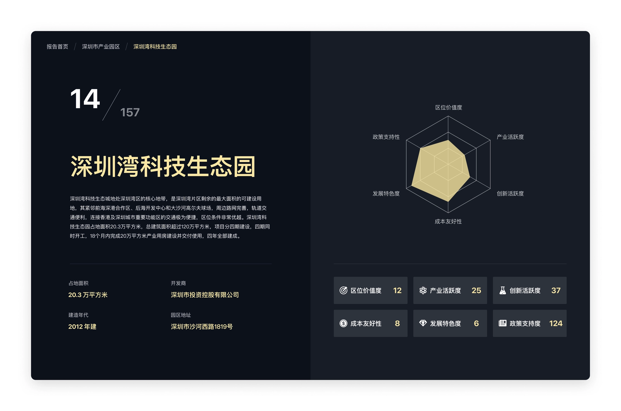
Industrial park page: the six evaluation dimensions showed as a radar chart.
Industrial Park Data
The data on the Industrial Park page focuses on the performance of this park under our six evaluation dimensions, each of which relies on a number of data to assess, again requiring consideration of suitable visualization forms based on data characteristics:.
- Location value: the external transportation convenience of this industrial park (distance to highway entrance/exit, railway station, airport, port), distance to core cities, proximity of innovation sources (distance to higher education institutions or research institutes), in order to more intuitively represent the distance in space, the design adopts the way of marking corresponding points on the map, and users can switch to view different categories in the left list; industry Activity: with some data in the city to assess, again need to consider the suitable visualization form according to the data characteristics.
- Industry activity: Similar to the industrial data in the city, the industry classification and enterprise scale are shown in a rectangular tree diagram (Treemap); the number of new enterprises is shown in a bar chart.
- Innovation activeness: the number of high-tech enterprises and special columns and soft writings within the industrial park, etc., are mainly displayed in text.
- Policy support: the relevant support policies of the region and the park are collected and displayed mainly in text; the business environment of the city where it is located is displayed using a bar chart with sorting and highlighting the position of the city among all cities;.
- Cost friendliness: land rent land price, labor cost, water and electricity price, and internal transportation convenience of the industrial park, using a combination of text display and map; development characteristic degree: land rent land price, labor cost, water and electricity price, and internal transportation convenience of the world in this park.
- Development characteristic degree: the number of the world's top 500 companies, unicorn companies, and listed companies in this park, and the development history and development highlights of the park; using a combination of map and text display.
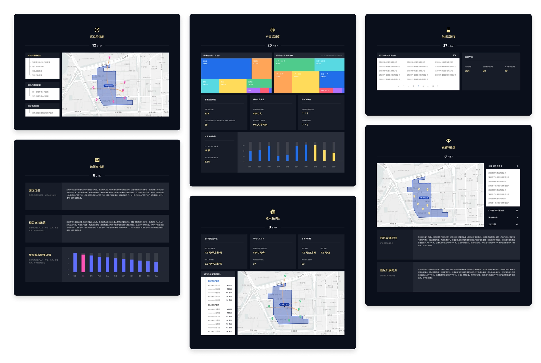
Industrial park pages.
Park Ranking
The value assessment of industrial parks in the report displays the 6 indicators used to assess the value of industrial parks, with corresponding description pages and individual rankings for each indicator.
- Introduction to the value assessment indicators: the top of each assessment dimension page displays the description of the assessment indicators and the specific calculation method, and is unified with the overall style of the website, adding a corresponding thematic background to the page (left in the figure below).
- Ranking of parks: the ranking of 157 industrial parks under this assessment dimension, with a map on the right to mark the location of the park on the current page (right in the figure below).
- Ranking of individual calculation indexes: the ranking of 157 industrial parks under each calculation index of the dimension is displayed at the bottom of each assessment dimension page (right in the figure below).
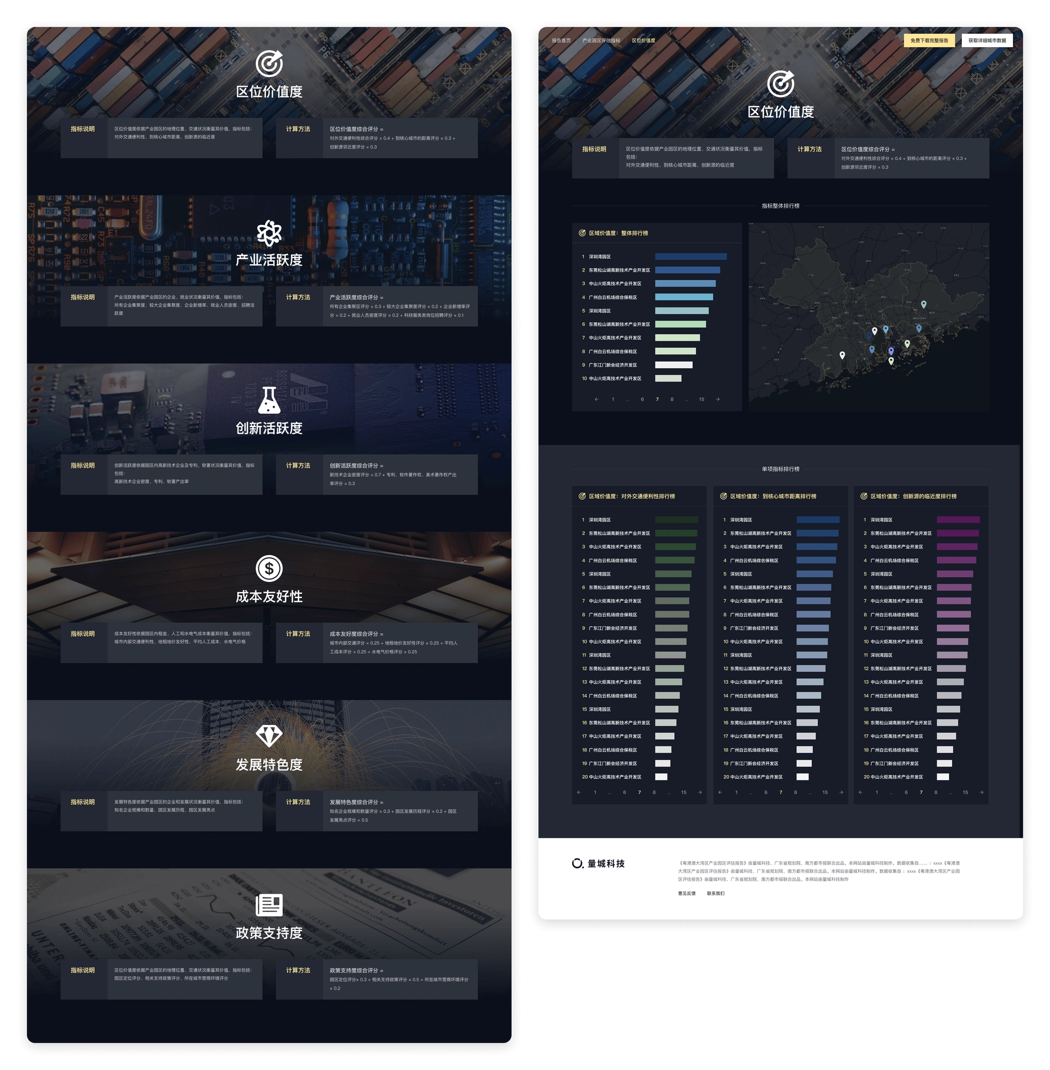
Park ranking pages.
Other pages
After the main pages were designed, simple responsive design were made for mobile, and marketing materials were designed.
Responsive design.
Marketing materials
Marketing materials
Thanks for watching!
Navigation


Case study
Value Assessment of Industrial Parks in Guangdong-Hong Kong-Macao Greater Bay Area
Visualizing the value of industrial parks.
role
Product Designer
Platform
Web, Responsive
My Contribution
UI / UX Design
Motion Design
Data Visualization
Background
Guangdong-Hong Kong-Macao Greater Bay Area includes the nine cities of Guangzhou, Shenzhen, Zhuhai, Foshan, Huizhou, Dongguan, Zhongshan, Jiangmen, Zhaoqing, and Hong Kong and Macau, with a total area of about 56,000 square kilometers, a total population of more than 71 million, and a gross regional product of US$16,425 billion at the end of 2018. And the region has a per capita GDP of US$ 23,342. The region is one of the most open and economically dynamic regions in China.
Value assessment of industrial parks in Guangdong-Hong Kong-Macao Greater Bay Area is a study initiated by QuantUrban and jointly completed by Guangdong Provincial Planning Institute. Based on the microdata of the Greater Bay Area, the study assesses the value of 11 cities and 157 important industrial platforms from the perspective of the development demands of industrial space by business entities. The final output of the study is the "Guangdong-Hong Kong-Macao Greater Bay Area Industrial Parks Value Assessment Report", and this website is a visual presentation of the study report.
Pages from the study report.
The website should not only present the findings of the study, but also visualize the massive data used in the study as well. Some similar products abroad have done a good example of open data visualization, such as DataUSA 、DataMéxico, where the data is in types of beautiful, interesting and easy to understand charts, rather than boring numbers in a table. Designing a "city data" website must be very complex and challenging, and I always want to have a chance to challenge myself.

Information Architecture
Unlike the organization of a research report, the first step in designing the website is to clarify the relationship between data. The data used in the research report contains both city and county level statistics, as well as spatial data such as the location of industrial park landings and surrounding facilities.
So the first step is to classify the information, which we divide into 4 categories.
- Guangdong-Hong Kong-Macao Greater Bay Area overall data: statistics of the Greater Bay Area as a whole, such as data on population, area, gross product, etc. As well as the distribution of industrial parks in each city.
- City data: data on city population, commuting, economy, industry, public service facilities, commercial service facilities, etc. For each city, including the districts and counties under the city.
- Industrial park data: data on the location, enterprises, surrounding facilities, etc. Of each industrial park, and its score and overall ranking under our assessment indicators.
- Value assessment indicators: descriptions of assessment indicators and calculation methods, as well as the ranking of industrial parks under individual assessment dimensions.
After classifying the information, we started to design the overall information architecture of the website. Considering the different types of data, we aggregated different types of data to different pages, while the home page as an overall overview page also provided entrances to cities, industrial parks, and assessment indicators. The contents of several pages are clearly distinguished.
- Home page: showing the overall situation of Guangdong-Hong Kong-Macao Greater Bay Area, providing entrances to the city page, industrial park and assessment index page.
- Cities: showcases the list of cities in the Greater Bay Area, and provides access to the city details page by clicking on it.
- Industrial parks: displaying the list of industrial parks and access to the details page of each industrial park.
- Park ranking: displaying 6 indicators used to evaluate the value of industrial parks, each indicator has a corresponding description page and a single ranking.
Information architecture of Parkfig website.
Homepage
The homepage is the entrance for users to visit the website, and it takes on the function of overview and index of the directory, so we should first consider that the information we want to convey can be displayed completely.
The homepage needs to display these information.
- The name and introduction of the study.
- Basic data of the Guangdong-Hong Kong-Macao Greater Bay Area.
- Map of the Guangdong-Hong Kong-Macao Greater Bay Area.
- The distribution of industrial parks.
- Methods of industrial spatial value assessment.
- Quick entrances to cities and industrial parks.
- Complete the report and purchase data entrance.
It can be seen that the amount of information to be displayed in the homepage is massive, and it needs to be organized appropriately and arranged reasonably in terms of layout design. What is more difficult is how to ensure that users have continuous interest in browsing when they visit on the basis of complete information display, and attract them to the story we tell.
At that time, we made some layout attempts, but the layout of information was a bit redundant, the interaction was relatively complicated, the access data needed to switch categories or click several times to see, and the overall was rather monotonous, just presenting the information originally, lacking attraction.
Prototype design: Some layout experiments
After some attempts, there was no clear idea on how to improve the homepage design, and the design was at an impasse. So the choice was made to stop and start rethinking the objectives of the homepage.
- To let users understand the background and objectives of the study initiation.
- To let users have a basic understanding of the urban composition, spatial location, population and economic situation of the Guangdong-Hong Kong-Macao Greater Bay Area.
- To let users understand the distribution of the industrial parks of this study in each city.
- To provide users with an understanding of our assessment methodology and the scores of the parks assessed according to our assessment methodology.
- Providing users with a convenient portal to visit particular cities or parks.
- To guide users to view the full report and purchase data.
When thinking about the goal of the home page, it is noted that there is a hierarchical progressive relationship between several contents of cities, industrial parks, and assessment methods. The hierarchical relationship can be utilized in the spatial display and combined with interactive actions to create a dynamic display.
In the map product, mouse scrolling to zoom in & zoom out is a very common action, and the interaction of scrolling to zoom in corresponds to the relationship between data, so we decided to use the interaction of "vertical scrolling", and considering the need to display the corresponding data under different levels, we added the design of "split screen".
- Vertical scrolling: corresponding to different zoom levels, when scrolling from the national level zoomed to the Bay Area, to 157 industrial parks.
- Split screen: while scrolling, a split screen is added on the right side to show the data of the corresponding map level (city → park → assessment method).
Homepage design: the initial state of the map, showing the location and basic information of Guangdong, Hong Kong and Macao Bay Area.
After scrolling and zooming into the interior of Guangdong, Hong Kong, Macao and the Bay Area, the map display changes to the location and classification of the 157 industrial parks we evaluated.
Keep scrolling to show the top 10 industrial parks and their locations under our evaluation methodology
Homepage design scrolling effect (video is a bit large, please wait)
Visualization of urban data
The prerequisite for data visualization is to understand the data and find a suitable form of expression for the data. After completing the design of the homepage, the next step is to complete the design of the city, industrial park and assessment dimensions. The biggest difficulty of this part is the visual presentation of a large amount of data, which requires thinking about the most suitable visualization form for each part of data one by one.
City Page
Cover of City
The city page wanted to let users feel the atmosphere of the city as soon as they opened it. The first screen was designed with a large background image, and the content displayed on the image was streamlined, keeping only the key information and putting the rest of the information outside the first screen. So the copyright-free images of each city were selected as the background.
City pages hero sections (Figma)
Urban Data
We have compiled a large amount of statistical yearbook data for the city in the Guangdong-Hong Kong-Macao Bay Area, and all these data need to be displayed in the city pages as needed. The next step is to decide the corresponding visualization form according to the data characteristics of each section.
- Basic information: allowing users to establish a basic knowledge of the city, using the way of highlighting the current city in the map to show the location of the city in the Guangdong-Hong Kong-Macao Greater Bay Area, and the basic data (the first line left in the figure below).
- City population data: The population data is divided into multiple dimensions such as resident population and household population, and each item shows the population statistics of the city and the districts and counties within the city, using a bar chart + map, while using different intensity of color filling, so that the bar chart (ranking of districts and counties) and the map (location of districts and counties) can establish a connection (middle of the first row of the figure below).
- City population distribution: daytime and nighttime population distribution in the city, and the "hotness" of the areas where residents are concentrated is well suited to be displayed using a heat map (first row right of the figure below).
- Commuting structure: the inflow and outflow of population between regions in the city, the proportion of inflow and outflow to the city using pie charts, and the location of inflow and outflow indicated by lines of different colors in the map, the thickness of the lines represents the amount of mobile population (second row left and center of the figure below).
- City Economy: The economic fundamentals of the city and counties, including GDP, growth rate, GDP per capita and other 15 dimensions, under each dimension, the data of each district and county should be displayed at the same time, so the card option is designed to be switched with a click, the card shows the data of the city by default, and the data of other dimensions can be automatically rotated or manually switched by users. The data of each district and county is added with the function of sorting from high to low, so the form of bar chart is adopted to visually reflect the position of each region in the city (the second row of the figure below, right).
- City industries: the same bar chart is used for the secondary and tertiary industries; important industrial parks within the city use the scheme marked on the map (third row left in the figure below).
- Enterprise microdata: for enterprise growth data, a line graph is used to better view the trend of the data; a treemap chart is used for industry classification in order to better view the proportion of industries within the city; a honeycomb diagram scheme is used for enterprise distribution displayed on the map, which is more detailed than the heat map.
- Public service facilities, commercial service facilities: using a switchable list format, when selected, the honeycomb map under the category is displayed on the map to view the distribution of this type of data in the city.
Charts on City page.
Industrial Park Page
The industrial park detail page shows the data of the park and how it scores on each dimension under our evaluation system.
Industrial Park First Screen
The first screen needs to introduce the basic information of the industrial park and our value assessment of the industrial park to users, so similar to the map area on the home page, a split screen design is used, with the left side showing the basic information and data of the park and the right side showing our value assessment of the park.
There are 6 dimensions in this evaluation of the industrial park, and each dimension is calculated and evaluated to give a score and ranking. In order to show the performance of the park under the evaluation dimensions more intuitively, we use a radar chart to show the scores of the park in each dimension at a glance.
Industrial park page: the six evaluation dimensions showed as a radar chart.
Industrial Park Data
The data on the Industrial Park page focuses on the performance of this park under our six evaluation dimensions, each of which relies on a number of data to assess, again requiring consideration of suitable visualization forms based on data characteristics:.
- Location value: the external transportation convenience of this industrial park (distance to highway entrance/exit, railway station, airport, port), distance to core cities, proximity of innovation sources (distance to higher education institutions or research institutes), in order to more intuitively represent the distance in space, the design adopts the way of marking corresponding points on the map, and users can switch to view different categories in the left list; industry Activity: with some data in the city to assess, again need to consider the suitable visualization form according to the data characteristics.
- Industry activity: Similar to the industrial data in the city, the industry classification and enterprise scale are shown in a rectangular tree diagram (Treemap); the number of new enterprises is shown in a bar chart.
- Innovation activeness: the number of high-tech enterprises and special columns and soft writings within the industrial park, etc., are mainly displayed in text.
- Policy support: the relevant support policies of the region and the park are collected and displayed mainly in text; the business environment of the city where it is located is displayed using a bar chart with sorting and highlighting the position of the city among all cities;.
- Cost friendliness: land rent land price, labor cost, water and electricity price, and internal transportation convenience of the industrial park, using a combination of text display and map; development characteristic degree: land rent land price, labor cost, water and electricity price, and internal transportation convenience of the world in this park.
- Development characteristic degree: the number of the world's top 500 companies, unicorn companies, and listed companies in this park, and the development history and development highlights of the park; using a combination of map and text display.
Industrial park pages.
Park Ranking
The value assessment of industrial parks in the report displays the 6 indicators used to assess the value of industrial parks, with corresponding description pages and individual rankings for each indicator.
- Introduction to the value assessment indicators: the top of each assessment dimension page displays the description of the assessment indicators and the specific calculation method, and is unified with the overall style of the website, adding a corresponding thematic background to the page (left in the figure below).
- Ranking of parks: the ranking of 157 industrial parks under this assessment dimension, with a map on the right to mark the location of the park on the current page (right in the figure below).
- Ranking of individual calculation indexes: the ranking of 157 industrial parks under each calculation index of the dimension is displayed at the bottom of each assessment dimension page (right in the figure below).
Park ranking pages.
Other pages
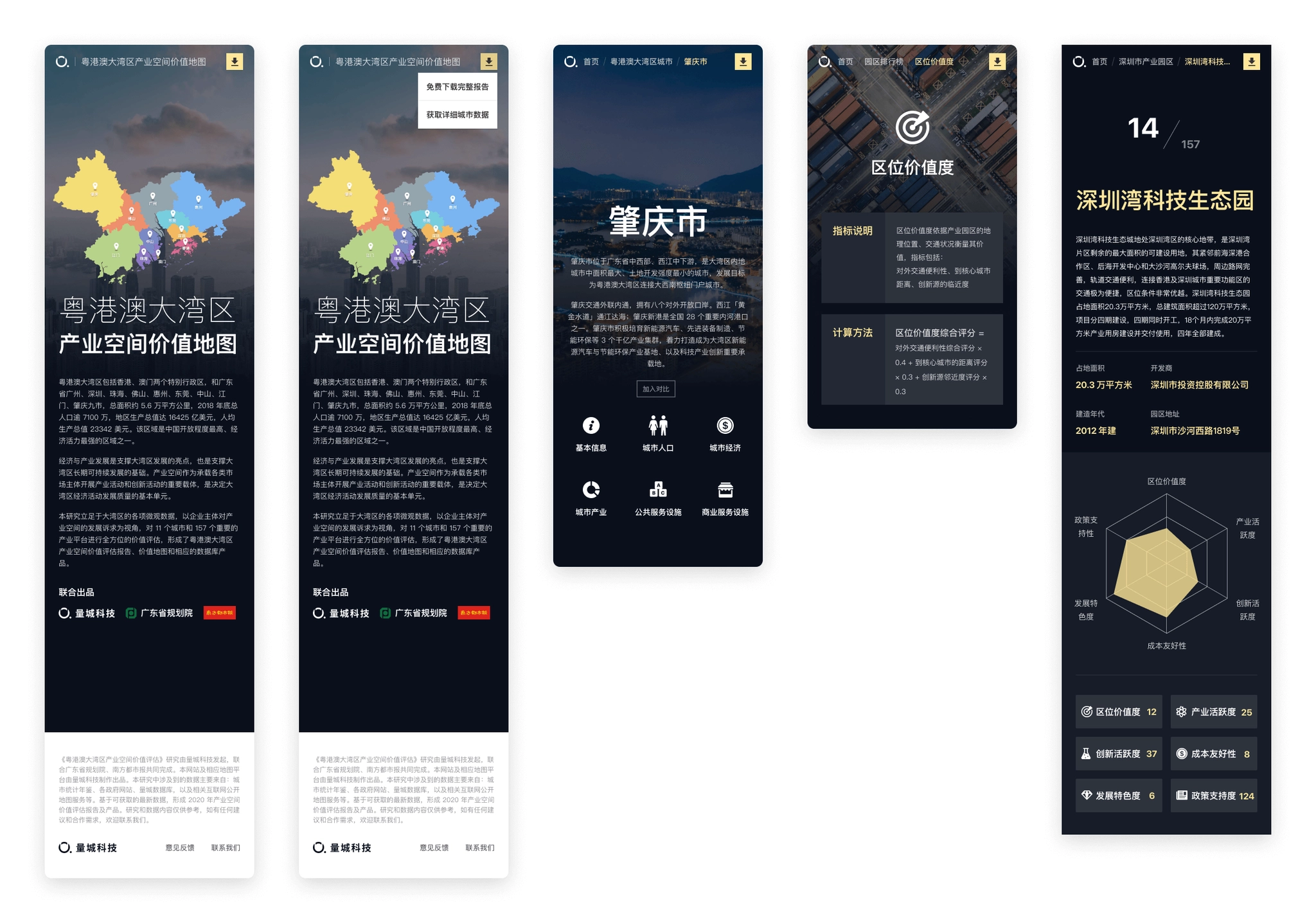
After the main pages were designed, simple responsive design were made for mobile, and marketing materials were designed.
Responsive design.
Marketing materials
Marketing materials
Thanks for watching!